MONOCHROME MULTITUDES (Review)

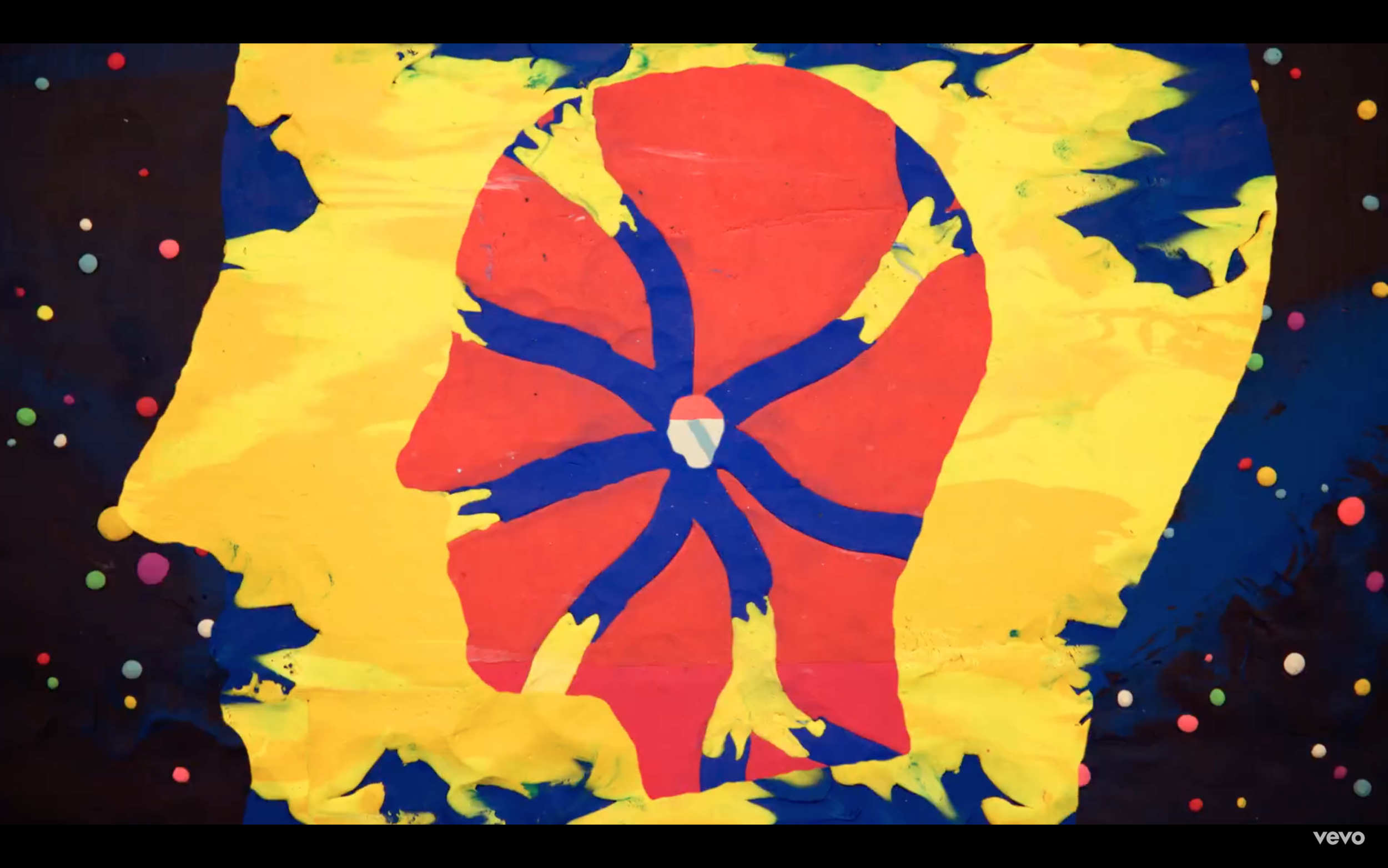
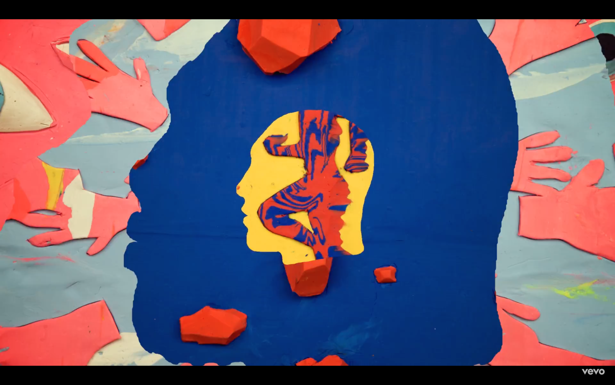
Monochrome Multitudes at the Smart Museum of Art takes on the challenge of presenting largely abstract, monochromatic art to an ever-increasingly critical audience. Wide spaces are divided into thematic rooms of blue, white, yellow, gray, black, and red color schemes that delight the eye but demand a close reflection. Self-reflective, the exhibition also pairs pieces into groupings based on themes of the body, urban spaces, gender, and more. As you walk along, you are led to consider what the pieces share, or what cannot be shared even among mediums and colors.

The collection is the second of a three-part series the Smart calls “Expanding Narratives,” which aims to reevaluate exhibitions through fresh curatorial strategies. The Smart Museum calls on its presence within the University of Chicago to continually reimage how such a relationship can enrich new exhibits. In turn, University staff from across the divisions are the source for many of the lengthy exhibit labels for the 120 exhibited works. The reshifting of monochromatic narratives operates through this collaboration across disciplines and academic worlds.

Whether it's William Turnbull’s “Mango” (1963) or Josef Albers’s 1972 “Formulation” series, Monochrome Multitudes’s simplicity poses a significant challenge for the exhibition. Christine Mehring–a University of Chicago art history professor and co-curator–is well aware that abstract, single-color art is the hardest for audiences to digest. In an interview with WTTW News, she notes, “It’s the type of art that many people will say, including my students, either ‘I can do this’ or ‘Why is this art?’”

Nevertheless, Monochrome Multitudes groupings of pieces pull together a stunning exhibition that asks the eye to engage with it beyond appearances. Past Smart exhibitions have lent themselves to being Instagram-post fodder, but this collection's subdued spirit demands a sustained focus on the work–for better or worse for visitors. The conscious spotlighting of queerness, emotion, and shifting modes of representation hits quite well within monochromatic rooms.

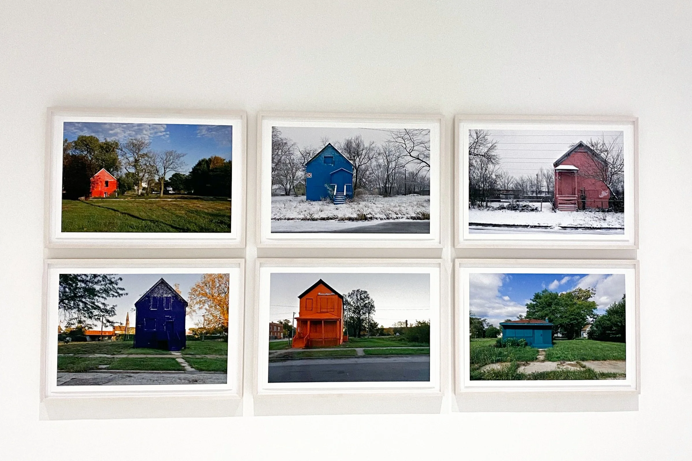
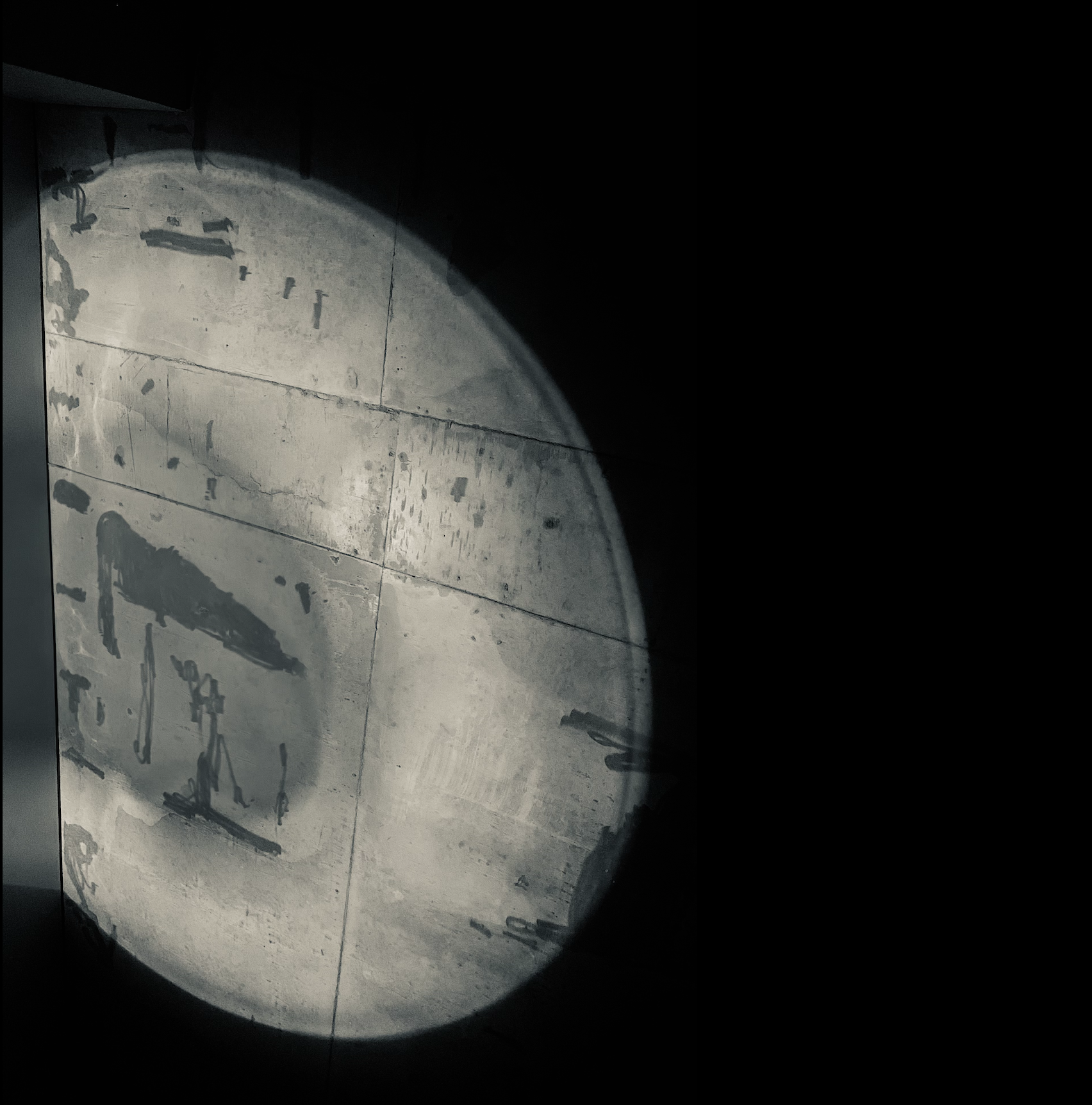
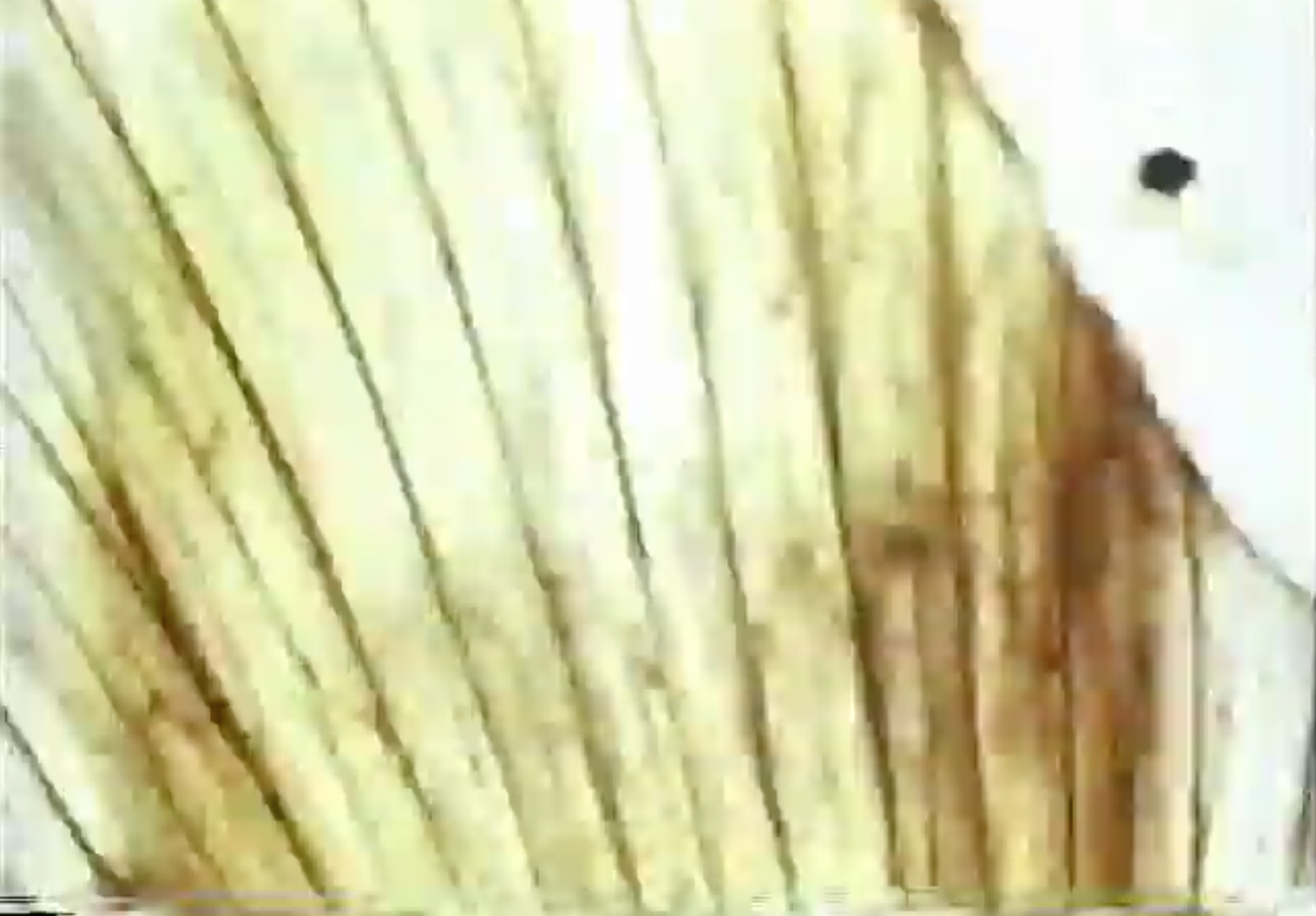
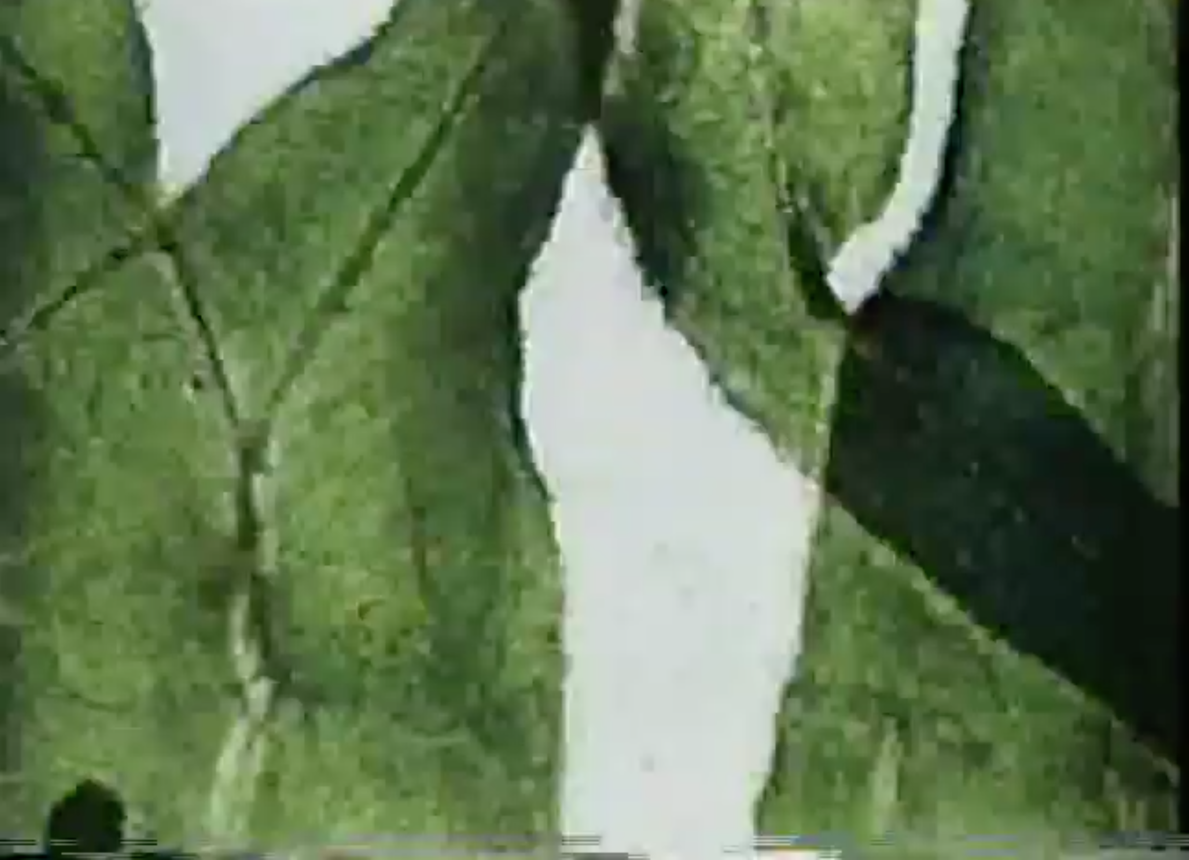
To mount its complexity, the exhibition features incredible textile work featuring weaving, sculptures, and clothing. Claire Zeisler’s work with wool in Triptych welcomes you to the exhibition, and Magdalena Abakanowicz’s “Structure Black” is one of the most unnerving and beautiful pieces I have ever experienced. Materiality is further explored through David Hartt’s photography of concrete or Lotte Jacobi’s glass. Finally, I couldn’t talk about this exhibition without the incredible monochromatic Chicago homes project of Amanda Williams.

Regardless of the depth of materiality used, the way Monochrome Multitudes pairs its pieces together demonstrates that it is not interested in engaging with audience questions of whether any given piece is actually art. The late Ellsworth Kelly anxiously wondered, “‘Can I make a painting with just five panels of color in a row?’ I loved it, but I didn’t think the world would. They’d think, ‘It’s not enough.’” In response, each space of the Smart’s exhibition poignantly represents the ability of art to go beyond the single medium of color, even when all the viewer can see is a single color. It asks us all to refrain from demanding more, and instead let in the spectrum of history and color before us.

Monochrome Multitudes is at the Smart Museum through January 8, 2023.

All photography featured is by Felix Gonzalez.

Guide to Better Your Museum Visit

Fall has officially descended upon us, and as the weather gets colder, what better way to spend the weekends in the warmth of some of Chicago’s best art museums? This is a short list of suggestions to make your museum visit more meaningful and enjoyable: 

  1. Know your timeframe. If you only have an hour, limit yourself to one section of the museum so you don’t get overwhelmed or easily distracted by the sheer amount of art. Large museums like the Art Institute and the MCA take several hours to walk through. Instead of trying to see everything, make it your goal to enjoy one exhibition. Moderation is good, and it applies to art-viewing too. 


  2. Read the wall labels. This makes all the difference. In conjunction with the last tip, focusing your energy on one exhibition makes it so you can digest the wall labels and understand the art better. Last month, my friends and I stumbled across a cool exhibition in Bangkok, where it was difficult to connect with the artist without knowing anything about his motivations and the sociopolitical context. So, we slowed down and read the labels, and I’m so glad we did, because it made the experience so much more memorable. 


  3. Talk about what you are seeing. Continuing with the story, after we started reading the wall text, we tried to understand the paintings — can we count the number of martini glasses? Is this creepy and complex painting about corrupt politicians?


  4. Sketch, if you are artistically inclined. Everyone has a favorite painting, the one that stood out to you like no other. Maybe you are drawn to the colors, the shapes, or the composition. Bring a sketchbook or notebook and put something on the page, anything goes!


  5. Take a water break. Museums have low humidity because artworks last longer in cold and arid conditions. I always feel thirsty about an hour into a visit, and I never have water on me, then I feel bad about buying overpriced beverages in the museum cafe. Therefore, bring water and stay hydrated! 

image via

Some exhibitions to visit right now:

  1. Monochrome Multitude, Smart Museum of Art 

  2. Martine Syms: She Mad Season One, MCA 

  3. David Hockney: The Arrival of Spring, Normandy, 2020, Art Institute

Visit the Smart Museum!

image via


cover image via

sample(d) I: Moon Men pt. 2

… on the same note of an ethereal space aesthetic. I’ve made the unusual pairing in my mind between “moon river” and “rocketman” (by E. John which he himself even sampled for “Cold Heart” feat. Dua Lipa). On a more tragic note, the notion of space could mean something entirely unattainable. Here’s my version of rocketman…

“mars ain’t no place to raise your kids” , photo by Katarina Grozdanic

Rocket Man (I think it’s going to be a long time)

link

rocketman

Promise you’ll take me to the moon

fingers crossed over his chest 

and life was at its best 

back then 

when 

clouds were but kingdoms unexplored

and dreams were alive 

breathing

beckoning 

… 

Somehow he knew —even then— they were to die very soon 

that the path of the greatest dreams were those 

that led to a graveyard 

No one can see

but you 

and you’ll visit them frequently

You’ll see a time capsule of every petaled memory 

      encased in settled dust 

The greatest ones are buried in glass 

too precious to visit 

to think about 

But

The greatest ones are just that… …dreams

that have long died at 2:13 am 

When the moon was high 

And you could look at it every night

reminding your eyes

they’re not lying to you 

that you could go Anywhere; be Anything

But life has now buried your feet in the ground 

with one eye on the sky 

and the rocketman 

…once breathing 

…once beckoning 

has now died

Stay tuned for many more sample(d) installments to come.

‘til the next installment, I’m going to keep basking in the magic of lyrics and storytelling and I hope you do too.

All of my lyrical inspiration for this first installment (Moon Men): moon river by Audrey Hepburn and more, Rocket Man by Elton John, Halley’s Comet by Billie Eilish, illicit Affairs and this is me trying by Taylor Swift, When we were young by Adele Adkins, “Bing Bong” from Pixar’s Inside out, and many many more…

sample(d) I: Moon Men pt. 1

“The reader is the space on which all the quotations that make up a writing are inscribed without any of them being lost; a text's unity lies not in its origin but in its destination.” 

-Roland Barthes, The Death of the Author 


The beauty of music — to me — is within the lyrics. But would this mean that the magic of songs lie within the songwriter? I’d beg to differ. The true power of a song — of a chorus or a bridge or a hook— lies within the listener. More specifically, how listeners can actively take apart lyrics and interlace a chorus, a hook, or a bridge into a tapestry of their own creation. It is the way a listener weaves their own lived experiences, imagination, and imagery to songs that make it last; make it mean something. This poem-based series is my way of exemplifying how magical songs are to me. 

I’d like to invite you to bask in the magic too… 


Sample(d) I: Moon Men

“two drifters off to see the world”


In this first installment, I “sample” a myriad of artists but primarily the various artists that have covered the iconic song “moon river” (popularized by Audrey Hepburn’s version in “Breakfast at Tiffany’s).

moon river

from breakfast at tiffany’s and beyond

Moon river, wider than a mile

I'm crossing you in style someday

Oh, dream maker

You heartbreaker

Wherever you're going I'm going your way

Two drifters off to see the world

There's such a lot of world to see

We're after the same rainbow's end

Waiting round the bend

My huckleberry friend

Moon river and me” 

-Performed by Audrey Hepburn, and Frank Sinatra, and Frank Ocean… 

… my turn-ish


moon landing

A love on a lie

is a castle on a glass cloud 

but not this love 

for it is different 

As if here on worn-in sheets under dim motel lighting

On a cross-bred cocaine high  

Nothing else matters 


And as your body curves into mine 

you confess, “this love is made of something out of this world”                                                         

— something I already know

… 

Let the crashing comets collide against the earth

Let it catapult me into the clouds

   into space 

So far from earth

So far from matter

Where I can lay in moon dust

with you forever

Where I can lay here in moon dust 

with you forever

A future with you

is a future worth dreaming of

A love on a lie

is a love good enough

for me

… 

And as the stars in your eyes dim into a deep sleep 

I’m mesmerized that somehow I’ve landed you 

and

I solemnly swear 

a secret

“I promise you 

I’ll stay here forever

and whatever comes after 

doesn’t matter”


Check out part 2 to this series debut…

What (Taylor's Version) Can Mean For the Future of Pop Music

By now, the whole world has caught on to Taylor Swift’s plan to re-record her masters. Announced in August 2019, the plan to re-record her first six albums after their sale to Scooter Braun’s Ithaca Holdings (and their consequent re-sale to Shamrock Holdings) is now in full swing, with Ms. Swift having successfully released two of her six stolen masters—April 2021’s Fearless (Taylor’s Version) and November’s Red (Taylor’s Version). These albums have topped the charts, starkly contradicting claims that re-recorded albums were doomed to flop and delighting people everywhere in the process. The remaining four albums are consistently being teased across social media platforms, and are widely anticipated. In short—re-recording her albums has worked. 

But more than being a brilliant and gutsy retaliation to a dirty legal move, the re-recording of Swift’s well-known old songs also represents a fundamental shift in pop music and modern mass-produced media as a whole. It’s no surprise to anyone that the modern music industry as well as modern media in general has become incredibly product-oriented— most dialogue centers around what will be released and when, and fans have become eager for “content” above anything else. This is not necessarily bad in and of itself, but it is incredibly interesting to see what Swift’s re-recorded music has begun to do. 

It’s given pop music permission to grow.  

Even the casual listener will notice that while many tracks on the re-recorded albums remain faithful to their counterparts on the original albums, many others don’t. There are “from the vault” tracks, which were previously unreleased songs from the time period of the original album, as well as remakes of old fan favorites. Fitting into both categories is perhaps the most famous example—the legendary ten-minute version of the cult favorite “All Too Well”. Originally a four-minute wistful track about lost love, the ten-minute version of “All Too Well” retains every word of the 2012 version, fitted neatly into a complicated, varied, tumultuous narrative of a relationship that grew and twisted and failed. The ten-minute version retains the wistful core of the original, but the darker elements that were subtly hinted at originally are fully fleshed out in the newer version, in long paragraph-like lyrical phrases like the ones explored in her folklore and evermore albums. It’s markedly different from Red’s original polished 2012 country-pop release. And, of course, it’s sung in Swift’s current voice. 

Most importantly, though, the whole world loves it. There were SNL performances, a full short film starring two very well-known actors with an in-person premiere, acoustic performances and Long Pond remixes. This is striking because, before the re-records began, no one expected that they would achieve more than a tiny fraction of the original records’ popularity, and yet people adore this. Some of this can be attributed to Taylor Swift’s star power, and more to clever marketing. But underlying all of that is a willingness by the audience to revisit previous creations and fully appreciate the changes that have been made, and that’s striking. 

Because in a fast-paced economic system that makes art for consumption, we often think of art as a final product and of artists as “content creators”. This isn’t evil in itself, of course, but a lot is lost when art is thought of as more of a product and less of a process. To an extent, thinking of creative arts as a linear process ending in a polished product is counterintuitive; anyone who has ever tried to create something knows that art is never truly finished. 

Swift’s success in re-recording her albums has shown that it’s entirely possible for both to be true. The commercial success of albums does not have to mean that they are never revisited; some of her best creations have come nearly a decade after their original release, and if she had stopped with the “final” version of RED in 2012, these startlingly masterful songs would not exist. Allowing her art to evolve has given a sharper and deeper meaning to what the songs originally were, and now that the public has received the re-recordings so well, perhaps it can signal a shift to this mindset in modern media as a whole. Hopefully, this will remind everyone of the magic that can happen when art is allowed to develop authentically, even after it’s passed its original deadline.

As I hit play on Red (Taylor’s Version) once again this weekend, I know it’s reminding me.


Thumbnail image via

Diana Vreeland: The Eye Has to Travel

Have you ever watched fashion documentaries? The directors, through the best aesthetics, allow insiders in the fashion industry to tell their stories and share their insights.

Diana Vreeland: The Eye has to Travel, released in 2011, has always been in the top 10 must-watch fashion documentaries—and I finally watched it this week. The documentary includes interviews of Vreeland with George Plimpton for her memoirs, the models and photographer who worked with her, her celebrity friends, and her family members. Through these different angles, a Diana who is saucier than Devil Wears Prada and lived her life to the fullest is presented.

Interestingly, one of the directors, Lisa Immordino Vreeland, is Diana’s granddaughter-in-law. Though Lisa had never met Diana, she had all the access and connections needed to make this a successful documentary, making it a tribute in turn.

 The best thing about London is Paris.
— Diana Vreeland (Harper's Bazaar UK)

Born in 1903, Diana Dalziel was the eldest daughter of American socialite Emily Key Hoffman and Scottish stockbroker Frederick Young Dalziel. Her early childhood home in Paris was frequently visited by leading artists at the time. As they immigrated to the United States, Dalziel started attending Brealey School to study ballet. When she was 18, she married the love of her life—Thomas Reed Vreeland—and gave birth to Tim and Frederick. She started working at the age of 33 as Harper’s Bazaar’s editor, then became the editor-in-chief of Vogue 26 years later. At the age of 70, she became the special consultant to the Costume Institute of the Metropolitan Museum of Art.

Her intuition towards fashion and her eyes for talent are impeccable. The Great Fur Caravan is one of the most breath-taking series I have seen in fashion magazines, and this 1966 series has proven its timeliness. The twenty-person crew from Vogue made an unprecedented journey to Japan with Richard Avedon, capturing a love story featuring supermodel Veruschka.

Two of the 26 page series

Featured image via

The narrative is about a girl who travels to a foreign country and falls in love with a Japanese giant (the male model is a 7ft sumo wrestler). The photos are truly breathtaking, a merging of art and fashion under an exotic and dreamy setting.

Rumour has said that this shooting cost one million dollars, which would be equal to modern day seven million dollars. It is definitely one of the most audacious projects that Vreeland has spearheaded, but I think the final result has proved its value.

Featured image via

Diana wasn’t pretty by society’s standards, and her mom would even call her ugly, but she has never tried to hide her imperfections. She created her own personal statement and style, which ensues in her work as well.

For Harper’s Magazine, she opened up a column called Why Don’t You? In this column, she wrote down eccentric style ideas that were best enjoyed as concepts as they were difficult to actually execute. Nonetheless, the ideas were playful and precious and could always put a smile on readers’ faces. She is not telling readers to do something a certain way, but shows them that there is another way of doing something. For 26 years, the column shouted freedom and invited the reader into her creative world.

WHY DON’T YOU…?

Paint a map of the world on all four walls of your boys’ nursery so they won’t grow up with a provincial point of view?

Cover a big cork bulletin board in bright pink felt banded with bamboo, and pin with colored thumb-tacks all your various enthusiasms as your life varies from week to week?
— Diana Vreeland (organized by Harper's Bazaar Staff)

Vreeland was not perfect. As a boss, she was strict; as an editor, she often went beyond the budget; as an individual, she over-romanticized things. However, she was special and not afraid to be quirky, and that’s good enough.

The 85 minutes documentary allows the audience to have a glimpse into a fashion pioneer’s life, and is just perfect for a chill night.


Tortured Geniuses and Starving Artists

Last month, I came across an article by Agnes Callard, professor at the university, where she criticized Beth’s character in The Queen's Gambit:

The myth is of the genius “tortured” by some internal struggle the rest of us are not smart enough to understand, so that the best we can do is step out of their way. The real torture is the one we enact by classifying people as geniuses, to serve our own fantasies of independence. Geniuses are the monsters we make.

Long story short, geniuses are admired but feared and isolated, and Beth is not alone. The BBC adaptation of Sherlock portrays a high-functioning sociopath who also deals with drug addiction, an inability to emotionally connect with other people, and loneliness. He often treats people with disrespect and total disdain, leaving Watson to smooth over awkward social situations.

The personality of the genius launches Callard’s criticism on real-life geniuses, recalling people’s tolerance of their rude behaviors — they are so talented in one aspect, mustn’t we excuse their ineptitude in other aspects?

image via

image via

image via

image via

In my own experience, tortured geniuses are accompanied by starving artists. Both are malicious stereotypes created to entertain our imagination of idealistic, intelligent people facing struggles. Picture a tired young man on the street of New York City, cigarette in hand, a dirty paintbrush propped up by his right ear. He had recently quit his job and become a full-time painter. He is a true creative genius, just a little held back by finances, but don’t worry — he might get noticed by a big gallery, blow up on social media, or he might give up completely!

Two years ago, I interviewed a 30-year-old painter who had quit her day job. We discussed the socioeconomic reality of being a full-time creative, and there was one sentence I could never forget:

Most people don't think that artists are serious. I don't wanna say that they're not thoughtful because I think a lot of people think that artists are very philosophical in a certain way, but not in a way that is serious or respectable. They are pot smokers or acid takers or wishy-washy lazy people who like to think about stuff and not work.

People only see the ends of the spectrum — the starving artist struggling to make a living, and the Jeff Koons making millions of dollars.

Why must we worship Andy Warhol while dismissing the new generation of young creatives? Why do we fit personalities into a box and call them starving artists, the same way we consume tortured geniuses for our own entertainment?

My discussion with the anonymous painter continued:

Once you've made it then they're like, oh yeah, it's awesome, I respect your rags to riches story, but it didn't have to be rags! If you had supported from the beginning, it didn't have to be so rough.

I don’t know why artists and geniuses must be tortured, and it intrigues me to see overlaps in their stereotypical makeup. Perhaps some of it comes from autobiographical truth.

Take the example of arguably the most famous “tortured” artist of the 20th century: during his lifetime, Vincent van Gogh was impoverished, isolated, institutionalized, and died from attempted suicide. People are intrigued by his personality, swarm to see his works at museum all over the world, and produce documentaries to showcase his hardships.

We love geniuses. We are impressed by how different they are from us, because we feel so ordinary. We place them under the spotlight and watch their struggles with morbid fascination…

That's it for my train of thought.

Image via

Image via


ThisIsNotSpam: Exploring Collaging and its History


To: You

Cc: MODA

Subject: Collaging


Dear readers,

Today, we are going to explore collaging, the art style that has consumed me for the past few months. I could talk about the pieces that inspire me and spark interest for days, but for now, I’ll just give you an elaborate gist (is that an oxymoron?) in hopes that you can at least gather some useful information. This can be anything from inspiration for creating, as collaging encourages me to do, or just the ability to become more observant when viewing art.

I never paid any attention to collaging myself until the beginning of last quarter when a good friend of mine made me two collages for my birthday. This led me down a whimsical rabbit hole that irked me learn more, and lucky enough when I saw that a collage class was offered last quarter I enrolled, no questions asked. So, this article right here is a giant soup, combining what I learned in class with my own research.

You may be wondering what exactly collaging is considered and how we can define it. Well, collaging includes but is not limited to: cutting and pasting, editing, quoting, sampling, mixing, and pretty much any sort of combining, which doesn’t need to be physical— my answer: what isn’t collaging?

Pablo Picasso, Le joueur de guitarre (Guitar player), 1910

Pablo Picasso, Le joueur de guitarre (Guitar player), 1910

Collaging began as a subcategory of cubism, mainly influenced by Pablo Picasso (note: this has been my fun fact this week!) Through art, he combined and disassembled day-to-day, recognizable figures into ways that would play with how our eyes make out images. In so many pieces, we see his obsession with the figure of a guitar and how he carefully selects slivers of its parts to paint, all interacting with each other in unique and confusing ways. For instance, Pablo Picasso’s Guitar Player, as seen below, re-figures a guitar in a way that would be considered ambitious since you can barely even tell there is a guitar there. A sneaking suspicion that an instrument is visible builds up with clues like the color of the painting, the title, and some curves here and there, which gives us a sense of the guitar’s presence. 

In the early 1900s, strange arrangements of figures in paintings become popular. They are similar to collating but exist in a single medium, completely flat. It’s as if a smashed guitar was recreated in strokes of oil paint. It’s a method that shifted surrealism into a multi-media genre, and although it’s only slightly dipping its toes into the sea that is collaging, these skills being developed by venturing artists were essential for this category of art.

Picasso was already extremely comfortable with the art of masquerading, of transforming. It was around 1912 that he began adding texture to these pieces, slowly but surely incorporating items like wooden pieces that added texture to painted guitars, music sheets peeking through the background of otherwise flat paintings, and the usage of wallpaper instead of solely relying on painted base layers. Soon he would inspire other artists to enrich the surface of the canvas using three-dimensional elements.

It was the group of artists known as the Futurists, who were most active between 1909 and 1918, that stepped into the next level of uniting materials. They began collaging entire pages rather than considering pasted elements minor parts of their creations.

My favorite example is Carlo Carrá’s Interventionist demonstration, which is composed of phrases and radical ideas relating to civilians’ perspective of World War I. He used cutouts from newspapers and magazines, enclosing them all in a looping spiral: a mind churning and slightly haunting arrangement.

This led right into the Dadaist movement during the early 1930s, which was made up of artists who specifically wanted to target media’s effect on society. They thought that the images presented to the public were toxic to our behavior of constantly participating in capitalist movements. Creators like Hannah Höch, Hugo Ball, John Heartfield, and Tristan Tzara wanted to go against some generally accepted ideas that were more effective than the bourgeois, political nonsense, and were able to alter an image’s original destination to relay strong messages. One of the most known pieces of these anti-art movements is John Heartfield’s 1932 Adolf the superman: Swallows gold and spouts junk. This piece makes fun of Adolf Hitler, showing an x-ray image of a stomach full of gold and a swastika replacing his heart.

Then came the Surrealist movement, where the obsession with the subconscious and Freudian studies led artists to wander into the crazy world of dreams. Some of these artists include Salvador Dalí, Max Ernst, and Joan Miró. Pretty much all surrealists experimented with collaging—metamorphosing body parts and objects into strange creatures, including sexual fantasies. With every year, more combining of leaflets, posters, advertisements, and media gave way to a nonsensical world of art that caused viewers to be drawn to the madness embedded within collaging.

Pop Art is the movement that emerged in the mid to late 1950s, where its artists celebrated mass culture rather than revolting against it. These artists built a bridge between what was considered exclusive, professional art, and kitsch art, a push for a more inclusive system for anyone to participate in. Here, we see a jump from using somewhat identifiable images in portions of the creator’s work to famous icons and brands taking over entire pieces. In James Rosenquist’s work, the 35th president of the United States is depicted in an oil painting. Cinema, advertisement, newspaper, television, and comics were frequently reintegrated into creative projects.

Since media itself was utilized to be fed back into its creation, Pop Art was huge for emerging artists who demonstrated their ability to reinvent common images in refreshing ways, ways that popped. Jean-Michel Basquiat and Andy Warhol were extremely talented creators who played with collaging’s mediums and helped drive the next wave of artists to create more playful masterpieces. They even collaborated before Basquiat’s death, managing to push numerous boundaries in a short period of time and making people question what art is “supposed to look like” and who can make it—questions we continue to ask today.

Today it’s hard to distinguish between collaging that is purely for aesthetic value and art that communicates a message, especially since we have access to an infinite number of mediums and materials to combine together. Collage’s development continues to define political movements, as it is an ever-expanding genre that uses current events to relay an artistic vision. For viewers, this is a unique experience that can’t be found among other one-dimensional creations. This is precisely what fascinates me about collaging, and I hope it inspires you to continue to delve deep into the art you are passionate about. 

Best,

Nicole


Thumbnail image via

 
Source: https://giphy.com/gifs/W6RAaegP4DoaOk4hh8

A Look into Graffiti


While admiring art and looking at what we associate with its historical evolution, our thoughts about expressive mediums may range from European Renaissance paintings to the acrylic project you had to turn in for your high school art class. But often times we may forget to go back and explore counterculture artworks that have significant influences and can be spotted in modern creative projects. This mistake of overlooking certain mediums is indeed a common one, so something to remember when we are deciding to interpret a piece, whether that be a fresco or the cheapest canvas you can find at BLICK, is that with art there is a story.

There is a drawing method that falls within the revolution of art history we ironically tend to oversee: graffiti.

This type of art contains historical significance like no other. It can be seen as a political message or as an act of boredom, yet its spread across major cities deserves to be praised.

Personal Experience

As most of you have probably experienced, graffiti can very easily feel like it is only vandalism. It is, in fact, the criminal act of defacing property, and having public infrastructure as a drawing space can make it seem destructive to the original architectural vision intended. Nonetheless, it has earned its title as an ever-evolving medium. Even graffiti artists themselves see the evolution within their lifetime.

I took it upon myself to engage in graffiti throughout Chicago and Miami in hopes to understand the history and meaning of it. One thing I quickly realized in my journey is that it is everywhere because there is no limit to what can be spray painted, but that’s what makes it so accessible and relatable. Cities with a large presence of graffiti artists have transformed a private skill for a niche audience into free art exhibits that are available for millions of people to interact with on a daily basis.

 
DSC00629.jpeg
 

I grew up in Miami, Florida, and although it is a fairly new city compared to Philadelphia or New York City where there is a lot to unload in terms of this artistic style, there is still a concentrated community of street artists in the neighborhood Wynwood. My first time visiting was purely accidental. I realized that my unintentional drive-through-tour of the city was keeping the meter on my car running. With every mile, I continued to get led deeper and deeper into Miami’s graffiti district. While circulating back streets and alleys, I was taken aback by the political messages and colorful murals that lay embedded on every wall and street corner. There was even art on the sidewalk, extending for what seemed like forever. From that moment forward these impressive creations remained cemented in my brain as one of the most unique art forms to interact with. I kept going back to watch the progression of this district filled with artists using small, metal, spray cans to add life and meaning out of thin air.

Today, as I walk around downtown Chicago it is not a rare occurrence to see an array of messages, different fonts, and mind-churning masteries spewed in hidden crevices between buildings. After a few years of being surrounded by street art, I have gathered that this medium must be applauded. Just because the art is rebellious does not make it meaningless. Rather, there is so much passion and many personal stories that have to be unlocked in the visual exploration of graffiti within a city. 

 
DSC00605.jpeg
 

History

Graffiti has so much history because it is an umbrella term for any drawing outside of a dedicated space. So, finding the origin of this art form makes it extremely difficult since even cave paintings are considered graffiti. One of the earliest examples goes back 10,000 years, in a cave called La Cueva de las Manos.

This natural landmark in the Argentine Patagonia contains repeated imprints of hands like stencils, in bright hues blending from red, to black, and yellow. There are even scenes of prehistoric life, including stories of hunting and symbols of sacred animals. Looking back this art concept has been around for as long as we have.


 Even though nearly anything can be “street art,” we tend to concentrate on its history within the last six decades when graffiti in urban spaces flourished. This happened in congruence to the rise of spray cans which completely changed the game. A spray can company known as Big Spray became popularized and began surpassing millions of sales of aerosol paint to the U.S. in the 1970s. Its intended purpose was to apply aluminum paint coatings to radiators, but its lightweight, portable, and inexpensive qualities caught the attention of street artists who found them practical for a speedy ejection of compressed color and its permanent application onto surfaces, leaving time to flee the crime scene without a trace.

(Well, except for one).

With a large population in states like Philadelphia and New York, the utilitarian origins of aerosol art became embedded in the visual appearance of the metropolis. The imperfect ensemble of colors by unidentified artists also started tying this idea of rebellion into the process of graffiti. Projecting ideals such as anti-capitalist and counterculture views could be controversial, but what better way to express political opinions than having works displayed across crowded streets and no one knowing who to blame? Even the fact that graffiti itself is imperfect backs its existence as an expressive form of revolt. 

The late 1960s and early 1970s started to see a growth in a form of graffiti called tags: where one writes their name tag (hence, the name) over and over. Tags from local artists started to be noted for their repetitive appearances; some recognized ones were Cornbread from Philadelphia and Julio 204 along with Taki 183 from New York. It’s interesting to break down the meaning of these artists’ tags because they are a lot more innocent than they appear. Taki 183 got inspired by Julio 204, using Taki from his name Demetrius and 183 for the street number where he lived.

Although tags can appear very simple, it is important to understand that just as graffiti itself evolves, the artist during his lifetime does too! It starts with these tags, which soon inspire people to move to bigger pieces. Considering that we are looking at art only a few decades back, it makes sense that the greatest street artists today only developed their craft, and the boundaries of street art, within their lifetime.


As I explored Wynwood Walls for tags I came across the artist by the name of Hec One who gave me a brief recap of his journey into the graffiti world. He told me he began tagging random neighborhood walls in Philadelphia with some friends for fun (as most artists involved in this field do). Then in the ‘80s he moved to Miami and continued to tag: with each growing victory of a mark left behind he would dedicate a little more time to developing interesting looking fonts and prints. From tags to pieces, what was once a hobby started to become his passion. The mix of adrenaline and attention he was gathering was enough to inspire the desire and dedication to continue, and years of adding more visible works led to it becoming his job.

He laughed at the irony. “I got arrested many times in Miami when I was younger for defacing public property, now the city of Miami pays me to create murals on their walls.”

Controversy and Meaning

The controversial aspect of graffiti does not only lie in its vandalism. Its taboo nature is related to the fact that a lot of street art was and is still used to communicate among gangs. Graffiti is a tool that serves to intimidate for territorial dominance. Areas that have been marked by gangs are likely to be under attack, serving as a warning to others not to interfere with activity. After the Los Angeles gang wars in the ’90s, there was an implementation of Graffiti Tracker, an online system that would track gang activities and new additions of graffiti near them. This gang association caused people to rank graffiti as low rather than high art.

However, because these low-income, gang-infested neighborhoods were mainly underfunded, black neighborhoods, the rise of hip-hop and street art were intertwined. Many emerging hip-hop performers located in New York created tags, “throw ups” or “throwies” (quick artistic tags), and “wildstyles” (very elaborate letterings), of their artist names which simultaneously promoted the art style and their music. Some common names in hip hop graffiti were Fab 5 Freddy and Grandmaster Flowers.

An instance of graffiti in pop is Blondie’s single “Rapture,” where the music video features Jean-Michel Basquiat, a famous graffiti artist from the ’70s that influenced the public to respect the art style. Released in 1980, it was one of the first songs introducing street art into mainstream pop culture that made the medium even more appealing. New York, Chicago, Atlanta, Philadelphia, Los Angeles, and Miami all started to see an influx of those who were passionate about adding color into the busy and dull cities just like the artist I met, Hec One.


Whether it was for aesthetic purposes, to bring light to important political subjects, or for social movement, it was working. Pieces were popping up from day to night and the public began noticing and having conversations that needed to be had.

The best part is that no one could do anything about it: if graffiti was covered it would reappear the next day. It was nightmare for police officers but an inspiration for younger artists that just wanted to be heard.

The strict ban of street art rather than the encouragement to redistribute art and add to the cityscape also makes the illegal aspect of it unattainable for those who have talent but don’t want to challenge authority. The line between what was seen as good or bad was blurry, and slowly it became understood that it just had to be accepted. I mean, look at Wynwood Walls. Rather than having government officials spend the rest of their lives painting over walls, they decided to hire the best artists and promote the district as a tourist attraction. The artists ruled and will continue to do so.

The cultural and artistic nature of graffiti shows that more can be said with images than with words. Social and political themes are very commonly portrayed. For instance, a Wynwood art piece showcases Black culture and empowering messages for young Black folks: in it you see the sight of a jazz player, a woman flexing her muscles, and young smiling Black faces followed by emotions of love and community.

Graffitied messages of gun violence or presidential candidates being mocked the size of a three-story building is an efficient way of voicing an opinion. When the Black Lives Matter movement gained momentum, I saw a significant increase of political pieces by artists who speak with their spray cans. I recently noticed a block-sized mural while walking under the train from Trader Joe’s to my apartment in Hyde Park. These sightings make me appreciate current events and street art more than ever before and I always notice a more accepted view of graffiti by those around me, too.

 
DSC00776.jpeg
 

 I am very glad I decided to tackle this article because I have a newfound appreciation for graffiti, the history of it, and what it means today. As someone who is still fully invested in admiring these eighth wonders of the world, all I can say to those reading this article is this.

Make sure you look up and take in the pieces you see around you. It can be a simple tag or the biggest mural you have ever seen; appreciate what it means and its history in order to become the spectator that the artist hoped you would be.

 
DSC00679 2.jpeg

Photographer: Nicole Helou

Model: Laura Sandino

The Art of Recreating The Art

It is hard to recall the first time I saw a photograph that recreates a famous painting. Yet, I definitely remember that when Google Arts launched their “selfie” application, which allowed users to find their painting-twins, the number of attempts drastically increased. Now, in the midst of a pandemic, museums all around the world are challenging their longed visitors to engage with their paintings via calls for recreation.

Everything started when the Instagram account Tussen Kunst & Quarantaine trended its users’ creative quarantine shoots, in which people were challenged to depict an arts scene with only three objects they had chosen at home. The attempts were not only creative in a funny way but also pleasing to the eye with the obvious effort put into them. Following the trend, other museums and art institutions worldwide invited their old visitors to perform the same activity. The Getty Museum in LA, Rijksmuseum in Amsterdam, and National Museum in London were all on the bandwagon.

In the world of hashtag clashes and click wars, this aesthetic and humorous challenge not only recollected the old visitors of the museums but also advertised the host institutions to the other art lovers who are not aware of them. However, the only ones that get the marketing are not the institutions themselves but the paintings that are promoted within the posts. The unknown, unsung paintings are now traveling on the extensive rails of the network, introducing various artists and styles to the twenty-first century. The underrepresented works are now at least getting familiarized to the eyes of the web, if not taught to them. Either by scrolling down the whole museum catalog to find a doable painting to recreate or by getting exposed to the before/after photographs on the recommended sections, people have started to recognize a larger range of paintings.

This challenge has also stimulated the creativity of our home-stuck, bored minds. Long known high-budgeted costume production is now in the hands of a paper roll, a blanket, and an eye to capture the scene in the right way; The result is a perfectly combined Renaissance outfit, a Victorian pose, or a modern frame. Even though most of the recreations ridicule the measures taken due to the pandemic and the limits of our houses, a countable minority of the photographs remind us that the only thing we need to create is just a little motivation and imagination.

Thumbnail Image Via

How Batman: Three Jokers is a Masterclass on Comic Book Art

Comic books are unsung heroes of the visual arts. They fall into a weird place between a literary form and a continuous painting. Artists can draw actions, motion, facial expressions, beautiful and powerful poses, big or small scale sceneries, but each scene is never conventional. There are so many different framing possibilities inside a page and so many ways to represent ideas visually, that reading a comic book becomes a visual experience in the same manner that it is a reading one. And if someone wants to experience a comic book despite its story and they end up liking the style created by the artist (or penciler and inker), colorist, and letterer, it is hardly difficult to be tired of the variety of beauty or aesthetic power each page of an entire issue displays.

Graphic novels are another ordeal. Instead of being segmented into around mostly 20 to 35 pages, following an arch that spreads around a couple of issues, they are self-contained bigger stories. They follow and end one plot-line, pretty much like a novel, but much more driven by an image’s illustrative potential. And they are not only superhero driven. Comic books, in general, are not only compelled by superheroes, with indie studios (not Marvel or DC, known as the big 2) creating short-form content for every genre of literature. So, graphic novels not only can be of any genre but more often than not, they are formats used to visually adapt several books like The Handmaid’s Tale and Percy Jackon and the Olympians: The Lightning Thief.

Separately, Batman: Three Jokers constitute three comic book issues of 48-pages of story each, but the series was released by DC Comics’ Black Label imprint grouped into a graphic novel format on November 17th, 2020. Black Label is a platform for writers and artists to explore more serious and darker stories with DC characters, mostly out of continuity. Its publishing method consists of releasing separate issues of the titles they run (many are only three issues) and then joining them into a trade paperback or hard-cover art spectacle, sometimes featuring variant covers, character sketches, and writer and artist commentary, at the end of the stories launch cycle. Stories coming out of Black Label are experimental and unconventional, highlighting the talents of their creators. Harleen is drawn like a cover as every image is highly detailed, provoking, and attractive, and Wonder Woman: Dead Earth puts Diana in a world ravaged by nuclear war; while, amid all titles, Batman: Three Jokers shines through as a masterclass in storytelling.

Firstly, the series’ main covers and variant covers are aesthetically enthralling and also informative of the main characters’ psychological traits, no words required. Drawn by Jason Fabok and colored by Brad Anderson, their horrifying allure speaks to an almost instinctive comprehension of beauty. 

One example is issue #2’s variant cover. With Batgirl’s image, her eyes are analytical bullets that hide a trace of anger inside. They do not lose sight of their target, forming a slight frown in the upper part of her mask. Her cowl parts her hair in two directions: one positioned in front of her uniform, while the other is combed back, leaving an area open for the title and for the interception between the two cloths, which react to light differently, that make the end piece of her cowl. Two lights shine from opposite directions. One is purple and reflects brightly on her black headpiece and her wavy hair while it overshadows part of her neck. The other is white and has a dimmer effect on the grey-black uniform, detailing her cowl more than making it shine. Blood spatter lines her face and mask, and through its subtleness, gives the whole image an ominous nature. Overall, Batgirl’s variant cover has an effect of both intimidating and impressing audiences, a killer juxtaposition that begs the reader to stop and have a look.

Image (Via)

Image (Via)

Image (Via)

Image (Via)

The other example is issue #1’s regular cover, which has the same effect as Batgirl’s but for different reasons. With Joker’s image, his crowbar is an extra point of reference besides his bust. He locates it close to his face, almost entirely in the frame, drenched in scarlet-colored blood. His face and clothing are also stained with blots of blood with different opacities. By itself, the bloody crowbar is frightening and graphic, but Joker’s facial expression augments the fear that comes with the object. His eyes, under the illusion that they are rolled upwards by his frown, are menacing. They express his lust for inflicting pain, his amusement at the suffering of others. Joker wants to beat more people with his crowbar, and the readers could become his next victims. His smile, moreover, has always been paradoxical, creating a feeling of direct danger rather than relief. His whole mouth is pushed back, showing Joker’s full line of teeth, as if he could also bite the readers. His facial muscles are stretched to the extreme. His forehead wrinkles, his procerus, his eyebrows, his crow’s feet, his cheek, his lips are all unnaturally bent, creating the impression of a relished pain. Joker’s whole face is monstrous, pushed to the limit. And the opposing lights play a game with the villain’s form, as the purple creates more shadows and makes his coat look plastic, while the white makes his face pale, almost shining silver, and his jacket look plain. The image conveys so much of Joker’s character and history while enticing the audience by calling them into a very conscious, simultaneously enthralling death trap.

Although covers are naturally made to intrigue the audiences to buy a book, Batman: Three Jokers’ covers are exceptional on their own as they convey the comic book character’s nature and incite several emotional responses through the depiction of almost realistic yet illustrative facial expressions and attire. Fabok and Anderson go above and beyond to create the most faithful and evocative visualizations of DC’s characters, and their hard work is perceivable in each pencil trace. Fortunately, the art inside the book is not far from looking almost exactly like the covers. 

One aspect that sets Batman: Three Jokers apart from most comics is how Geoff Johns, the writer, and Jason Fabok evoke a lot of what Alan Moore and Dave Gibbons did with Watchmen. Comics and graphic novels have always diversified the way action is framed inside a page. One drawing of characters standing amidst a background can often fill a page, and in the lower-left corner, a small squared panel can display a head and shoulders shot with those characters talking. Other times, instead of being only a square, a whole rectangular frame superimposes the entire lower part of the page depicting action occurring simultaneously as the full-page image but in another space. And on other occasions, actions can be divided into separate panels in grid configurations of three horizontal rectangles, three squares in the top and one whole image at the bottom, or a vertical shot on the left with six other squares filling the right side, between countless options. This grid-like organization is the style both Watchmen and Batman: Three Jokers employ to tell their stories.

The 1987 graphic novel, originally a 12-issue comic book series, is famous because of how Moore masterfully deconstructed the superhero genre of the 1980s and brought these larger-than-life characters to a possible real world filled with dubious moralities and injustice in the midst of a cold war, with the doomsday clock close to midnight. The writer plays with the superhero status quo and forces readers to reexamine why they are so drawn to the fantasy behind the super. But Gibbon’s attention to detail in his art and his gritty and vivid aesthetic appeal complements the story in the best of ways.

Image (Via)

Image (Via)

Image (Via)

Image (Via)

One strategy employed by Watchmen’s creative team to depict the progression of action was to play with the 9-grid panel page framing. It frames motion by compartmentalizing shots into rectangles of the same size, sometimes cutting actions into split-second images, other times representing a segmented bigger picture. That serves to either make the story more haptic and give it an almost consistent rhythm during faster-paced scenes or slow it down to focus on the details that each separate frame contributes to the whole picture. The grid-style doesn’t need to be always 3x3, with alternatives including 3-1-3, 2-3-2, 2-2-2, and many others based on the creative team’s preferences. Nonetheless, there is no scene in the book that is not in the grid style. And Batman: Three Jokers follow the same framing style throughout the three issues, using it to shape the background and continuity of scenes and highlight character emotions. Combined with Fabok’s expressive inks and pencils and Anderson’s vivid and dull colors, which uncannily and impressively resemble the covers, more than ever, each panel invites the readers to pay attention to and consider the impact of highly intricate visual language over verbal language in the overall enjoyment of comic book art. Hardly any comic book since has been able to replicate Watchmen’s efficacy applying the 9-grid panel framing.

Finally, another aspect that sets Batman: Three Jokers apart from other comic books and graphic novels, including Watchmen, is how it cinematically contemplates the world it depicts. Many of its pages have no dialogue in them, and in those that feature it, the speech bubbles hardly ever profoundly invade the images. Motion is mostly driven by colors and figures in this series, which, based on Fabok’s hauntingly beautiful work, produces the perfect visual medium for contemplative art. Several single panels on issue #2 depict Red Hood going through objects that helped Batgirl heal from the trauma inflicted by the Joker, which evoke memories without even needing to show flashbacks. The first three panels on issue #1 repeat the same picture but at different close-up lengths to focus on a specific letter, the W from Wayne, which then transitions into another scene. Before the epilogue on issue #3, the last three panels do precisely the same thing with the J from Joe Chill to represent how endings and beginnings are mirrors of each other. A whole page on issue #2 even features four different shots of one of the main characters’ corpses seen through the eyes of a fly (reproduced in hexagonal shapes), and then three more panels of different insects interacting with the dead head as the close-ups move from one eye to the whole face. That gives the page a gorgeous yet putrid image that sums up the reader’s feelings toward the dead character.

Image (Via)

Image (Via)

In sum, Batman: Three Jokers is a masterclass on comic book art because of how well crafted, beautiful, and aesthetically provoking all its illustrations are, both on the poster-worth covers and inside the book, and how Johns, Fabok, and Anderson innovate Watchmen’s groundbreaking 9-grid panel style into making the series both a contemplative art piece and a quasi-cinematic experience. The illustrations are so compelling that DC Comics even sold a limited-time clothing line featuring one of the comic book covers for their FanDome event, and if you want to get a t-shirt or sweatshirt now, you can find them only at European Amazon websites from the UK and Italy. And if you wish to read the three issues, you can find them digitally at Comixology and other retailers and at your local comic book shop.


Cover Image Via

The Pop-Expression & A Glance into PAP Magazine

How do we convey ideas?

Believing that not everything can be verbalized, the concept of language is never enough for me. I have never been good at dubbing my mind anyway… When you try to narrate a memory of yours, have you ever felt that the words you are choosing from your limited vocabulary are just a very bad voiceover compared to what you experienced? That’s what I am talking about. Sometimes when there are less words, it is louder, chattier. What matters is the expression and the experience. At least, that’s what I think.

Since I think of arts as multi-perspectived experiences, arts speak more to me. Arts speak literature, films, notes and lyrics, stitches on fabric, brush strokes on paint… It is not a matter of words. It is a matter of finding the right medium to tell your story. 

As these thoughts preoccupied my mind, with my discovery of PAP Magazine, an aesthetic euphoria took over. 

PAP Magazine is a digital fashion magazine based in Milan, with editorship and creative directory of Domenico Kang. They publish daily editorials from artists all over the world with contents ranging from fashion shows to philosophical reflections.

“Based on the Asian Philosophy, ‘Moment by Moment Awareness’ demonstrates how people reach self-awareness via meditation. Focus on the story line of 3 Parts <Moment - Disorder - Awareness> represented by Media Art collaborated with fashion”


What is so unique about PAP is how they create their stories. Almost with every content, the observer is drawn into an experience. The artists -and their works- are aware of the fact that if the focus is on only one aspect of the concept, the meaning would be dull. The expression would be lacking the essence. As arts is an experience, the experience of the artist, and therefore of the viewer, would be incomplete. To this end, they blend different mediums in their artistry. When one looks at a work, from the title to photography, from the costume to makeup, the chaos of all these diverse areas tells a story in unity. The observer is absorbed into an ambiance.

Their contents are not limited to fashion photography. Although an aspect is always the style, there are the decoration and ornament, the model, a storyline, and always but always the moral of the artist. The photography is motionless, yet the observer comprehends that it presents a snapshot of the moment, of the experience of the artists, of the art work. Most of the time, the content is supported by a video, even if  the movement of the work is already established.

“URODA means both 'Goddess of Agriculture & ploughed land' in Slavic paganism, and equally translates as the word 'ugly' in the Russian language. 

This is a short performance film centred around our issue of ecological crisis; humanity’s overwhelming of the natural resources of the planet and the industrial world has affected not only the health of us and the planet but the psyche and psychology of what it means to be alive, the quality of life and how we live.”

Being a home to many young artists and their works, PAP represents the extraordinary, albeit it appeals to the most familiar experiences. When concentrated on a post, maybe one is unable to tell word by word what that theme is; however, the sense is there. That familiar feeling when you do x or y, it is there. It is in harmony with the aesthetic, proving the unspoken language of  fashion, arts, and design. Proving that the creativity appreciates the experience.

I asked how we convey ideas, giving my humble answer, the expression and the experience. Consider PAP as my evidence.


References to the art works:

Thumbnail image via: Drowsy Bloom: Photography by Kim Changjun Styling by Sim Jieun Hair & Makeup by Kim Minyoung Photography Assistant by Kim KiwoongKim Yunju and Kim Taehyung Styling Assistant by Nam Yoonkyung Model by Jang Minyoung

Seasons: Photography by Nina Petko Styling by Darina Kulikova Makeup & Hair by Kate Hrustaleva Model by Anna Photography Assistant by Daria Erantseva & Anfisa Bittner Flowers by Botanica Garden Ceramic by Polina Kamardina Location by ArtKvartira

Moment by Moment Awareness: Photography & Flim by Shin Jae Lee Creative Director & Styling by Boyeon Hur Hair by Eun Hye Jo Makeup by Chakyung Park Executive Producer by Chan Hee Jung Producer by Jun Young Hwang Art Director by Han Sol Lee Media Visual Artist by Jun Hyung Park Styling Assistant by Jinhyuk Kwon Art Assistant by Ha Jung Jang & Ji Hee Choi Photography & Film Assistant by Chang Hwan Oh & Hyo Jung Son Model by Yujeong So & Yoon Lee

Intermixture: Photography & Creative Direction by Rein Kooyman Styling by Amber Aste Hair & Makeup by Xiu Yun Yu Assistant by Aristos Latrou & Laurien Doodeman Model by May Kamara from Solid Model Management

Lucid Dream: Photography by Vitaboy Styling by Maria Fuhre 3D Art by Nik Gundersen Hair by Katrine Løver Makeup by Celin Aydin Photography Assistant by Sunniva Hestenes Model by Margrethe Alida from Team Models

Beauty and Grace: Photography & Creative Directing by Joelle Grace Taylor Styling by Joelle, Grace and Tatiana Makeup & Hair by Tatiana Kazana
 Model by 
Grace Edward

Uroda: Direction by Vasilisa Forbes DOP by Oscar Oldershaw Styling by Vasilisa Forbes Makeup by Daisy Oldershaw AC by James Willmott Talent by Franzine Maria

Homebodies: Art Direction & Photography by Gioia Cheung Styling by Coco Chan Wing Lam Hair by Cheng Po Ki Makeup by Ruby Kh Chan Photography Assistant by Jack Hackett Model by Lucia Lau from Stage Management

Neon: Photography by An Shaoda Video Maker & Art Direction by Chiara Trimigliozzi Styling by Erica Benocci Makeup by Francesca Bechi Hair by Madia Legrottaglie Model by Maria Darts from Fabbrica Milano Management

Retrofantasia: Photography & Directing by June Hyuk Park Styling by Hye Su Jo Hair & Makeup by Hong Ju Sung Model by Bom Kim & Ye Eun Lee

Is Pierre Menard a Plagiarist?

“Why don’t they try the same thefts? If they do they’ll find it's easier to steal Hercules’ club from him than to steal a line from Homer.” 

Virgil in response to critics of his thefts from Homer, according to Suetonius

“Immature poets imitate; mature poets steal; bad poets deface what they take, and good poets make it into something better or at least something different. The good poet welds his theft into a whole of feeling which is unique, utterly different from that from which it was torn; the bad poet throws it into something which has no cohesion. A good poet will usually borrow from authors remote in time, or alien in language, or diverse in interest.”

– T.S. Eliot, “Philip Massinger”

Determining what counts as plagiarism in art is notoriously tricky; the line between inspiration and ripping off is thin. No artist can create in a vacuum, nor can a work of art have meaning in one: all art exists in a lineage (or perhaps a web) of influence. Even Shakespeare based his plays on previous stories, and Proust wrote pastiches before composing his masterpiece. But we must draw the line between influence and stealing somewhere. As lawsuits like Katy Perry’s have shown, the potential for monetary penalties for getting it wrong is steep. And we clearly have an intuitive sense of when an artist has gone too far, as in the case of Led Zeppelin. Plagiarism also does not always align with copyright, so the law cannot be our guide here. We must find a way to demarcate plagiarism from inspiration without relying solely on copyright.

Of course, for plagiarism to be a meaningful concept, a certain notion of authorship is presupposed which does not hold for all artistic pursuits. In folk music, for example, songs – even ones for which a single author is known – are commonly considered communal material; it is a faux pas to claim individual ownership of a song. Borrowing lyrics and melodies from earlier songs was commonplace, and some even disdained writers of original material. Bob Dylan’s Greenwich Village subscribed to this more diffuse notion of authorship, and Dylan’s branding as a phony even before his “electric” moment was in part due to his insistence on writing original material (while generously borrowing old melodies, of course). Indeed, for forms which are not often considered “art” to Western audiences, such as many oral traditions, the notion of authorship which plagiarism presupposes is inconceivable. Stories or songs are passed down from one performer to another, with changes made according to the vagaries of memory and personal style. Some “postmodern” works of art, furthermore, challenge the relationship of spectator to artist, such that the work of the spectator is constitutive of the art itself; engaging with the piece is an active part of the creation of the art. They thus break down our ordinary ideas of authorship, making plagiarism harder to pin down. What we need is a conception of authorship which attributes an artistic work – and even what can be said to be art is up for questioning – to a distinct individual for plagiarism to make sense. 

Still, even when working under this idea of authorship, not every instance of borrowing is rightfully considered plagiarism. Here is where “intertextuality” is usually invoked, usually defined as when a text references another, thereby appropriating its meaning for its own purposes. A prominent example is the photomontages of Hannah Hoch, which borrowed and combined magazine clippings, advertisements and paintings to create entirely new pieces. She often re-appropriated male images of the female form, as in her famous work “The Sweet One,” to satirize the monstrosity produced by the male gaze. Hoch, then, in Eliot’s words, “welds [her] theft into a whole of feeling which is unique,” makes “it into something better or at least different” than the originals she uses. In a word, she re-contextualizes the elements of previous artists, as Virgil did to Homer’s lines. The meaning of her work is understood through reference to the previous works she uses.

Hannah Höch: The Sweet One 1926

Hannah Höch: The Sweet One 1926

Although Eliot is suggesting a criterion for separating good poets from bad, perhaps we can use it to demarcate plagiarism from influence: if the stolen idea is put to different use, is re-contextualized in some way, it is not plagiarism. This would explain why Hoch does not plagiarize the images she uses and why Virgil and Dylan stole, but are not plagiarists. Richard F. Thomas, in his book Why Bob Dylan Matters, notes a further difference between the two:

intertextuality is as far as you can get from plagiarism, which is a practice meant to escape notice. Plagiarism is about passing off as your own what belongs to others. In contrast, the most powerful and evocative instances of intertextuality enrich a work precisely because, when the reader or listener notices the layered text and recognizes what the artist is reusing, that recognition activates the context of the stolen object, thereby deepening meaning in the new text.

We therefore seem to have a way of differentiating intertextuality from plagiarism. Plagiarism tries to disappear, while intertextuality calls attention to itself; plagiarism does not build on the meaning of the original, whereas intertextuality adds new layers of meaning. Intertextuality allows the artist to acknowledge and make reference to a particular tradition, while simultaneously adding something original to it. They can thus stand in a more complex relationship to their tradition, be it one of criticism, irony, reverence and so on. Plagiarism does none of this.

The two differences, then, might be summed up as follows. (I) Intention: plagiarism wants to be invisible; intertextuality, for its full purpose to be comprehended, must be noticed. (II) Meaning: plagiarism adds no new meaning to the plagiarized work; intertextuality does. Also note that here intention seems inseparable from meaning, but that we can distinguish them for clarity for now.

But there’s a potential problem with this attempt at a definition: it might not include much of anything as plagiarism. In his story “Pierre Menard, Author of the Quixote,” Jorge Luis Borges provides a reductio of sorts of this definition. The story consists of a monograph, written by one of Menard’s “true friends,” which seeks to justify the recently deceased author’s final project. 

Those who have insinuated that Menard devoted his life to writing a contemporary Quixote besmirch his illustrious memory. Pierre Menard did not want to compose another Quixote, which surely is easy enough – he wanted to compose the Quixote. Nor, surely, need one be obliged to note that his goal was never a mechanical transcription of the original; he had no intention of copying it. His admirable ambition was to produce a number of pages which coincided – word for word and line for line – with those of Miguel de Cervantes.

We will analyze his project in terms of our definition of plagiarism, in the stages through which his project evolves. Menard’s first method was to “be Miguel de Cervantes” – he learned Spanish, converted to Catholicism, and attempted to forget the history of Europe after Cervantes’ time. This was his intention in producing another Quixote. He eventually gives up this course, however, because “To be a popular novelist of the seventeenth century in the twentieth seemed to Menard to be a diminution.” 

According to our definition, this stage of the project seems to be a clear case of plagiarism. His intention was to disappear, to be Miguel de Cervantes. His own identity – as an author writing in the twentieth century, whose first language is not Castilian but French etc. – had to be ignored for this attempt at composing the Quixote to succeed (or, rather, to fail in an interesting way). And the note’s reason for Menard to try a different tact shows why, according to our author, no new meaning would be added by this composition – it would be just as Cervantes wrote it. As Menard wrote to our author, “Composing the Quixote in the early seventeenth century was a reasonable, necessary, perhaps even inevitable undertaking; in the early twentieth, it is virtually impossible.” So he changes his course: he will continue being “Pierre Menard and [come] to the Quixote through the experiences of Pierre Menard.” Composing it thus is the more interesting attempt, and, as the author argues, will add meaning to the Quixote through the changed context of its composition.

“Menard’s fragmentary Quixote,” he notes, “is more subtle than Cervantes’.” Cervantes’ comedic juxtaposition of country life with Don Quixote’s fantasies is “crude”; Menard, “with perfect naturalness,” avoids such trivialities. When Cervantes’ Quixote comes down in favor of arms instead of letters, it is natural and understandable; when Menard’s does so, it seems a manifestation of Menard’s “resigned or ironic habit of putting forth ideas that were the exact opposite of those he actually held.” Our author sees those words from Menard’s Quixote – “a contemporary of La trahison des clercs and Bertrand Russel” – as more complex, precisely because of the changed context of its utterance. 

Our author then recounts – with an apparent touch of irony from Borges – several “identical” passages from both Quixote’s, comparing their respective meanings. Cervantes’ passage is “mere rhetorical praise of history,” whereas Menard’s is praised loquaciously: 

History, the mother of truth! – the idea is staggering. Menard, a contemporary of William James, defines history not as a delving into reality but as the very fount of reality. Historical truth, for Menard, is not “what happened”; it is what we believe happened. The final phrases… are brazenly pragmatic.

Again, it is the context of Menard’s composition which creates its meaning. This new attempt, then, satisfies our definition of intertextuality. Menard does not try to make the original disappear, nor does he try to erase his own identity from the composition. The meaning of the work also deepens, becoming more complex as layers of irony and ambiguity are added. 

Is this not absurd? It begs the question of whether our definition is meaningful at all. Borges’ parodic style suggests that he senses the inanity of it all. But there is a serious point to be made. If context constitutes meaning, as the story seems to imply, then every new reading would generate additional layers of meaning – every new reading would be a different story. Like in many of Borges’ works, authorship in “Pierre Menard” isn’t stable. It is subject to tellings and retellings, filtered through memory and the inclinations of the particular author. The reader must also then make meaning from the text, not find it in the text. The reader, like the author, is a particular individual in a particular time and place, and relates to the text accordingly. They constitute the text and its meaning just as the author does. The story thus mirrors Barthes’ theory of reading in S/Z, where reading is equivalent to writing “by transforming the reading in re-writing.” 

To return to our definition of plagiarism, on this reading of “Pierre Menard” it seems that our second condition, meaning, will always be satisfied. There is no possibility of creating identical meaning; there is, on this reading, no possibility of plagiarism. Even Menard’s first attempt at writing the Quixote – to become Cervantes – would add new layers of meaning, because meaning is unstable, constantly prone to being revised and amended.

to read the Odyssey as though it came after the Aeneid, to read Mme. Henri Bachelier’s Le Jardin du Centaure as though it were written by Mme Henri Bachelier. This technique fills the calmest books with adventure. Attributing the Imitatio Christi to Louis Ferdinand Céline or James Joyce – is that not sufficient renovation of those faint spiritual admonitions?

Menard rejects becoming Cervantes not just because it is impossible, but also because it is boring. Menard was right: we can only understand the text, to the extent that we can, through ourselves, and through its relevance to our time. It is the mark of great literature that it remains vital and relevant to new times, that it continues to speak to different experiences. When it no longer does so we are left with a stale alexandrianism, with Menard’s academic attempt to become Miguel de Cervantes. Borges is warning us to not let literature fall into this: to not let reading become boring.


Thumbnail via

Reclaiming Kitsch

Kitsch and commercialism are art’s not-part: they are what art or the avant-garde defines itself against, but what it is constantly in danger of becoming. Kitsch is, in a sense, art that lacks a certain quality which art aims for. Kitsch helps define art by its exclusion from it. In his 1939 essay “Avant-Garde and Kitsch,” influential critic Clement Greenberg tries to capture what kitsch lacks. He writes that kitsch is a product of the Industrial Revolution and the subsequent universalization of literacy. The proletariat, he claims, “learned to read and write for the sake of efficiency, but they did not win the leisure and comfort necessary for the enjoyment of the city’s traditional culture.” The workers, hungry for distraction and leisure, but “insensitive to the values of genuine culture,” were fed kitsch: familiar, easy to process, explicit in its intended effects. It harnesses a “fully matured cultural tradition” for the raw materials for its hackneyed ends; and what provided kitsch with new tricks to water down for the masses, Greenberg argued, was nothing but the avant-garde.

Greenberg didn’t prophesize the (post-)modern obsession with the ironic reappropriation of kitsch, made most famous in the work of Andy Warhol, but also present to some degree in the high-brow fantasy of Terry Pratchett, the self-aware comics of Alan Moore, and the idea of camp investigated by Susan Sontag. These artists reversed the flow of cultural materials identified by Greenberg. The low-brow informed the high-brow, in an explicit subversion of tastes. 

Panel from Alan Moore and Dave Gibbons’ critically acclaimed Watchmen (1987). Image via

Panel from Alan Moore and Dave Gibbons’ critically acclaimed Watchmen (1987). Image via

Still, the ironic re-appropriation of kitsch merely reinforces the avant-garde/kitsch divide, as what was once kitsch is converted to “true art.” It can only be appreciated ironically, that is, outside the intention of the original art. Kitsch still cannot be appreciated as kitsch.

With his acknowledgment of the reliance of the avant-garde on moneyed backers, Greenberg hints at a dialectic central to many discussions of art, one closely connected with the kitsch/avant-garde divide. It is virtually a truism to hold the demands of “art” to be in tension with those of “commercialism.” Popularity and quality are held, by some pretentious souls, to be related inversely. Greenberg’s opposition has, then, found another form to take. This tension is especially apparent in major label music. In rock this opposition manifests itself most often in debates over authenticity: who is and who isn’t, who sold out and who makes art. (Even when the two align we still talk as if they were diametrically opposed: did The Beatles make art that happens to be pop, or did they make pop that happens to be art?) 

It is also worth noting that what gets labelled kitsch has historically been connected with the prototypical consumers of the genre or medium; our value judgments of the art is fundamentally tied to our value judgment of its consumers. What held (holds) no appeal for wealthy white men was presumed to be simply bad art, rather than art which spoke to the concerns and desires of others with different experiences informing them.

This is not to say that terms as “kitsch” and “art” and “avant-garde” are useless or harmful and that we should abandon them. But juxtaposing them is less useful than is supposed; this is related to the implicit point that “kitsch” and “art” are not stable designations. Focusing on what kitsch is obscures the more important question of what kitsch does – for art, for artists and for critics. What kitsch does is provide something with enough superficial similarities to art to resemble it, but is in some way defective. Nabokov, for example, claimed to “loathe” science-fiction while writing the very sci-fi Ada; science fiction was for him not a genre or set of conventions but a boogeyman, a prima facie bad thing to be avoided. Science fiction, as kitsch, was definitionally bad, and so anything which resembled it, but was good, must not be science fiction.

What do we lose when we talk in the terms of this tired – and, as showcased by Greenberg’s essay, latently classist – dichotomy? 

 
Designer Jeremy Scott often turns to consumer culture as inspiration for his collections at Moschino, earning him a common attribution to kitsch. Image via

Designer Jeremy Scott often turns to consumer culture as inspiration for his collections at Moschino, earning him a common attribution to kitsch. Image via

For his fall 2019 show, Jeremy Scott re-imagined kitsch by presenting a Price is Right inspired collection.  Image via

For his fall 2019 show, Jeremy Scott re-imagined kitsch by presenting a Price is Right inspired collection. Image via


The appeal of kitsch, Greenberg argues, lies in the immediacy of the response it provokes, the explicitness of its intended emotional effect. Kitsch is a simulacra of the true effects of art, designed for those not “sensitive” enough to understand the real thing. I disagree. Kitsch is capable of the same depth of feeling, the same ambiguity, the same imaginativeness as the avant-garde. This is not to say that all kitsch is meritorious, or that all art is the same quality. It is only to say that the quality of a work of art is not a property of its being kitsch or avant-garde or “true art”; bad is not synonymous with kitsch. Kitsch is just another category of art, rather than being diametrically opposed to it. It is just another way of going about doing art, and is therefore capable of reaching the same heights as “true art.” Kitschiness gives artists forms of expression not available otherwise, allows artists to do things which are impossible without it. Analyzing art, even “high-brow” art, in terms of kitsch lets us see aspects of it we might otherwise miss.

To display this further, let us examine a piece of kitsch: Harry Nilsson’s “Without You.” It’s kitsch, I believe, for three reasons. The song, as a cover song of a commercially successful song, is familiar in precisely the way kitsch is meant to be. Next, the song is not ironically reappropriating kitsch (or can at least be plausibly and fruitfully read that way), and finally it harnesses the language and conventions of a “fully matured cultural tradition.” The final point – that Nilsson’s song utilizes a fully realized tradition – needs no argument: “Without You” is a pop-rock song working within the strictures of a well-established genre. The other two, however, require some elaboration.

The first point is really two: first, that cover songs are inherently kitschy, and second, that a cover of a commercially popular song adds to that kitschiness. Cover songs fit nicely into Greenberg’s criteria for kitsch. Because cover songs do not require writing original lyrics, or in some cases even instrumentation, they mirror the mass producibility of kitsch. (This is not to say that cover songs require no creativity – Nilsson definitively disproves that.) Furthermore, covering Badfinger’s “Without You,” a commercially successful pop song in the style of The Beatles (various members of which worked with Badfinger), adds to the familiarity with the work already present in a cover song. You’ve heard this song before, from the lyrics to the Beatlesque melodies (Christgau accused Badfinger of mining the territory of The Beatles too heavily). Covers take the idea of utilizing the raw materials of a “fully matured” tradition to nearly parodic levels, and ensure one’s familiarity with the work, then. Covering “Without You” can, I believe, be seen as a conscious decision to highlight this kitschy aspect of Nilsson’s proclivity for covers.

Finally, is Nilsson merely doing what I argued previous artists had done – namely, is he ironically reappropriating kitsch? At the very least, “Without You” can be plausibly read as a serious expression from Nilsson, and thus as a reclamation of kitsch; understanding the song in this way allows us to see a complexity we would otherwise miss. It is only by seeing it as kitsch that we can see the song in its full ambiguity and depth. Nilsson’s “Without You,” to this listener, seems plainly sincere. The instrumentation swells and shrinks according to the hyperbolic emotion of the piece, but does not overdo it. The instrumentation works primarily because of Nilsson’s vocal delivery: his performance is convincingly self-serious, showing no trace of irony. The vocals are over-the-top, and not too self-conscious about their own ridiculousness – held together by Nilsson’s impressive voice, capable of suppleness and strength at once. The two conspire to create the impression of entirely unironic melodrama. And why not? Is not melodrama a part of life?

Viewing the song as (at least partly) sincere kitsch allows an interpretation not open to the ironic interpretation. A kitschy cover of a kitschy song enables Nilsson to place a certain distance between himself and the sentiment of the song; after all, it could all be one big joke. The song is so over-the-top that Nilsson can shield himself behind the possibility of irony. This plausible deniability gives room for Nilsson to express himself in ways not open to him normally; as Wilde observed, a mask can give the freedom to tell the truth. The song thus takes on an element of tragicomedy as the listener confronts Nilsson’s absurd position, one of sincerity of feeling coupled with a sense of its own outlandishness. It hints at the curse of self-consciousness, familiar to Camus’ Sisyphus: the necessity of living one’s life and all the while feeling it to be ridiculous. And it suggests a way of living with that knowledge, one imbued with a sense of absurdist humor and balanced on the edge of irony and sincerity (which turn out to not be so opposed). The balance Nilsson achieves is fragile, susceptible to falling into either jaded irony or soppiness; the understanding of the silliness of one’s life must be paired with inhabiting it. The dialectic can never be resolved, only accepted. 

The conflation of kitsch with commercialism, as opposed to “real art,” highlights a tension inherent in all works of art. Greenberg’s Marxist leanings led him to see kitsch as a manifestation of capital’s ability to infiltrate all forms of production, including artistic. Thus kitsch lands somewhere between art and utilitarian object, and helps set up another dichotomy in terms of which art can be understood. Greenberg also noticed, however, how the avant-garde’s dependence on rich patrons indebted them to capital as well, and worked to dissolve their revolutionary potential. The difference between the two is, then, not entirely clear; but the juxtaposition, the definition (of art) by exclusion (of kitsch) remains. Art is contemplated, passively spectated, purely aesthetic, while objects are used, active, teleological. Objects are commercial products, art is not. Kitsch lies between these two poles, the idea goes, thereby making it not wholly art. 

Marina Abramović and Ulay. Image via

Marina Abramović and Ulay. Image via

These notions of the conditions of spectatorship for art have come under increasing suspicion in recent memory. A theme of much postmodern work has been to draw attention to the theory-ladenness of seeing and of the constitutive role it plays in creating the work of art. “Performance pieces” like Marina Abramovic’s “The Artist is Present” force the spectator to play an explicitly active role in constituting the piece, rather than being allowed to passively view a completed art object. The relation of spectatorship is made two-way, with “art” viewing and shaping spectator and vice versa. Passive and neutral spectatorship, work like Abramovic’s seems to be saying, was never possible. Abramovic’s work is not kitsch (it seems to be a repudiation of kitsch, in fact), but it does highlight how the barriers between kitsch and art are permeable, how kitsch and art as we understand them cannot be defined in opposition to one another. Pop songs, similarly, call attention to the kitschiness of all art. It is easy to forget in the days of streaming that songs are objects, and are bought and sold. They are unequivocally commercial: they are unequivocally kitsch. That doesn’t lessen them as art.

If art cannot define itself without an opposition to kitsch, where does that leave it? I couldn’t presume to begin to answer that question, except to say that we haven’t lost much.


Feature image via.

Quarantine, Memphis-Style

We all have days when we need some fun, colorful inspiration to keep us looking on the sunny side of life. My suggestion? Memphis-style design.

If you don’t know what this means, you’re not alone. I found this tea pot, listed as “Memphis Style Tea Pot,” on Other Times Vintage’s website, and I had no idea what “Memphis style” was. So, vintage enthusiast and curious human that I am, I went on a deep internet dive. And, reader, I fell in love.

Memphis style originated in the 1980s with Ettore Sottsass’s Memphis Group. Active for just seven years, this Italian design and architecture collective was instrumental in the early days of postmodernism, and their influence still resonates in art, interior design, and even fashion—Dior’s Fall 2011 collection was deeply inspired by their style.

Dior fall 2011 images via

If the bright colors and abstract patterns make you wince, if the acrylic and ceramic makes you want to dig yourself a hole to hide in, if the asymmetry makes you throw up your hands and turn away, you are definitely not alone. The group’s designs were widely criticized at the time, especially coming as they did on the heels of the midcentury’s streamlined silhouettes, and the style is still incredibly polarizing. Basically, if you don’t like it, you hate it, but if you like it, you love it.

The style speaks to rebellion, to a fight against “good taste” and tradition, David Bowie was a fan, and, honestly, it just makes me happy. We all need a little more color in our lives. Case in point, I just bought this rug for my room. Loud colors? Yes. Very patterned? Yes. Incredibly smile-inducing? Very much yes.

I’ll stop fangirling at you now and leave you with a collection of pieces I love to help with your procrastination. (Fair warning: don’t get too attached—most of them are wildly expensive) Have fun!

Featured image via

Source: https://www.instagram.com/p/BUupqA2gSQi/

Quarantine Skillshare: Juliana Freschi’s Dreamy Pokes

Juliana Freschi is a graduating fourth year sociology major and tattoo artist. While at UChicago she sang in Dirt Red Brass Band and was both president and an active member of Motet Choir. You can find more pictures and up-to-date info about her tattoos on Instagram via @dreamypokes!

Hand poke tattoos are the most accessible, self-created form of magic available in quarantine, says graduating fourth-year Juliana Freschi. They are at once affirming, adornment, and a positive change. Her tattoo imagery draws from a range of styles, from art deco to traditional to bold geometry to delicate stippling, all while remaining distinctively hers. 

Working both within and outside of the broader Chicago tattoo community, Freschi enjoys the act of giving tattoos because of how they connect her to the individual. The edited conversation transcribed below covers Freschi’s start to tattooing, her thesis on sociological boundary work, and how stick and poking herself in quarantine has imparted the magical and transformational qualities of the medium. 


Examples of Freschi’s Work via @dreamypokes

Examples of Freschi’s Work via @dreamypokes


Ariana Garcia: How would you describe your style of tattooing?

Juliana Freschi: I don’t really have one. I like to stay open to all different styles. My artistic style and visual language stay kind of fluid. I’m definitely influenced by traditional tattoo imagery, which has been sort of a recent development. Probably in the last few months, hearts, cherries, and pinup girls have been coming up in my drawings more and more. I also have a strong affinity for geometry and clean lines and shapes. I’m trying to find a way to marry those two things. 

How and when did you start to get into tattooing? 

It was the summer before my third year and I had spent it drawing. I had just gotten my first tattoo in the April of my second year and it was by a former UChicago student who used to do stick and pokes out of their apartment. It was this homemade style and the DIY experience: in their living room, their roommates were drinking beer right next to us, and me draped over a chair. It was a really ideal first tattoo experience. I really liked it and I started following more and more tattoo artists and realized how accessible it is. It’s even more accessible now than it was two years ago. Now, everyday new stick and pokers are popping up with new Instagram accounts. A lot of people could get into it, find relative success, and just have fun with it. So I ordered some really basic materials off of Amazons (a 100 piece variety pack of needles and really shitty ink) and practiced on a banana first, then myself, and gave my roommate a tattoo on her ankle. 

Also, when I am getting a tattoo, I just ask the artist a ton of questions about what they’re doing and their experiences. That’s how I’ve learned a lot of techniques because, when it comes to DIY tattooing, there is not that much solid information available, other than some YouTube videos and old articles of just super basic information. So, if you want to learn the more advanced stuff you have to go out there in the field to talk to other artists. 

From Flash Drawing to Ink, accessed via @dreamypokes

From Flash Drawing to Ink, accessed via @dreamypokes

Do you think that your attitude towards receiving tattoos on yourself has changed since that first one?

Definitely. Especially considering how many tattoos I have now, I started getting them really late. I mean I got my first tattoo in April of 2018 and I was 20. But then after that I just really liked the way it became a part of my body and I got so used to looking at it. 

What drew you to stick and poke tattooing specifically?

That's sort of like a comfort thing. It's not like in a studio where it feels sort of sterile, but it's like kind of a hang out, right? Also, hand poking is really great for starting out because tattoo machines are really, really expensive. First of all, they're $300 to $600 and then you have to buy a power supply, which is like $200 and then all of the different cartridges and grips and everything. Stick and poking is way more economically feasible. It's not a huge investment if you're not really sure how seriously you want to take it. So that was pretty great for just wanting to dabble in it. When I first started I bought supplies off of Amazon.

As an art form in and of itself, hand poking is a much slower pace. A tattoo machine is like having a pen and drawing a line, whereas hand poking you have to make that line out of many tiny individual dots. So it probably takes four times as long. But that said, you have so much more control over the piece that you're making. I kind of feel more connected, a lot more present, and a personal connection with the pieces I make because I'm bringing them to life, one tiny dot at a time.

And then working from home is very chill, and I think it's just really welcoming for people. Not to say that shops can't be welcoming because a lot of people that I know have really beautiful and relaxing spaces that they've made, [like Time Being], which is a newer shop where the residents all have DIY backgrounds as artists.

What is the process from moving from a tattoo design to actually putting it on a person, especially when you’re making something specifically for them, and not for a flash sheet?

When people have an idea, it becomes a collaborative process. For example, sometimes people will already have a drawing that they've made that they want me to tattoo for them, which I really like doing. Any tattoo artist is going to say that making your own designs or your own flash is really gratifying because it is. But then I also enjoy making other people's art come to life as well because that's clearly so special for them, which I love. Then some people will bring an image they want, but ask me to put my personal spin on it. Like this one guy wanted some skis, but he wanted me to put a little geometric flair on them. This type of collaboration is definitely a challenge for me, but it's fun to stretch my creativity and think about how to conceptually apply my visual language. 

Tats courtesy of @dreamypokes

How does it feel for you to give a tattoo? What are you thinking about when you do this?

It's a lot of pressure, of course, because you don't want to mess up somebody's body. It's simultaneously really relaxing because the process of a hand poke tattoo is very meditative for me because of the type of brain that I have. I've always been able to focus on detail-oriented things for a long time. So I can just zone in on a tattoo for three hours and it feels like no time has passed. I love to get into that zone and make something happen. 

It's important not to take that all lightly because like you are permanently altering somebody's body, and there's a lot of different elements and facets [of technique] that you have to take into consideration. Not only is the final piece a thing that they're going to carry with them forever and you want it to be as good as possible, but I think that the experience of receiving the tattoo is just as much imprinted into that image.

Who or what inspires you?

On Instagram, I follow so many inspiring tattoo artists, so it’s hard for me to narrow it down because I like so many different styles. I am drawn to people who make bold, traditionally-inspired tattoos and know their style as artists. Recently because of quarantine, I have been seeing all of these tattoo artists translate their designs to canvas, paper, and clothing, which is an exciting experience because I feel like I'm getting to know a different side to all of these artists. For example, there's this one artist Emma Bagley over in [Santa Fe, New Mexico] who takes traditional imagery, but then makes them a little more psychedelic and warped.

I'm also inspired by people who know a lot about tattoo history. There are two Chicago artists who come to mind: Sema [Graham] Tattoo  and Kyle Butler. I love them. They just know everything there is to know about tattooing and they think it's the most amazing art form in the world. Like they are obsessed with it. And I think it really comes through in their practices and the art that they make because they are so invested. 

But, you don't have to be obsessed with tattoo history to be an amazing tattoo artist. There's a million and one ways to be a tattoo artist. I'm excited when people are clearly passionate about the art they're making or when they're doing something new, something inspired.

IMG_1379.PNG

Reworking

The Traditional

Featured Tattoos by:

@kybut

@emasesame

@sema.tattoo

How do you engage with tattoo history? Is there any sort of facet there that you identify with? 

For my thesis, I actually interviewed 17 tattoo artists. Before this, I didn't really have any appreciation for traditional tattoo imagery or culture, and I just kind of thought it was all sort of boring or too old school, et cetera. Through doing this research and seeing how passionate these different artists were about it, I also gained more appreciation for it. [Traditional imagery, as a result,] started to come up more in the things that I'm drawing and the things that I want to get on my own body. I wouldn't say that I know a ton of history, but I could name drop old school artists who were foundational. I think they're just so badass. There's absolutely a reason that [those designs] have lasted so long and yeah, it's made me want to incorporate it more into the art that I am making. 

What was your thesis about?

 It was using all of these tattoo artists as a case study in boundary work, which in sociological literature is basically like gatekeeping. So, I'm talking about how all of these tattoo artists construct their individual identity as artists by comparing themselves to others, and either validating or invalidating things that other people in the tattoo community do. I think that gathering all of that research was the most fun I've ever had. I made so many friends by just talking about tattoos. If I had to give some thesis advice, I’d recommend that you do it on something that you are actually really passionate about, so you can talk to people that you think are awesome.

Chicago has a really amazing, strong, tightly knit tattoo community. What’s it like being a part of that? Do you feel a part of that?

Being in Hyde Park makes it harder to feel included because all of the shops and most of the client base is on the North Side, but that's okay. Tattoo artists are the nicest people in the whole wide world and it's the most welcoming community ever. I don't even have to have met some of these people in person for them to be people I would consider friends. Everyone's just really supportive of everyone else's work . We're always commenting on each other's stuff and sharing it and just being like, yo, that's sick. Like the response that people had to my thesis research was heartwarming because everyone was really eager to participate and talk about tattoos. They were just so accommodating. I really love everybody who's a part of the community. I wouldn't say that I'm super in it, but the connections that I have made with people have been very important to me, and really pure and wholesome. That's what I would say. Tattoo artists are just wholesome.

How has quarantine affected your work or how you engage with it?

 I miss tattooing people, but it's also kind of been amazing because, to be honest, I didn't really know anything about art when I got into tattooing. I've never had formal training and I didn't know a lot of basic technical stuff, which I always felt was a disadvantage. Sometimes I look at other people and I'll be like, damn, like y'all just like, know how to shade something. And I'm over here being like, everything I make looks wonky, in my head. So quarantine has been this incredible opportunity for me to just learn. I've been experimenting with a lot of different media like oil pastels, soft pastels, colored pencils, charcoal, graphite, painting and it's been the most fun ever. Quarantine has been a great time for me to really figure out more deeply what truly inspires me and what the art is that I really want to be making. So, yeah, I've just been able to like think about that and engage with it a lot more. 

I have some t-shirts in the works. Um, I did this really dumb thing. I bought a pack of tee shirts and then I got home and realized that they were children's t-shirts. Yeah, they are boys large. But, you know, actually it's not that bad because the boy's large is kind of like an adult small, and they just sort of fit like baby tees...whatever. Hopefully somebody will wear this anyways. So, yeah. I've been painting t-shirts. 

1/2 Self-Poked Quarantine Tats via @dreamypokes

1/2 Self-Poked Quarantine Tats via @dreamypokes

Have you given yourself any tattoos during quarantine?

Yes I have tattooed myself twice in quarantine. Both of those pieces that I made were exciting for me because I was trying out a different technique. Especially the most recent one I made, which is lips with a cherry, was a bit of a challenge because it had a certain type of detail that I had never really attempted before. But I was really happy with the way it came out and I was like, yay, we're making progress. And I felt like it was a step forward in what I want my sort of look to be. 

For some reason, though, I am more afraid or more hesitant to tattoo myself than other people. I have some friends who tattoo themselves constantly and that's great because you're practicing so much. But I'm always afraid to mess up my own body. Doing it has been a good exercise in trusting myself. I also really like the power to customize my own body. I've tattooed myself one, two, three, four, like seven, no eight times. I started really small and I slowly got to doing bigger and bigger things and I'm really happy with the way they've turned out.

2/2 Self-Poked Quarantine Tats via @dreamypokes

2/2 Self-Poked Quarantine Tats via @dreamypokes

It's also made me feel more confident in my own ability and in my body. Tattoos are amazing for making you love your body and your skin, which is huge, especially during quarantine because it's been such a rough time for people who struggle with their bodies or have disordered eating.

It's just been a really brutal time for all of us out here. Tattooing myself has been a great way to check in with myself and take some time, zone into this work, and then make something that I'm really proud of, on my own skin. I also like tattooing myself because I can take however much time I want and I can always go back and make changes to it later, which is nice because I am a hyper perfectionist. 

What would you say to someone who is currently in quarantine and thinking about picking up hand poking?

I say like, definitely go for it. Like I said before, tattooing isn't something that you should take lightly because it's both a psychological and physical change in your body and other people's bodies. But I think in quarantine, if you want to poke yourself, it's your body, so like go off. It's really fun to have control of your body and make something that you're proud of and happy with. I would say, though, maybe practice on something that is not skin first. The first thing I ever tattooed was a banana. I think it's kind of important to get the basic feel of it without permanent repercussions. Now's a great time to start. 

Tattoos mean so many different things to everybody. I don't really think that the first thing that you get tattooed has to be super meaningful. Some people approach it that way and that's fine, but in my experience, I find that the meaning is going to change and go away. Whereas if you just get something that's really beautiful, you're less likely to hate it later. Definitely don't try to imbue some meaning into it cause you think that it has to have meaning. I've gotten some tattoos that were a snap decision. I just walked in, knew that I was going to get something from somebody’s flash, without seeing it, and then saw a piece that looked cool and they're some of my favorite tattoos.

I just think that tattoos are super, super magical and there's no [other art form as immediately transformative]. This quarantine has sent me to hell and back again a hundred times because I just have to be with myself and my brain and my body all day, every single day and it's made me feel crazy. But being able to customize and have control over your own body is the most special and important thing that tattooers offer the world, in my opinion. 

IMG_1401.GIF

“BEING ABLE TO CUSTOMIZE AND HAVE CONTROL OVER YOUR OWN BODY IS…”

dreamy, magical, empowering

Featured Image Provided by Juliana Freschi

GIF Collage & Featured Collages by Ariana Garcia

Quarantine Skillshare: The Kaleidoscopic Animation of Elizabeth Myles

Elizabeth Myles is a fourth year majoring in Cinema and Media Studies and minoring in Visual Art. She was a board member of Fire Escape Films and a FOTA Fellow. Off campus, she can be found on rollerskates. Her most recent documentary animation, Love Stories (linked below, in article), has been accepted to four film festivals. Find more of her animation on Instagram: @elizabethmylesart and @quaranzining and on Vimeo!


Elizabeth’s animation communicates in a variety of multimedia and multisensorial languages, constructed through collage, drawings, music, motion, and found poetry. The effect is a frenetic feast for the eyes lovingly assembled, frame by frame, by only her hands. 

Our conversation is driven by the classes at UChicago that were pivotal to Elizabeth in learning how to animate, the way that the visual component of animation can both supplement and subvert the content of the audio, and Oklahoma. At the center of this is a deep-dive into Love Stories (video password: lovestories19), which premiered at the Ivy Film Festival. Below is our edited transcript.  

Still From Love Stories

Still From Love Stories


Ariana Garcia: How would you describe the art that you do? What did you produce as a FOTA Fellow?

Gif From Oklahoma City

Gif From Oklahoma City

Elizabeth Myles: My main medium is animation. I started this last year in Winter Quarter when I took a two-part “Experimental Animation” sequence with Scott Wolniak. I learned both manual and digital animation, but I prefer manual. This includes hand drawn things, rotoscoping [when you trace and sketch things over and over], stop-motion, and collage. 

[I made an animation about Oklahoma.] No one ever thinks about Oklahoma! It is never on anyone’s mind! Maybe I talk a lot about it, but whatever! Oklahoma is my home! I lived there and I love it. People assume that there are just cows there (and there are cows!), but it means so much more to me. I made an animation called Oklahoma City , that’s still a work in progress, and [the items I chose to showcase are nostalgic for me]. I show receipts from my favorite burger place, Braum’s, this kitchen towel my mom gave me that has little icons of state attractions, and the movie Twister that I bought at Best Buy. It also includes a sound collage of my voice and I sort of give a tour of these symbols. I just wanted to make an homage to my home, in my own weird experimental way, I guess. 

What is your process? How do you start an animation?

Sometimes I have an idea of the base materials. For example, I once had 39 drawings of a line that progressed from the top to bottom of the screen. In the editing room, I keyed out the background so I could only work with the line. Then I just copy-pasted it and could move it around. A lot of my animations are like that. I’ve done the same thing with a circle, but that was 120 drawings. It took 30 hours just to edit! Not even counting the hours it took just to draw the circle. My friend, Sam Basté, (@sam.baste.media), who graduated last year, does really great [multimedia art and sounds] and is in this group called Bad Optics Collective (@badopticsco). [Under the alias ‘Not Yet’], she released this cool track, “Eartha May” featuring interviews with Eartha Kitt and she let me animate to it. I wanted to start with a circle, and once I started editing, it lined up pretty well with the audio. The animation got crazier and crazier as the music turned more into house music. It was just a really fun project and amazing to collaborate with her. 

Gif From Eartha May Animation via Vimeo

Gif From Eartha May Animation via Vimeo

I think that collage is harder for me to plan because I have all of these different images. I like collage animation more than just collaging and glueing something down because I am really indecisive. With animation, I can continually change things. 

There aren’t many other disciplines where literally every single thing in the project is moved and molded by a single pair of hands. Who or what inspires you?

Lowkey I’m very bad at, like, art history and name dropping, but I really like the music video “Feels Like We Only Go Backwards” by Tame Impala. That is a collage animation using plasticine, which is a type of clay and a team of animators with over a thousand segments. It kinda just blows my mind. It would be cool to get to that level and make something as complex and intricate as that animation is. That size of a project definitely necessitates a team. I think if one person took that on, they’d go crazy. 

Stills From “Feels Like We Only Go Backwards”

Also my professor, Scott Wolniak, who I’ve taken two animation classes and a collage class with, has had a huge influence on my craft. He’s an amazing professor and also advocates for my art. He gets you to think about art in a different way. I never would have made most or all of the animations that I’ve made without his prompts or feedback. 

I also really like this film called Mothlight by Stan Brakhage that I watched as a second year when I started taking a lot of film classes and before I started animating. Basically, he put things like moth wings and leaves in between two clear strips of 16mm film, then made a print of that, and projected it. The result was a barrage of densely packed images. It got me thinking about what a moving image even means, which sounds heady and theoretical. With more experimental films, you can do more with each frame because you have more autonomy over it. That film got me out of my head, and [showed me what taking risks in animation can look like]. 

Stills From “Mothlight”

Would you say that shorter, more experimental films need to have some sort of internal arc or narrative?

I don’t think it needs to have a narrative, it can [just exist as something that you wanted to create]. I made an animated documentary last year called Love Stories, where I interviewed people and they told me their love stories. It was a really sweet project. For example, I used another line animation to supplement a scene about a dad storytelling to his children. I also included the love story that my granddad recounted about my grandma, who passed away a few years ago. I think that one had the strongest narrative because it was unfolding like history. However, I still don’t think experimental films and animation necessarily need to have a narrative. Sometimes it’s important to just see how far you can push the medium. 

Still From Love Stories, Showing Elizabeth’s Grandparents

Still From Love Stories, Showing Elizabeth’s Grandparents

Animation is a really potent way for an artist to move their thoughts and feelings. How has it affected your way of communicating and engaging with the viewer?

I still stay in contact with the couple I interviewed for Love Stories. [I met them on Facebook, after I sent out a call looking for people to interview for that documentary. They were incredibly open, vulnerable, and tender.] They sent me a beautiful mood board of visuals that were pertinent to their story and I distilled it down to two elements: warmth and the color blue. [I used a gold tinsel and a blue agate slice] to abstract this. But, for the story about my grandparents, I knew I didn’t want to abstract anything. I wanted people to see the black and white photos, see the package that my granddad sent me, and see the realness of their story. Talking to the people who have seen the film, and what they thought about it, and which stories resonated with them personally means a lot to me because animation is such a solitary act. I invested so many hours making the film and it excites me when I see its own life, or afterlife. 

Are the images you used for Love Stories found or things that you specifically looked for?

I think a lot of them were found. There were two collage animations in that film. One of them started as an assignment for class, before I started making the film, and was a silent animation with images I cut out from Vogue and other art magazines. For that class, we had to make five animations in different styles and I was looking for inspiration, so I just focused in on the theme of Love because of what was available in the magazines. The two phrases that are rapidly switched out in the beginning (“what it means to love” and “to know someone deeply”) answer its own question. That’s how Love Stories came to be, and that specific animation became the bookends for the film. 

Still From Love Stories, Showing “You Are My Sunshine”

Still From Love Stories, Showing “You Are My Sunshine”

The other collage animation in that film was for Peter Forberg’s story about his grandma who has Alzheimer’s. For that, I was really struggling with how I wanted to visually supplement that. I had some collages for another animation I made for a film I produced called Habibah, that was directed by the amazing May Malone. She gave me some of the items and materials that she had used. I supplemented these with some cutouts from a book [about the Great Depression, so all of the words and phrases I had to choose from were dark and I had to use the most basic ones I could find,] like: “Mother”, “Grandson”, “Love”, and “He was only 11 years old”. I ended up just making them circle around on screen and the words themselves are not the focus. Sometimes the movement itself is more important than the content. Peter also specifically mentions a song that his grandma used to sing to him, which is “You Are My Sunshine” by Johnny Cash, so I decided to write out the sheet music and animate a few verses. That was the most difficult animation to conceptualize because the story was so powerful and I didn’t know how to pair the visuals with the narrative. It turned out to be my favorite, though. 

Do you think quarantine has changed the way you animate? 

I actually got to borrow some equipment from the Logan Media Center over Spring Quarter, so I currently have a scanner and a copy stand to hold my camera vertically as I animate. In terms of what I choose to animate, my subjects tend to be kinda random. For example, I started this new animation last week for my art class, which was just meant to be a sketchbook assignment, but it progressed into something I’m working on now. I painted each section on this piece of paper, waited for it to dry, and then scanned it. Being in quarantine has given me more time and freedom to animate. If we were on campus for classes I would have to find time to go to Logan and balance my time there with my studies. Since it’s such a time-consuming process and I’m in my apartment, I can watch TV while I animate. I can take the time I need to do it, and not feel trapped in an editing suite for 5 or 10 or however many hours. 

At the medium’s most bare bones, it is approachable to anyone. What things does someone in quarantine need to get started?

You can really just use the materials you have around you. If you have a camera (and it can even be your phone) you just set it up and move objects around. Videos on YouTube really just show you how easy it is to teach animation to yourself. I don’t even technically need a scanner, I could’ve just used my phone to take pictures. This is really a medium where you can play with things and get to know the techniques as you do it, which is fun. There is a lot of freedom in animation.

Gif From Love Stories

Gif From Love Stories

Featured Image via Elizabeth Myles

Quarantine Skillshare: Charlie Kolodziej’s Fantastical Embroidery

Charlie Kolodziej is a second year student in the College considering a major in either sociology or psychology with a minor in creative writing, urban studies, or computer science. Outside of the classroom, they write for The Maroon, play the drums in the Percussion Ensemble, and work for the Neighborhood Schools Program. You can find more embroidery on Charlie’s Instagram: @charlie_stitched!


The first time I met Charlie, they were wearing their signature bag with the UChicago phoenix embroidered on it, in eye-catching shades and textures of reds. I knew that it was born out of love and many (many) hours of careful and tedious stitching. Since then, Charlie has been cemented as “That Embroidery Kid”, and that’s a hand-stitched patch they wear with style. 

I have been very closely following the recent resurgence of textile art, especially as “Circular Fashion” has become a more prevalent consideration of the average consumer. I have noticed more people knitting hats, crocheting two-piece sets, and learning to sew clothes and, more recently, masks. Embroidery has also emerged as a way to rescue clothes or fabrics that have become lifeless with new designs and as a rising de-stress practice for many.

Through this conversation with Charlie, we discuss their particular work, the embroidery community at large, the gendered history inherent to embroidery, and how anyone interested can begin to engage with the medium.


This interview has been edited and condensed for clarity.

When and why did you start embroidering?

I started embroidering at the beginning of my senior year of highschool following a breakup. Partially to distract myself. Partially because I saw my friend embroidering in the school’s art room and I was like “Oh, that’s really fucking cool”; over a break I bought the stuff and taught myself how to do it. I had a lot of anxiety. Embroidery definitely helps with that. I usually compare it to meditation because doing an action over and over again makes me zone out and breathe, which is really nice. 

Is that repetitive action part of what inspires you to embroider?

Yeah, sometimes I embroider just for the sole action of embroidering and I don’t have any vision of what I am creating. I post a lot of the things I make on my Instagram, but 99% of what I make I don’t because I’ve just decided to stitch a cool pattern. There’s nothing really to these pieces, just the motion, and I find that relaxing. 

Image of “Pandemic” (2020) via Instagram

Image of “Pandemic” (2020) via Instagram

I saw your most recent project “Pandemic” on your Instagram (pictured) and it struck a chord for me. Can you tell me more about it

My other “Art Love” is graphic novels. I’ve made and written a number of comics and short stories in the past. The use of panels really appeals to me because they are nice and ordered. So that’s the inspiration behind that piece. It is part of a series that I’ve been working on. But, with that specific piece, I went back and forth on whether to name it “Pandemic”, because I did not want to make light of a serious situation. I intended to just reference the anxiousness that everyone is feeling right now, and the general zeitgeist, so I ended up seeing that theme in the piece. 

Why not show off the incredible detail of the work, by wearing it as a brooch or patch?

I do wish more people could see the intricate nature of the pieces because it is hard to discern through photographs, and a lot of time goes into each of them. In terms of wearables, I’ve been incorporating more beads into my stitching projects, instead of one or the other. I find this really hard to do without it appearing too kitschy or crafty-looking, not that that’s necessarily a bad thing. 

Image of “String Theory” (2020) via Instagram

Image of “String Theory” (2020) via Instagram

Is there a specific style that you tend to gravitate towards?

I think when I started I was very into hyperrealism and artists who make thread-based pieces look like paintings. Now, I’m totally the opposite. That style is still incredibly impressive, but, to me, it seems to take away the fun of embroidering. It is not painting. It does not need to imitate other opposing art forms. Why not create something new that is specific to this medium? Now, I use larger gestural stitches with chunky thread in combination with beading. It’s a little more camp… and there’s something inherently queer about camp. 

Why do you think the embroidery community is expanding? Why are people gravitating towards this medium?

Obviously social media is playing a part in the distribution of embroidery work. There’s also been a resurgence in non-traditional ways of consuming and producing garments. Upcycling and thrifting have become more popular because of their lower toll on environmental waste. The Romanticist in me, however, would argue that because we are so tied to our devices, and embroidery is just the complete opposite of that, that maybe we are trying to escape and unplug. It is also just a really accessible art medium because it accepts all skill levels and requires very few materials. 

Featured work from artists (from left to right): Jessica Gritton, Charlie_Stitched, Fistashka.Art, TheNudeNeedle, and Archcurate.

To follow up, in terms of the gendered history of embroidery work, which can be viewed as a functional technique of mending clothing and as embellishment, do you think those expectations of the medium have impacted your own work?

In short, yes. I think, partially because I see myself as more genderqueer, I do put a lot of thought [to how I situate myself in that discussion]. But, I do kind of like that it has this feminine side. In terms of the Instagram community, I am one of two or three other people I can think of who were assigned male at birth, which isn’t to say there aren’t a lot out of others out there, those are just the ones I know. It does feel like we are received differently although I can’t exactly pin down in what way. But, there is a community of queer and trans  embroidery artists, who are producing valuable work about gender and [exploring themes and techniques that are unexpected for the medium]. For example, Jessica Gritton is an embroidery artist and a trans-woman who is processing her transition through embroidering and she is amazing.

How has embroidering your own clothing impacted the way you view your style?

Whenever I see someone who has hand-embroidered on their clothes — and you can tell it is hand-embroidered rather than machine-embroidered because there is more love in the stitches — I get super excited. I actually don’t have that many embroidered pieces that I wear regularly. My hat, bag, and jackets are all exceptions. I think at first this was because embroidery felt feminized, but since coming to college, I have felt more comfortable displaying my own femininity. 

Image of Jacket and Bag via @charlie_stitched

Image of Jacket and Bag via @charlie_stitched

What is your opinion on upcycling clothing from thrift stores to embroider on?

I come at this discussion in two veins. On one hand, I admire that people are manipulating old things in new ways and reinterpreting their clothes. This is both stylistically forward and environmentally conscious. But the other side of me remembers “thrifting” because I needed clothes, and not because it was trendy. However, embroidery feels more benign [than upcycling clothes with just a “Vintage” tag and a higher price] because it is more about making something new and feels less problematic.

Image courtesy of Charlie

Image courtesy of Charlie

How has quarantine affected your embroidery?

I definitely have more time! I’ve been producing a lot more stuff. My sources of inspiration have changed because I can’t really go outside and see something that inspires me. This series of works based on comic books came from being inside and reading graphic novels and being bored. Looking around my tiny apartment, rather than out in the world. I never really buy new fabrics, instead I recycle fabric from garments. So, the materials I gravitate towards have changed slightly.

What advice would you give to someone who wants to give embroidery a go during quarantine?

Start. When I first started, I literally Googled “basic embroidery techniques” and then just used an old t-shirt as a canvas. You don’t need any fancy types of thread or needles—DMC thread and needles are the really nice stuff, but that doesn’t have to be the starting place for beginners. Don’t be afraid to fuck up.


Featured photo via @charlie_stitched