ThisIsNotSpam: Exploring Collaging and its History


To: You

Cc: MODA

Subject: Collaging


Dear readers,

Today, we are going to explore collaging, the art style that has consumed me for the past few months. I could talk about the pieces that inspire me and spark interest for days, but for now, I’ll just give you an elaborate gist (is that an oxymoron?) in hopes that you can at least gather some useful information. This can be anything from inspiration for creating, as collaging encourages me to do, or just the ability to become more observant when viewing art.

I never paid any attention to collaging myself until the beginning of last quarter when a good friend of mine made me two collages for my birthday. This led me down a whimsical rabbit hole that irked me learn more, and lucky enough when I saw that a collage class was offered last quarter I enrolled, no questions asked. So, this article right here is a giant soup, combining what I learned in class with my own research.

You may be wondering what exactly collaging is considered and how we can define it. Well, collaging includes but is not limited to: cutting and pasting, editing, quoting, sampling, mixing, and pretty much any sort of combining, which doesn’t need to be physical— my answer: what isn’t collaging?

Pablo Picasso, Le joueur de guitarre (Guitar player), 1910

Pablo Picasso, Le joueur de guitarre (Guitar player), 1910

Collaging began as a subcategory of cubism, mainly influenced by Pablo Picasso (note: this has been my fun fact this week!) Through art, he combined and disassembled day-to-day, recognizable figures into ways that would play with how our eyes make out images. In so many pieces, we see his obsession with the figure of a guitar and how he carefully selects slivers of its parts to paint, all interacting with each other in unique and confusing ways. For instance, Pablo Picasso’s Guitar Player, as seen below, re-figures a guitar in a way that would be considered ambitious since you can barely even tell there is a guitar there. A sneaking suspicion that an instrument is visible builds up with clues like the color of the painting, the title, and some curves here and there, which gives us a sense of the guitar’s presence. 

In the early 1900s, strange arrangements of figures in paintings become popular. They are similar to collating but exist in a single medium, completely flat. It’s as if a smashed guitar was recreated in strokes of oil paint. It’s a method that shifted surrealism into a multi-media genre, and although it’s only slightly dipping its toes into the sea that is collaging, these skills being developed by venturing artists were essential for this category of art.

Picasso was already extremely comfortable with the art of masquerading, of transforming. It was around 1912 that he began adding texture to these pieces, slowly but surely incorporating items like wooden pieces that added texture to painted guitars, music sheets peeking through the background of otherwise flat paintings, and the usage of wallpaper instead of solely relying on painted base layers. Soon he would inspire other artists to enrich the surface of the canvas using three-dimensional elements.

It was the group of artists known as the Futurists, who were most active between 1909 and 1918, that stepped into the next level of uniting materials. They began collaging entire pages rather than considering pasted elements minor parts of their creations.

My favorite example is Carlo Carrá’s Interventionist demonstration, which is composed of phrases and radical ideas relating to civilians’ perspective of World War I. He used cutouts from newspapers and magazines, enclosing them all in a looping spiral: a mind churning and slightly haunting arrangement.

This led right into the Dadaist movement during the early 1930s, which was made up of artists who specifically wanted to target media’s effect on society. They thought that the images presented to the public were toxic to our behavior of constantly participating in capitalist movements. Creators like Hannah Höch, Hugo Ball, John Heartfield, and Tristan Tzara wanted to go against some generally accepted ideas that were more effective than the bourgeois, political nonsense, and were able to alter an image’s original destination to relay strong messages. One of the most known pieces of these anti-art movements is John Heartfield’s 1932 Adolf the superman: Swallows gold and spouts junk. This piece makes fun of Adolf Hitler, showing an x-ray image of a stomach full of gold and a swastika replacing his heart.

Then came the Surrealist movement, where the obsession with the subconscious and Freudian studies led artists to wander into the crazy world of dreams. Some of these artists include Salvador Dalí, Max Ernst, and Joan Miró. Pretty much all surrealists experimented with collaging—metamorphosing body parts and objects into strange creatures, including sexual fantasies. With every year, more combining of leaflets, posters, advertisements, and media gave way to a nonsensical world of art that caused viewers to be drawn to the madness embedded within collaging.

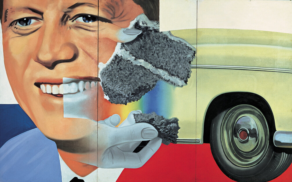
Pop Art is the movement that emerged in the mid to late 1950s, where its artists celebrated mass culture rather than revolting against it. These artists built a bridge between what was considered exclusive, professional art, and kitsch art, a push for a more inclusive system for anyone to participate in. Here, we see a jump from using somewhat identifiable images in portions of the creator’s work to famous icons and brands taking over entire pieces. In James Rosenquist’s work, the 35th president of the United States is depicted in an oil painting. Cinema, advertisement, newspaper, television, and comics were frequently reintegrated into creative projects.

Since media itself was utilized to be fed back into its creation, Pop Art was huge for emerging artists who demonstrated their ability to reinvent common images in refreshing ways, ways that popped. Jean-Michel Basquiat and Andy Warhol were extremely talented creators who played with collaging’s mediums and helped drive the next wave of artists to create more playful masterpieces. They even collaborated before Basquiat’s death, managing to push numerous boundaries in a short period of time and making people question what art is “supposed to look like” and who can make it—questions we continue to ask today.

Today it’s hard to distinguish between collaging that is purely for aesthetic value and art that communicates a message, especially since we have access to an infinite number of mediums and materials to combine together. Collage’s development continues to define political movements, as it is an ever-expanding genre that uses current events to relay an artistic vision. For viewers, this is a unique experience that can’t be found among other one-dimensional creations. This is precisely what fascinates me about collaging, and I hope it inspires you to continue to delve deep into the art you are passionate about. 

Best,

Nicole


Thumbnail image via

 
Source: https://giphy.com/gifs/W6RAaegP4DoaOk4hh8

A Visual History of Tarot Cards

The first time I met a tarot reader was in Providence, Rhode Island. In an incense shop frequented by Brown University students, we had our palms read for 20 dollars by a mysterious woman who spoke to her family in a mixture of Italian, Serbian, and Bulgarian (at least that’s what she claimed). She stumbled upon some really convincing, secretive facts about my friend that left her in absolute shock, so we had our hopes up a little — maybe she was actually a psychic? However, when it was my turn, she persisted that I had an evil twin whom I have mixed feelings toward, so she lost me right from the beginning. Nevertheless, the mysterious woman captured my friend’s curiosity and convinced her get a tarot reading for 40 dollars.

The Past, the Present, and the Future.

Drawing three cards and interpreting them as insight into the past, present, and advice or admonition for the future — this is one of the most popular methods in tarot reading.

Now, I have friends who give occasional readings for both fun and guidance. One time I got the Tower, arguably the worst card in the Major Arcana, then I was coughing and sneezing for the majority of winter quarter. Another friend also encountered misfortune after getting a “bad” card. On the other hand, there are little pieces of advice that become surprisingly fitting or “too precise to be an accident.”

Ultimately, I don’t believe in tarot cards in the context of the occult, but I think they can offer sound advice through an entertaining and interactive process. I believe in tarot cards because I believe in the person giving the reading.

Enough about me. Let’s dive into the visual history of tarot cards.

History

Tarot cards likely originated in northern Italy during the late 14th or early 15th century. The oldest surviving set, known as the Visconti-Sforza deck, was thought to be inspired by the costumed figures who participated in carnival parades. Interestingly, the same carnival is mentioned in Edgar Allen Poe’s infamous short story, “The Cask of Amontillado."

Carnevale di Venezia is known for decorative masks.

Carnevale di Venezia is known for decorative masks.

A carnival float in Azeglio, 1929.

A carnival float in Azeglio, 1929.

These illustrated playing cards with imaginative themes were used for a leisurely card game called tarocchi, which became popular in Europe. Tarocchi became tarot in southern France, which is how it got its name. Although the cards have always carried fanciful, richly connotative imageries — Death, the Hanged Man, the Tower, just to name a few — they did not carry occult meanings until the 18th century.

In a series of French volumes called “The Primeval World, Analyzed and Compared to the Modern World,” published from 1773 onward, Antoine Court de Gébelin proposed the theory that tarot cards came from Egypt and contained the secret wisdom of Thoth, the god of writing, magic, wisdom, and the moon. Around the same time, Jean-Baptiste Alliette, writing under the pseudonym Etteilla, popularized tarot divination and made a living. Eliphas Lévi, author and former Catholic priest, popularized the notion that tarot symbols were somehow connected with the Hebrew alphabet, and thus to the Jewish mystical tradition of kabbalah.

Much of the tarot imageries we see today come from the ignorance of French occultist linking Egypt and the Hebrew language to spiritualism.

In 1909, Arthur Edward Waite, British poet and writer of occult and esoteric matters, hired Pamela Colman Smith to illustrate the widely popular Waite-Smith deck. It is also known as the Rider-Waite deck because it was published by the Rider Company, which is used by many tarot card practitioners until this day. Even for amateurs, it is undoubtedly a classic deck to own.

Aesthetic

In the Rider-Waite deck, catering to a modern taste and giving importance to esoteric practices, the Christian imagery of previous decks was toned down. For instance, the Pope became the Hierophant, and the Papess became the High Priestess. The Minor Arcana was illustrated with allegorical scenes, where earlier decks only had simple designs.

However, general compositions for the Major Arcana remained unchanged. In the case of both the Empress and the Knight of Cups, the imageries are distinct in terms of color scheme and decorative details. It is intriguing to compare these renditions because they have such different artistic styles.

Similarly, the Moon has kept its compositional elements for more than five centuries: a path leading off into the distance, animals on both sides representing two sides of human nature, a crawfish crawling out of the water, and distant towers.

Uncut sheet of playing cards from Milan, 1500.

Uncut sheet of playing cards from Milan, 1500.

Culture

The continuous reproduction and recreations of the Rider-Waite deck is extremely fascinating to me. While most artists follow the composition and major elements, they infuse unique styles into the depiction of these elements, therefore delivering completely different visual experiences for the viewer.

Recreation also occurs in the realm of fashion. Both Christian Dior and Maria Grazia Chiuri, creative director since 2016, are interested in the visual and spiritual qualities of tarot cards. Numerous collections in the past decade have been inspired by tarot cards.

JOJO’s Bizarre Adventure, created by manga artist Hirohiko Araki, bases the main characters of his third series in a mixture of the Major Arcana and Egyptian deities.

Created as playing cards and later imbued with a layer of the occult, tarot cards have become an artistic medium that expands out of its original significance. The prevalence of “pop culture tarot cards” is a proof of its power to infinitely carry ideas and meanings — what is a Jane Austen tarot deck supposed to represent? What about Luke Skywalker as the Fool? Tony Stark as the Chariot?

Modern Witch Tarot deck by Lisa Sterle.

Modern Witch Tarot deck by Lisa Sterle.

Much like the format of a poster, a canvas, or a triptych, tarot cards have become an evolving art form. Personally, I am excited to see what people do with tarot cards in this new decade.


cover image via 

A Visual History of Vampires

Vampires are one of the most popular folklore characters of all time. From beginnings in traditional tales across the globe that told of monsters who sucked blood from humans, they now carry a reputation of untouchable coolness, sensuality, and allure. Though their rise in popularity has been documented, their visual development from grotesque monsters to shimmering young adults is less often discussed. To track this dramatic shift in portrayal, let us start with one of the earliest mentions of vampire-esque beings.

“Empusa.” Image via

“Empusa.” Image via

Greco-Roman Mythology

One of the earliest portrayals of vampires comes from Ancient Greece and Rome. Both cultures described deities and figures with vampiric traits.

One was Empusa, daughter of the Goddess Hecate, who seduced men and then drank their blood while they slept. She was described as being tall and having the legs of an ox or other animals, but she shape-shifted into an attractive young woman in order to seduce her victims.

There were also the striges, described as having the bodies of crows and fed on the flesh and blood of adults and children.

“The Striges”. Image via

“The Striges”. Image via

Medieval Europe

During the 1100’s, English historians Walter Map and William of Newburgh recorded the earliest European accounts of vampire-like creatures, which they called revenants.

Revenants are corpses that become animated and come back to life to haunt the living. These early folklores vampires were depicted as repulsive and corpse-like monsters, and bore little resemblance to the vampires we know and love today.

Revenant. Image via

Revenant. Image via

Peter Blagojevic

Peter Blagojevic

Early Modern Europe

The 18th century saw a mass vampire-hysteria take over Europe after a series of vampire sightings in Eastern Europe, specifically in Tranyslvania. Even government officials were involved in hunting and staking those accused of being vampires.

The first two officially recorded vampire cases occurred in Serbia during thi time, furthering the vampire frenzy. which is now called the “18th-Century Vampire Controversy.” One of these cases involved Petar Blagojevic (pictured above), who was thought to have become a vampire after his death. His case was widely published and was one of the most sensationalized remnants of this vampire hysteria.

Though they were still portrayed as monsters, this age saw the beginning of the transition to the our current-day idea of vampires, as they were depicted with more human-like qualities.

Carmilla. Image via

Carmilla. Image via

The 1800’s

This period saw an explosion of vampires in popular culture, with some of the most famous works of vampire literature published during these years. These works included The Vampyre by Polidori, Carmilla by Sheridan le Feu and perhaps the most famous work of vampire fiction of all time, Bram Stoker’s Dracula.

This new image of the vampire—refined, of high status, alluring, sensual— was partly the work of the period’s Gothic authors, who found the vampire to be an effective and now well-received character.

Pictured is Actor Sir Henry Irving, a friend of Bram Stoker and one of his inspirations for the character of Dracula.

Pictured is Actor Sir Henry Irving, a friend of Bram Stoker and one of his inspirations for the character of Dracula.

These works began to establish the modern image of the vampire. Dracula was described as being exceedingly pale and thin, dressed in all black, and having sharp teeth and ears. Carmilla was described as being unearthly beautiful and seductive, and having the ability to shapeshifter similarly to Dracula.

The 1900’s

Over the course of the 20th century, vampires remained a central focus of literature, as well as cinema. The first half of the 20th century saw a rise of vampires in science fiction, while the second half saw a shift in vampires being portrayed as more heroic, tragic, and romantic protagonists.

Early notable examples of vampire-centric media include the 1922 film Nosferatu and the 1960 Italian Gothic film Black Sunday.

In the late 1900’s, two films came out that left a significant impact on the present-day image of vampires: Bram Stoker’s Dracula and Interview With the Vampire.

A shot from the 1994 film, Interview With the Vampire.Image via

A shot from the 1994 film, Interview With the Vampire. Image via

The 21st Century

The most recent depiction of vampires have retained many of the characteristics of those from the late 1900’s; they are mysterious, alluring, seductive, pale, and refined.

Over the past few years, vampires have been favored in media for young adults, which has affected their visual portrayal. Vampires in hit series such as The Twilight Saga and The Vampire Diaries have a distinctly youthful feel compared to those of the 20th century. Along with their refinement is a dominating sense of angst and rebelliousness, which has made these characters even more beloved than ever before.

Whether you’re more of a fan of Dracula or Edward, there’s no denying that vampires are here to stay. What will come next in their aesthetic development? Only time will tell.


The Meaning Behind The Met

It’s the first Monday of May. Your feed is flooded with celebrity candids, bathroom “Get Ready With Me”s, and all things fashion (at least, this was the case pre-pandemic). As tempting as it is to dive into the virtual world of the Met Gala, have you ever taken a second to look up from your phone and ask yourself the big questions? What about this event drives people from all around the world into a fashion frenzy? What is it all for? Why does it matter?

In order to fully appreciate the magic behind The Met Gala, we’ll need to look back to how it all started.

Diana Vreeland. Image via

Diana Vreeland. Image via

Eleanor Lambert. Image via

Eleanor Lambert. Image via

It’s hard to believe that fashion even existed before the iconic Anna Wintour took on Editor-in-Chief of American Vogue in 1988. Many of us automatically associate the Met Gala with Anna because of the countless number of connections she has been able to maintain with revolutionary photographers, designers, and models around the world. But before Anna stepped into the limelight, proving that she was so much more than her pageboy haircut, an American fashion publicist, Eleanor Lambert, was hard at work. By the end of her career, Eleanor had successfully directed the world’s attention to the American fashion industry. Eleanor was the mother of the Met Gala and many other prestigious New York fashion events including the International Best Dressed List, New York Fashion Week (that’s right, the whole week), and the Council of Fashion Designers of America Awards, better known as the C.F.D.A. Awards. 

The first Met Gala, formally called the Costume Institute Gala, was held in 1948. What started as a simple fundraiser for the Costume Institute, marking the birth of its annual exhibit evolved into the astounding Gala that all know and love. With the help of Diana Vreeland, another pioneer in the world of fashion who, after writing for Harper’s Bazaar, claimed the throne and became Editor-in-Chief for Vogue in 1963 and consultant to the Costume Institute in 1972, the Gala started to introduce themes, invite the most prominent celebrities, and actually take place on Fifth Avenue. It’s one of those events that doesn’t need to be advertised. With faces from the fashion, film, and music industry showing up every year on the Met steps, there is little to no concern that the Gala will fail to attract the attention it’s looking for. 

Anna Wintour in Karl Lagerfeld at the 2019 Met Gala. Image via

Anna Wintour in Karl Lagerfeld at the 2019 Met Gala. Image via

Nevertheless, there is so much more to the event than spectators’ built up anticipation for the release of the guest list and the slow unveiling of designs. It’s important to remember that behind all of the glitz and the glamour, the Met Gala will always be devoted to supporting creativity. Afterall, the Costume Institute continues to be one of the Met’s only curatorial departments that has to find funding for itself. The history of fashion has not been supported in the same way fine arts have. So often it is labeled as superficial, ingenuine, and an overall bad example for younger generations to aspire to be a part of. Sure, at its worst, the fashion industry may have its faults. But at its best, it not only offers creative minds a new medium for their work, but also has the capability of honoring cultures and inspiring political conversations. The Met Gala, unlike any other carpet event, is a celebration of the arts that cannot be replaced.

Made evident from the Gala’s long history, this may be one of the few fashion events that hasn’t been birthed from Anna Wintour’s brilliance. Although she has indeed contributed to its increasing exclusiveness, carefully crafting a list of invitees only accessible by her loyal Vogue staffers, perhaps the most important role she has taken on is caretaker of the legacy both Eleanor and Diana have left for her. In other words, what lies behind the magic of the Met are three extremely powerful women, who have influenced major changes in the industry. It is because of each of their grit, determination, and an undying appreciation for all things fashion that the Met Gala continues to “wow” us commoners and even its guests.

Kendall Jenner in Versace at the 2019 Met Gala. Image via

Kendall Jenner in Versace at the 2019 Met Gala. Image via

While the art of celebrity table-seating at the Met remains a mystery to us all, the recent growth in social media, specifically Instagram, usage over the past decade has allowed for the designers, models, politicians, Oscar winners, Grammy winners, and sometimes EGOT winners to give fans behind-the-scenes looks at all of the time, people, and effort that goes into preparing for what Vogue Contributing Editor André Leon Talley has labeled the “Super Bowl of fashion.” And although Anna doesn’t seem to want to budge on her strict ban on social media usage at the event, a select few, including the “self-made” model Kendall Jenner, have managed to snap some candids to later share with their 127 million or so followers.

Now that we’ve gone through all things Met, it’s time for my favorite part: the outfits. That is what we’re all here for, isn’t it? In honor of the event being postponed for the sake of safe social distancing, I thought I’d go through some of my favorite recent Met Gala looks from the past two years. So grab a glass of water, or Perrier if you’re feeling fancy and join me on a walk down memory lane.

Besides the fact that I’ve included a picture of both Anna and Kendall from last year’s Camp: Notes on Fashion theme, I personally wasn’t much of a fan. Don’t get me wrong, I was impressed by the craftsmanship and creativity that went into the designs for a very complicated theme (almost every article that I read from the 2019 Gala was a new attempt at explaining “camp”), but it’s always difficult for me to welcome color with open arms. I’m a minimalist, so I prefer when it’s used sparingly. For the sake of this experience, though, I guess I’ll award “best-dressed” to Lady Gaga’s four-part piece by Brandon Maxwell, a close friend of Gaga, co-host of the 2019 Gala. Contrary to popular opinion, what attracts me most about this piece is not the hot pink fabric or even the performance that took place on the carpet, but Gaga’s dedication to her work. The dedication that led her to be so adamant about holding rehearsal’s for the big day. But I mean come on, it’s Gaga, you should expect nothing less.

Spotted on the steps of the Met: B stunning everyone in Versace at the 2018 Gala. Image via

Spotted on the steps of the Met: B stunning everyone in Versace at the 2018 Gala. Image via

Take it back to 2018 when we were blessed with Heavenly Bodies: Fashion and the Catholic Imagination. Apparently, for most designers, the theme called for headpieces. SZA, Solange, Madonna, Winnie Harlow, Priyanka Chopra, and Rosie Huntington-Whitely, were among many who graced us with a variety of crowns, veils, and levitating halos. To my surprise, of the hundreds of pieces that made an appearance that year, there were very few I didn’t like. The theme, an ode to the relationship between fashion and the Church, brought a comforting sense of familiarity that is so often lost in an event as spectacular as the Met Gala. Perhaps it is because there was more consistency among the style of designs that year. Somehow, the gorgeously loud Gucci ensembles worn by Lana Del Ray and Jared Leto did not clash with the collage of Saints that decorated Stella Maxwell’s Moschino gown. Although it was difficult to pick a favorite for 2018, for the complete opposite reason as 2019, I was content with Blake Lively, an angel if I’ve ever seen one, claiming the top spot.

Blake’s clutch. Image via

Blake’s clutch. Image via

The other side of Blake’s clutch. Image via

The other side of Blake’s clutch. Image via

It is no surprise that Blake, a regular attendee, was the center of attention when she showed up at the museum. From her wispy curled hair and halo bun, engineered by hair-stylist Rod Ortega, to her gown’s jewel-encrusted bodice and sheer leg cut outs, there were no imperfections in Blake's Met Gala look. Even with her perfectly put-together ensemble in mind, none of the previously mentioned elements are the reason for her well-deserved win (awarded by me of course). In fact, it is because of one simple accessory, which only made it into a few of the photographs taken of her that night, that her look stood out from the rest. With the help of Judith Leiber, a Hungarian-American designer who got her claim to fame from unique Swarovski crystal encrusted purses, Blake was able to attend the Met with her whole world in her hands. One side of her custom clutch features her family’s name: Reynolds, and the first initial of her own name, her husband Ryan’s and her daughters’, James and Ines. The clutch followed the theme closely and added the perfect detail to Blake’s already extravagant look.

This last one is for the boys, or shall I say, men. 

It’s common knowledge that men are less likely to impress us with their fashion at big-shot award shows, movie premieres, or Met Galas. It could just be me, maybe I don’t have a palette mature enough for that level of craftsmanship, but I highly doubt it. Regardless of my own opinion, I think everyone can agree that the men of the 2017 Met Gala did not come to play. For some unknown reason, the theme Rei Kawakubo/Comme des Garçons: Art of the In-Between really spoke to the designers styling the men in attendance. One highlight of the night was none other than Migos. The family trio—Quavo, Offset, and Takeoff—made their Met Gala debut dressed in Versace. Their sleek black suits embodied was the perfect example of simple, yet sophisticated. Iced out in matching “Culture” necklaces, the name of the rappers’ second hit album, Migos has never looked better. Jaden Smith was decked out in head to toe Louis Vuitton, impressing us all when he conquered the steps in shiny heeled boots. As if that wasn’t enough, he decided the perfect arm candy would be his own dreadlocks. He was right. Although these looks may not top Zayn’s metal arm from the 2016 Met Gala Manus x Machina: Fashion in an Age of Technology, they come in a close second. 

The Metropolitan Museum of Art. Image via

The Metropolitan Museum of Art. Image via

I hope this brief exploration of the history of the Met Gala has helped make the indefinite postponement of this year’s event a little less unbearable. If you’re feeling down, there are 21 years of past Galas to browse through. Have some fun looking for the big mistakes and the hidden gems. Here’s to many more years of celebrating fashion and the arts.


Featured image via. First gallery images via. Second gallery images via here, here, and here.