Punchline

Alexis Kaye, DC Comics’ new supervillain called Punchline, is the latest fashion icon for the current generation of comic book readers. After being conceptualized by writer James Tynion IV and artist Jorge Jiménez, she has become much more than the Joker’s new female companion. Her design is so gothic and fantastic, yet so contemporary and in vogue that it presents the perfect paragon of style as a storytelling device. Her striking new visual persona has transported Punchline from novelty to notoriety for the right reasons, preluding her backstory’s attractive quality, which has only been recently fully exposed. In other words, her fashion choices and overall image are so appealing that they have helped propel the further development of Punchline's character, even before her story was first told.

From her comic book origin, Kaye was once a normal high school senior who, in a field trip to a Gotham news channel, encountered the Joker hijacking the channel’s transmission, killing her teacher, and asking her to read one of his “manifestos” for the whole of Gotham to hear. From that traumatic experience, Kaye became obsessed with understanding the motivation behind many of the villain’s actions, producing a podcast that explored many of his past crimes. With time, she became enamored with Joker’s ideals—his provocations, motives, jokes—seeing them as expositions of truths about false justices promoted by masked heroes and those in power. Alexis tried to find the meaning behind Joker choosing her to read his message but ended up realizing that she was nobody to him; just another of his victims. However, she also understood that all his jokes were only setups to a grander vision, and therefore, she could become somebody to help him accomplish that vision: his Punchline. Her motivation ends up being to completely comprehend Joker’s master plan for Gotham and the world, and carry that plan into the future one way or another. 

Canonically, Punchline’s costume was a way for her to differentiate herself as a villain in Gotham and define herself as a clown-adjacent criminal to attract Joker’s attention. But as designed by her creators, she was always supposed to be inspired by Harley Quinn, Joker’s previous love interest and henchwoman, and simultaneously be her antithesis. Harley’s original costume, the red and black Harlequin one-piece garment, was vivid, full of big pieces, details, and weird shapes, and contrasted highly with her white skin to form a trio of colors, highlighting her impetuous personality as the second-fiddle for the clown. On the contrary, Punchline’s look is much more threatening than Harley’s.

Image (Via)

Image (Via)

Image (Via)

Image (Via)

From her make-up and hair to her garments, Kaye appears much more nimble, logical, and down-to-business than Harley Quinn. Jorge Jimenez, the artist that first visually conceived her, explained that “I added freckles that give personality to her face, and I have noticed that it is fashionable in makeup to place a point just below the eye, and I thought it would be super cool to add this to her cold and tenebrous look.” Her facial design, combined with her ear piercings, red cheek circles, and red nose, differentiates her drastically from Harley’s white face, which is adorned with a black eye mask and a joker hat, because it is more detailed and thus more expressive than Quinn’s. While Harley has always expressed herself through her costume, voice, and body movements, Punchline seems to have a design that highlights her emotions through her countenance. Interestingly, the red cheeks and nose are the only aspects of her costume that make her resemble a clown, two subtitles details, while Harley Quinn’s entire original outfit screams clownish, informing both of their personalities. 

Moreover, Punchline’s entire clothing appears silent, with only some details glowing in neon. Her main piece is a tight-fit leather-like short black sleeveless shift dress with neon red pockets and a neon blue belt, and blue X markings. Her boots are black, adorned with neon blue laces that go up to her knee, and a neon green circle and an X in the boot’s upper part. She also has black gloves marked by the same green patterns as her shoes and a short cape that attaches to her shoulders. Finally, her whole body is wrapped in a purple bodystocking, ripped in many places and highly detailed with arm and chest patterns. The color combo that defines her is black and purple (also found in her hair), but she has blue tones all over (including a bang streak), with reds and greens working as minor side tints. Unlike Harley, who has always been designed in comics with only three of four colors equally surrounding her in a splash of hues, matching her bubbly personality, Punchline is illustrated with two dark overarching colors slightly delineated by neon tinctures, a more quiet and sleek look, showing her more reserved personality, one that may have many tricks under her sleeves to surprise her enemies. For one thing, her knife is small and has a black handle that camouflages with her body, giving Kaye the air of an assassin.

So, as both Jiménez and Tynion intended, Punchline is a complete anti-Harley Quinn, dressing up as a more serious killer and Joker henchwoman, a silent striker interested in Joker’s ideology to fix the broken system, contrasting with Quinn’s all over the place look and demeanor, and her love (currently turned into hate) for the clown prince of crime’s heart. However, even before her overall character was first fully presented in Batman Vol 3 #92, comic book readers and fans were already making Punchline cosplays, a telltale sign that her costume design resonated with so many fans after being officially unveiled by DC and Jiménez. That speaks to the idea that comic books are both a visual medium as well as a literary one, meaning that the appearance of a character's costume and the novelty of their design propels a general enthusiasm from a dedicated fanbase to consume the comic book like never before. The aesthetic power of a superhero/supervillain costume is what many times unites a fan base because, at the end of the day, the comic book looks stunning with it, and fans can dress up like the hero/villain and feel amazing about it later.

Image (Via)

Image (Via)

From the author’s perspective, James Tynion IV acknowledges how Punchline’s design, even before DC first released it and everyone saw it, was what brought life to the character in the first place. He wouldn’t have written her origin and given her a story if her costume was not unique. He once had a backbone for the character in his mind, but it would have been just another henchmen without the design. And then, after Punchline’s public release, he felt that the audience had an overwhelmingly positive response to it because “there is a huge excitement for new characters right now (...) seeing the response to her and that design was just like, oh wow, like people are really hungry for their own [singular] characters (...), and Punchline just connected really quickly.” In other words, readers are keen on getting to know new characters right from the beginning, and Kaye’s appearance sold everyone about her potential for being an engrossing persona people would be interested in keeping up with. 

All things considered, Punchline is the most recent supervillain to leave a mark in the comic book audience in so little time. Her costume design by Jorge Jiménez is not only beautiful, sexy, and dangerous. It is a style powerhouse that has inspired readers to dress like Alexis Kaye and be genuinely interested in her story and personality, beyond being Joker’s new “girlfriend” and the mirror version of Harley Quinn. For my part, I see Punchline as a fashion icon with the potential to move beyond the comic book world to influence the stylist expression of many people today. And this article was a way to inform those that do not follow comics about this new phenomenon that took DC by storm called Punchline.

If you want to learn more about Kaye, read Year of the Villain: Hell Arisen #3, Batman Vol 3 #89-#100, The Joker 80th Anniversary 100-Page Super Spectacular #1, Batman: Secret Files #3, and Punchline #1.
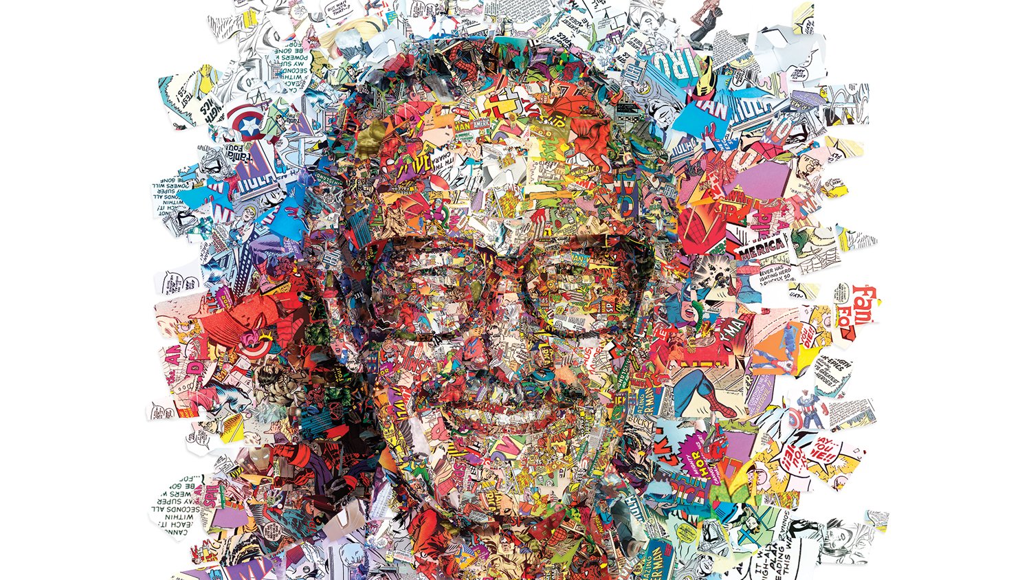

Cover Image Via

How Batman: Three Jokers is a Masterclass on Comic Book Art

Comic books are unsung heroes of the visual arts. They fall into a weird place between a literary form and a continuous painting. Artists can draw actions, motion, facial expressions, beautiful and powerful poses, big or small scale sceneries, but each scene is never conventional. There are so many different framing possibilities inside a page and so many ways to represent ideas visually, that reading a comic book becomes a visual experience in the same manner that it is a reading one. And if someone wants to experience a comic book despite its story and they end up liking the style created by the artist (or penciler and inker), colorist, and letterer, it is hardly difficult to be tired of the variety of beauty or aesthetic power each page of an entire issue displays.

Graphic novels are another ordeal. Instead of being segmented into around mostly 20 to 35 pages, following an arch that spreads around a couple of issues, they are self-contained bigger stories. They follow and end one plot-line, pretty much like a novel, but much more driven by an image’s illustrative potential. And they are not only superhero driven. Comic books, in general, are not only compelled by superheroes, with indie studios (not Marvel or DC, known as the big 2) creating short-form content for every genre of literature. So, graphic novels not only can be of any genre but more often than not, they are formats used to visually adapt several books like The Handmaid’s Tale and Percy Jackon and the Olympians: The Lightning Thief.

Separately, Batman: Three Jokers constitute three comic book issues of 48-pages of story each, but the series was released by DC Comics’ Black Label imprint grouped into a graphic novel format on November 17th, 2020. Black Label is a platform for writers and artists to explore more serious and darker stories with DC characters, mostly out of continuity. Its publishing method consists of releasing separate issues of the titles they run (many are only three issues) and then joining them into a trade paperback or hard-cover art spectacle, sometimes featuring variant covers, character sketches, and writer and artist commentary, at the end of the stories launch cycle. Stories coming out of Black Label are experimental and unconventional, highlighting the talents of their creators. Harleen is drawn like a cover as every image is highly detailed, provoking, and attractive, and Wonder Woman: Dead Earth puts Diana in a world ravaged by nuclear war; while, amid all titles, Batman: Three Jokers shines through as a masterclass in storytelling.

Firstly, the series’ main covers and variant covers are aesthetically enthralling and also informative of the main characters’ psychological traits, no words required. Drawn by Jason Fabok and colored by Brad Anderson, their horrifying allure speaks to an almost instinctive comprehension of beauty. 

One example is issue #2’s variant cover. With Batgirl’s image, her eyes are analytical bullets that hide a trace of anger inside. They do not lose sight of their target, forming a slight frown in the upper part of her mask. Her cowl parts her hair in two directions: one positioned in front of her uniform, while the other is combed back, leaving an area open for the title and for the interception between the two cloths, which react to light differently, that make the end piece of her cowl. Two lights shine from opposite directions. One is purple and reflects brightly on her black headpiece and her wavy hair while it overshadows part of her neck. The other is white and has a dimmer effect on the grey-black uniform, detailing her cowl more than making it shine. Blood spatter lines her face and mask, and through its subtleness, gives the whole image an ominous nature. Overall, Batgirl’s variant cover has an effect of both intimidating and impressing audiences, a killer juxtaposition that begs the reader to stop and have a look.

Image (Via)

Image (Via)

Image (Via)

Image (Via)

The other example is issue #1’s regular cover, which has the same effect as Batgirl’s but for different reasons. With Joker’s image, his crowbar is an extra point of reference besides his bust. He locates it close to his face, almost entirely in the frame, drenched in scarlet-colored blood. His face and clothing are also stained with blots of blood with different opacities. By itself, the bloody crowbar is frightening and graphic, but Joker’s facial expression augments the fear that comes with the object. His eyes, under the illusion that they are rolled upwards by his frown, are menacing. They express his lust for inflicting pain, his amusement at the suffering of others. Joker wants to beat more people with his crowbar, and the readers could become his next victims. His smile, moreover, has always been paradoxical, creating a feeling of direct danger rather than relief. His whole mouth is pushed back, showing Joker’s full line of teeth, as if he could also bite the readers. His facial muscles are stretched to the extreme. His forehead wrinkles, his procerus, his eyebrows, his crow’s feet, his cheek, his lips are all unnaturally bent, creating the impression of a relished pain. Joker’s whole face is monstrous, pushed to the limit. And the opposing lights play a game with the villain’s form, as the purple creates more shadows and makes his coat look plastic, while the white makes his face pale, almost shining silver, and his jacket look plain. The image conveys so much of Joker’s character and history while enticing the audience by calling them into a very conscious, simultaneously enthralling death trap.

Although covers are naturally made to intrigue the audiences to buy a book, Batman: Three Jokers’ covers are exceptional on their own as they convey the comic book character’s nature and incite several emotional responses through the depiction of almost realistic yet illustrative facial expressions and attire. Fabok and Anderson go above and beyond to create the most faithful and evocative visualizations of DC’s characters, and their hard work is perceivable in each pencil trace. Fortunately, the art inside the book is not far from looking almost exactly like the covers. 

One aspect that sets Batman: Three Jokers apart from most comics is how Geoff Johns, the writer, and Jason Fabok evoke a lot of what Alan Moore and Dave Gibbons did with Watchmen. Comics and graphic novels have always diversified the way action is framed inside a page. One drawing of characters standing amidst a background can often fill a page, and in the lower-left corner, a small squared panel can display a head and shoulders shot with those characters talking. Other times, instead of being only a square, a whole rectangular frame superimposes the entire lower part of the page depicting action occurring simultaneously as the full-page image but in another space. And on other occasions, actions can be divided into separate panels in grid configurations of three horizontal rectangles, three squares in the top and one whole image at the bottom, or a vertical shot on the left with six other squares filling the right side, between countless options. This grid-like organization is the style both Watchmen and Batman: Three Jokers employ to tell their stories.

The 1987 graphic novel, originally a 12-issue comic book series, is famous because of how Moore masterfully deconstructed the superhero genre of the 1980s and brought these larger-than-life characters to a possible real world filled with dubious moralities and injustice in the midst of a cold war, with the doomsday clock close to midnight. The writer plays with the superhero status quo and forces readers to reexamine why they are so drawn to the fantasy behind the super. But Gibbon’s attention to detail in his art and his gritty and vivid aesthetic appeal complements the story in the best of ways.

Image (Via)

Image (Via)

Image (Via)

Image (Via)

One strategy employed by Watchmen’s creative team to depict the progression of action was to play with the 9-grid panel page framing. It frames motion by compartmentalizing shots into rectangles of the same size, sometimes cutting actions into split-second images, other times representing a segmented bigger picture. That serves to either make the story more haptic and give it an almost consistent rhythm during faster-paced scenes or slow it down to focus on the details that each separate frame contributes to the whole picture. The grid-style doesn’t need to be always 3x3, with alternatives including 3-1-3, 2-3-2, 2-2-2, and many others based on the creative team’s preferences. Nonetheless, there is no scene in the book that is not in the grid style. And Batman: Three Jokers follow the same framing style throughout the three issues, using it to shape the background and continuity of scenes and highlight character emotions. Combined with Fabok’s expressive inks and pencils and Anderson’s vivid and dull colors, which uncannily and impressively resemble the covers, more than ever, each panel invites the readers to pay attention to and consider the impact of highly intricate visual language over verbal language in the overall enjoyment of comic book art. Hardly any comic book since has been able to replicate Watchmen’s efficacy applying the 9-grid panel framing.

Finally, another aspect that sets Batman: Three Jokers apart from other comic books and graphic novels, including Watchmen, is how it cinematically contemplates the world it depicts. Many of its pages have no dialogue in them, and in those that feature it, the speech bubbles hardly ever profoundly invade the images. Motion is mostly driven by colors and figures in this series, which, based on Fabok’s hauntingly beautiful work, produces the perfect visual medium for contemplative art. Several single panels on issue #2 depict Red Hood going through objects that helped Batgirl heal from the trauma inflicted by the Joker, which evoke memories without even needing to show flashbacks. The first three panels on issue #1 repeat the same picture but at different close-up lengths to focus on a specific letter, the W from Wayne, which then transitions into another scene. Before the epilogue on issue #3, the last three panels do precisely the same thing with the J from Joe Chill to represent how endings and beginnings are mirrors of each other. A whole page on issue #2 even features four different shots of one of the main characters’ corpses seen through the eyes of a fly (reproduced in hexagonal shapes), and then three more panels of different insects interacting with the dead head as the close-ups move from one eye to the whole face. That gives the page a gorgeous yet putrid image that sums up the reader’s feelings toward the dead character.

Image (Via)

Image (Via)

In sum, Batman: Three Jokers is a masterclass on comic book art because of how well crafted, beautiful, and aesthetically provoking all its illustrations are, both on the poster-worth covers and inside the book, and how Johns, Fabok, and Anderson innovate Watchmen’s groundbreaking 9-grid panel style into making the series both a contemplative art piece and a quasi-cinematic experience. The illustrations are so compelling that DC Comics even sold a limited-time clothing line featuring one of the comic book covers for their FanDome event, and if you want to get a t-shirt or sweatshirt now, you can find them only at European Amazon websites from the UK and Italy. And if you wish to read the three issues, you can find them digitally at Comixology and other retailers and at your local comic book shop.


Cover Image Via

Remembering Stan Lee's Humanity and Heroism

Image via

Image via

The death of legendary comics creator Stan Lee last Monday stung the hearts of millions of admirers around the world. Lee contributed to the creation of classic superheroes with collaborators Jack Kirby and Steve Ditko including Spider-Man, The Fantastic Four, Black Panther (notably the first black superhero in American comics), and The Avengers.

Born Stanley Lieber to Romanian Jewish immigrants, he was instrumental in creating and normalizing a diversity of personalities and complex identities for superheroes. Ushering the medium out of its days of one-dimensional bombshells and boy scouts, he unmasked superheroes as scientists, lawyers and teachers just like us. The Fantastic Four were initially designed to fight evil in pedestrian clothes but readers demanded dynamic costumes. His supers had to wrestle with the moral implications of their actions and were always saddled with flaws such as anger issues, family problems, low self esteem or drug abuse.

“Just because you have superpowers, that doesn’t mean your life would be perfect. I just tried to write characters who are human beings who also have superpowers.”

Captain America’s debut cover featured him punching Hitler in the face. Image via

Captain America’s debut cover featured him punching Hitler in the face. Image via

Lee didn’t just want to entertain the masses–he also sought to instill love and empathy in pop culture. Daredevil was blind, Spider-Man was a geek, and Black Panther was (while the king of an uncolonized, prosperous African nation) a black man in America.

The most political examples of his mission lie in the pages describing the escapades of the X-Men starting in 1963. Using the mutant/human conflict to illustrate nuanced perspectives on the civil rights movement of the 60s, Lee fearlessly pioneered the concept of comic books tackling social issues. His characters set the stage for allegories on the nature of prejudice, oppression, genocide, black nationalism, apartheid and integration–all playing out across the mainstream superhero comic book universe.

A panel from the classic X-Men story God Loves, Man Kills by Chris Claremont and Brian Anderson. Image via

A panel from the classic X-Men story God Loves, Man Kills by Chris Claremont and Brian Anderson. Image via

One of Lee’s most iconic co-creations and Marvel’s flagship character is a teenager from Queens who found courage and purpose by protecting his community as their “friendly neighborhood Spider-Man.” Lee created a world where readers could see themselves as superheroes; their flaws were shared with their hero, and a bit of heroism was inspired in turn.

Image via

Image via

“You know, my motto is 'Excelsior.' That's an old word that means 'upward and onward to greater glory.' It's on the seal of the state of New York. Keep moving forward, and if it's time to go, it's time. Nothing lasts forever.”


Feature image via