Though it was only released in December, Kat Von D’s Alchemist Palette has already become a cult favourite among makeup junkies. It’s sold out in pretty much every Sephora store, and usually online too. By some small miracle, I managed to get one. And let me tell you, from them needing to re-stock their Kat Von D inventory, to UPS having delivery issues, God sure tested me the whole time. In my opinion though, it was 100% worth the pain.
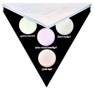
The whole concept of the palette is based around medieval alchemy – the science of creating precious materials out of the mundane – and it’s been Kat Von D’s passion project for the last seven years. (Which, by the way, completely blows my mind. Seven years ago I was an angsty thirteen year old who liked eyeliner way too much and thought that knowing Nirvana basically made me queen of the alt scene. But I digress.) In it are four shimmery, holographic pressed powders that can be used as highlighters, eyeshadows, and even layered on matte lipsticks: {green}emerald, {blue}saphyre, {ultra-violet}amethyst, and {pink}opal. Inspired by the palette’s versatility, I did my own swatch of the colours, comparing them on my skin alone, and layered over white and black eyeliner:
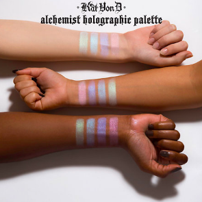
I had only ever worn the shades on their own before, so I was really excited to see how they looked layered. The white eyeliner was more underwhelming than I had expected it to be, but I really loved how the black intensified the colour and really brought them to life. Taking all three combination swatches into account, I’ve ranked the palette accordingly:
4. {green}emerald

image via
Though I really love the colour of the emerald on black, I’m not super enthusiastic putting it on my face. I also thought it was interesting to see how the white eyeliner brought out much bluer tones in the powder than the other two swatches. Overall, the idea of green makeup reminds me too much of the 80s. However, it could work well to colour-correct red areas that you might also want to highlight.
3. {blue}saphyre

image via
It really pained me to rank saphyre next to emerald. I love this colour and how well it blends with amethyst. However, it also shares the “too 80s” problem. If used on a large area (think cheekbones or brow bones) it treads the line of looking gaudy. Saphyre is definitely best used on small areas like the inner corners of your eyes or your philtrum (the ridge between your nose and mouth). It also works really well with the white eyeliner to create an in-style frosty 90s eyeshadow.
2. {pink}opal

image via
Out of the three swatches, I definitely prefer opal on its own. My indifference, and almost dislike, towards its layered swatches almost bumped it to #3. However, at the end of the day its solo appearance is enough to help it maintain its position. I love opal because it’s so delicate and in turn versatile. I have a very fair skin tone, so the pink hues look natural against my skin. Personally, I tend to use it to highlight my brow bones. I tend to stick to warmer colours when I use eyeshadow, and when I don’t I find that its ability to match my skin tone makes it a no-brainer for when I want to highlight without putting on a full face of makeup.
1. {ultra-violet}amethyst

image via
Honestly, this shade is the reason I bought the palette, so we’re treading in very biased territory right now. While opal is versatile in how natural it is, amethyst is versatile in how unnatural it is. On its own, I love to use it to highlight my cheekbones as it defines them really well (contrasting with the warmer tones of my skin) and also fosters the very on-trend otherworldly mermaid/alien look. I also love it over the black eyeliner, and can totally see myself using it to create the impression of a sparkly cobalt winged look. I find that even though amethyst is blue, its cooler tones bring it away from seeming kitschy or outdated. I’ve also seen it used beautifully on very dark skin tones which shows it’s not only versatile on me, but on a whole range of people. Taking all this into consideration, amethyst is undoubtedly my #1 shade out of the palette.
While this is the definitive ranking for me, the shades you like will probably vary according to personal taste and how the colours match or contrast with your skin tone. At the end of the day, makeup is what you make of it. We would never have all the styles and techniques we do today if we only listened to what other people say is the best. So take this ranking with a grain of salt and use the Alchemist palette the way that makes you most happy. Because at the end of the day, your makeup is not about others, but yourself.
Feature gif via
You can find the Alchemist palette at Sephora, or directly off Kat Von D's Website.