Poetrybounding: How Should You Dress Based on Amy Lowell’s Bath Poem?

Here we go again, everyone. This is a new installment of my series called Style-based Poetry: Poetrybounding. If you are new to this series, fret not. In poetrybounding, I try pushing the boundaries of written poetry as a medium of emotional expression into the visual reality fashion presents. There are so many similarities between the aspects of poetry that display the personal language of a writer and the potential of fashion as a visual medium that conveys a person’s image based on who they are and who they want the world to see, that I was able to make a whole series about it, one that could even reach its fifth entry. I tend to pick poems with a lot of imagery because a visual backbone translates nicely into various looks and garments that receive extra meaning from the source material, and this post’s featured piece is no exception.

In this post, I will be looking at Bath by Amy Lowell and how she recreates a relaxing scene invoking the colors and light dynamics of water reflecting the morning sunlight in a bathtub and the fragrances of a summer’s day. This poem does not feature many different metaphorical devices to present transitions between visual scenes, so it does not provide a multifaceted composite album that can be segmented and assigned to various garments. Instead, what Lowell does with Bath is choosing one single space and transitioning between variations of the images presented through her different actions engaging with light, water, and the bathtub. This approach to poetry by action and perception grants me a new challenge to the overall look creation, but one that leaves my “design work” less constrained to the formula I have been using so I can focus on an idea more than all the minute details that make them, and opens more possibilities for those who want to perform poetrybounding themselves.

Here is Bath

The day is fresh-washed and fair, and there is a smell of tulips and narcissus in the air.

The sunshine pours in at the bath-room window and bores through the water in the bath-tub in lathes and planes of greenish-white. It cleaves the water into flaws like a jewel, and cracks it to bright light.

Little spots of sunshine lie on the surface of the water and dance, dance, and their reflections wobble deliciously over the ceiling; a stir of my finger sets them whirring, reeling. I move a foot and the planes of light in the water jar. I lie back and laugh, and let the green-white water, the sun-flawed beryl water, flow over me. The day is almost too bright to bear, the green water covers me from the too bright day. I will lie here awhile and play with the water and the sunspots. The sky is blue and high. A crow flaps by the window, and there is a whiff of tulips and narcissus in the air.
— https://www.poetryfoundation.org/poems/42993/bath-56d221a8c0d0c Source

The poem starts with a gentle rhyming sentence, setting up the atmosphere of the whole bathroom scene through water-related words like “fresh-washed” and the scent of tulips and narcissus, a smell that is later brought back at the end, cyclically encompassing the poem as to infuse its essence in the sensory experience the piece provides. The second paragraph/verse of Bath depicts an almost purely visual scene where the sunlight coming from the bathroom window shines into the filled bathtub, but the way Lowell describes it grants power to the sunlight and the quality of jewelry to the water, encasing the whole scene in diamond or nacre. Words like “pouring,” “bore,” “cleave,” and “lathes” create vivid imagery that pictures the refraction of sunlight dominating the bathroom atmosphere and being concentrated into light beams that perforate the water surface, coloring the spotlight it forms greenish-white, while words like “jewel” and “bright light” serve to qualify the subject of the severing as gems that upon being subjected to light, break into a myriad of shiny reflective pieces. Because of the aquatic motif, I tend to imagine the reflectiveness of pearls more than diamonds.

The third paragraph/verse is more comprehensive, so there is more to uncover. Lowell commences it with a glaring contrast to the previous paragraph/verse. The sunshine is not a powerful force now, but tiny dancing flickers in the water, ephemeral and delicate. I would see this representation of light due to the scattering of sunshine in the gem-like water surface. The sunlight is also reflected in the ceiling, described in an unmighty manner, with the funny wobbles of waves and the playfulness of the lyrical persona interacting with the water. After she starts interacting with it, the poem describes the color of the water in jewelry terms, beryl being the chosen gem. Emeralds and Aquamarines are beryls, so the idea that water acts like a gem, being both precious and shiny, is further exemplified. And then, the lyrical persona mentions that the water becomes a blanket, covering her from the brightness, or the vehemence and vigor of the day, creating this relaxing and fun environment she can stay hours in. Finally, the poem ends with remarks regarding menial things about the day, like how the sky is blue (always a sign of peace and calm) and how a crow flies close to the lyrical persona’s bathroom window, something that grounds the reader in a shared state with her while she is laying in the bathtub, before going back to the scent that closes the cyclical pleasing atmosphere.
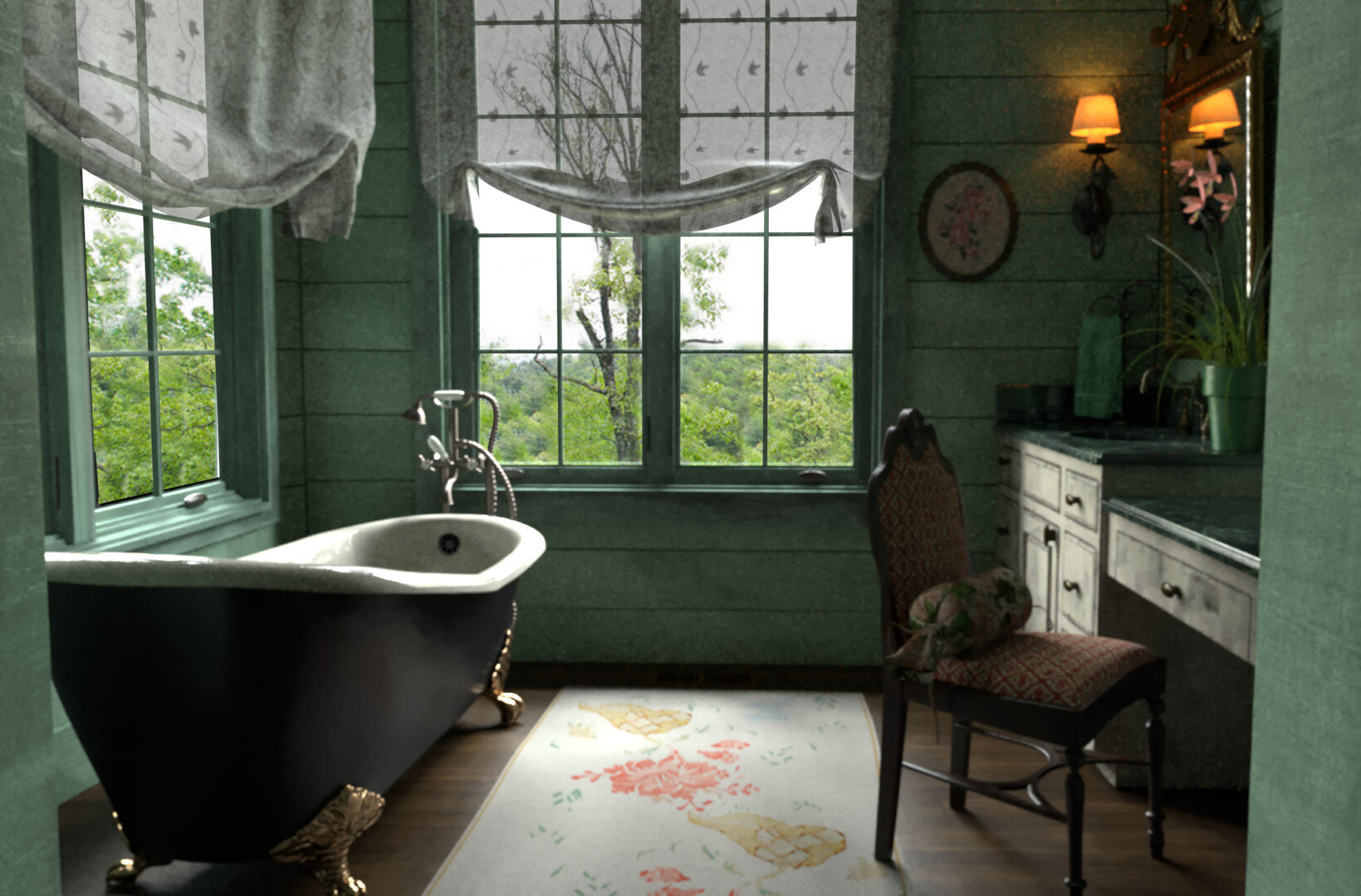
Image Via

Image Via

So, what will I extract from this poem to bring into the final look? I chose Bath because of its refreshing and relaxing feel and the aquatic theme. It is a spring to summer kind of poem, resorting to scent notes that can be found in both spring and summer perfumes and the healing and fun nature of playing with sunlight and water. Therefore, I will pull from a beach kind of style to build a look that anyone could wear during the day in a city, but that fits much better with a pool/beach/vacation situation, relying on green-white hues, a soft and light feel, glistering touches (when called for), and wavy shapes to invoke the poem’s atmosphere relayed through its imagery.

Firstly, starting with the upper and lower body areas, because of the poem’s approach to imagery describing the bathroom scene in a more open-ended manner with not many specific visual words, besides beryl, the flower scents, and crow (more on them later), I found three different ways to represent the calming, soft sensations of a body surrounded by water. 

Image Via

Image Via

Image Via

Image Via

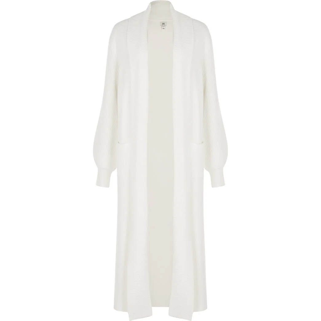
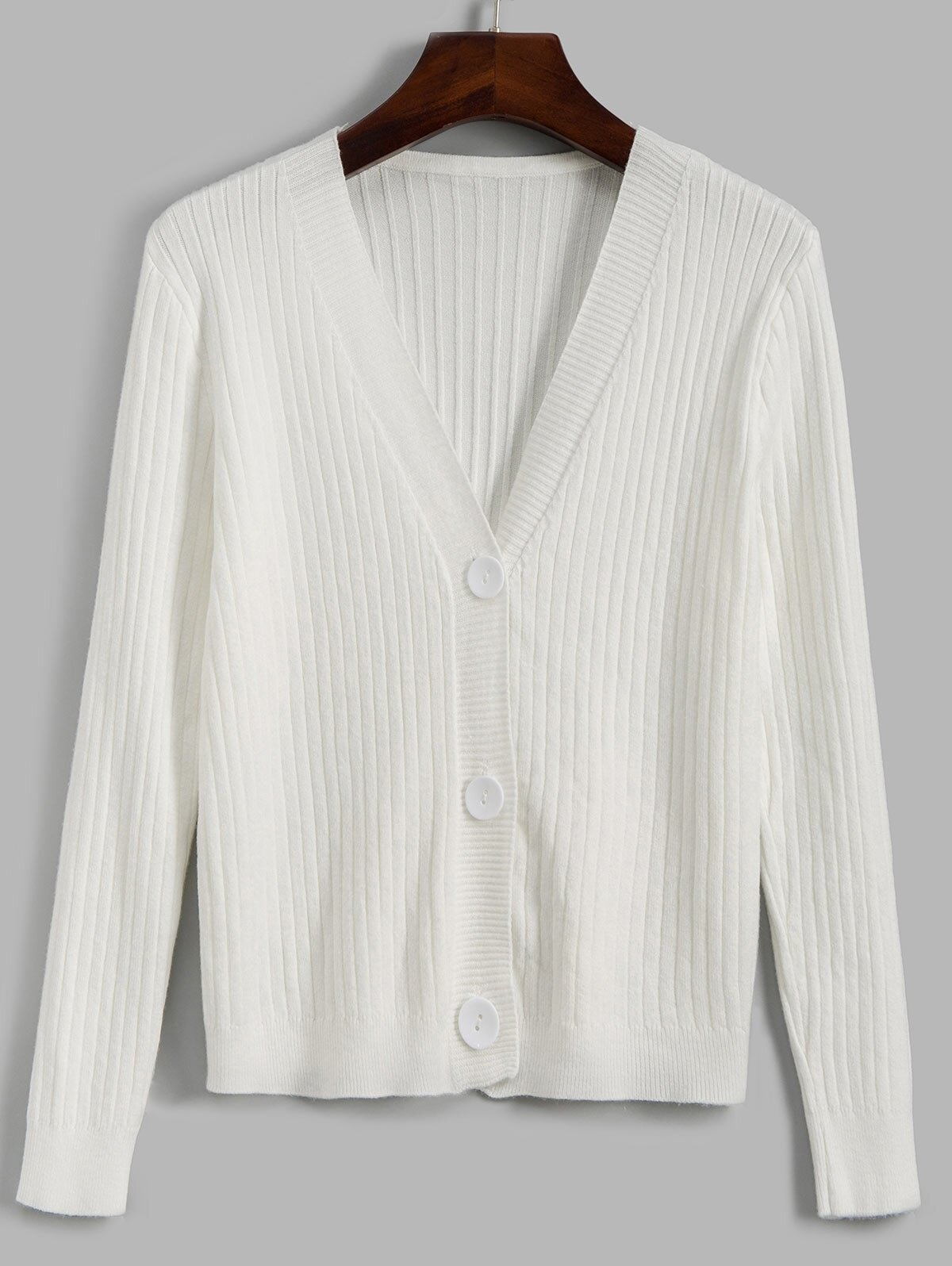
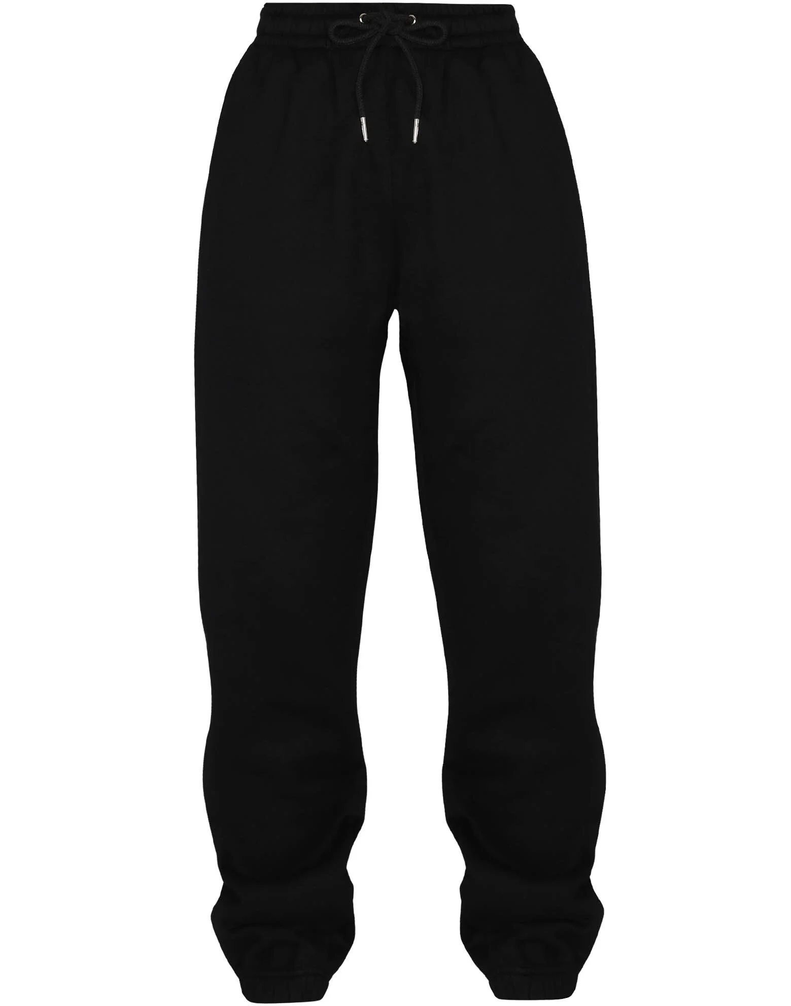
The first is to build a look with a nude/nacre-colored chiffon or viscose fabric blouse and a mint/seafoam maxi skirt. That would play with the idea that in Bath, the lyrical persona’s body merges with the water, so the nude color would represent, in an abstract way, the human body interacting with the mint colored skirt representative of the liquid, and depending on the blouse’s shade, it could even look like a rose pearl’s nacre. I could be reaching a little in the pearl part based on my perception of the gem line being this aquatic “stone,” but interpretation is the real crux of the exercise, so whatever you find proper concerning the poem’s atmosphere and message goes. The skirt then would be maxi to fully encompass the lower body, almost like a tail formed by the water, and its chiffon fabric both provides the wobbly grooved pattern representative of waves and the soft and light sensations of the body covered by it. The mint/seafoam hues are not emerald or aquamarine, but they are closer to white-green than those beryl hues, so I picked them as the outfit’s base colors.
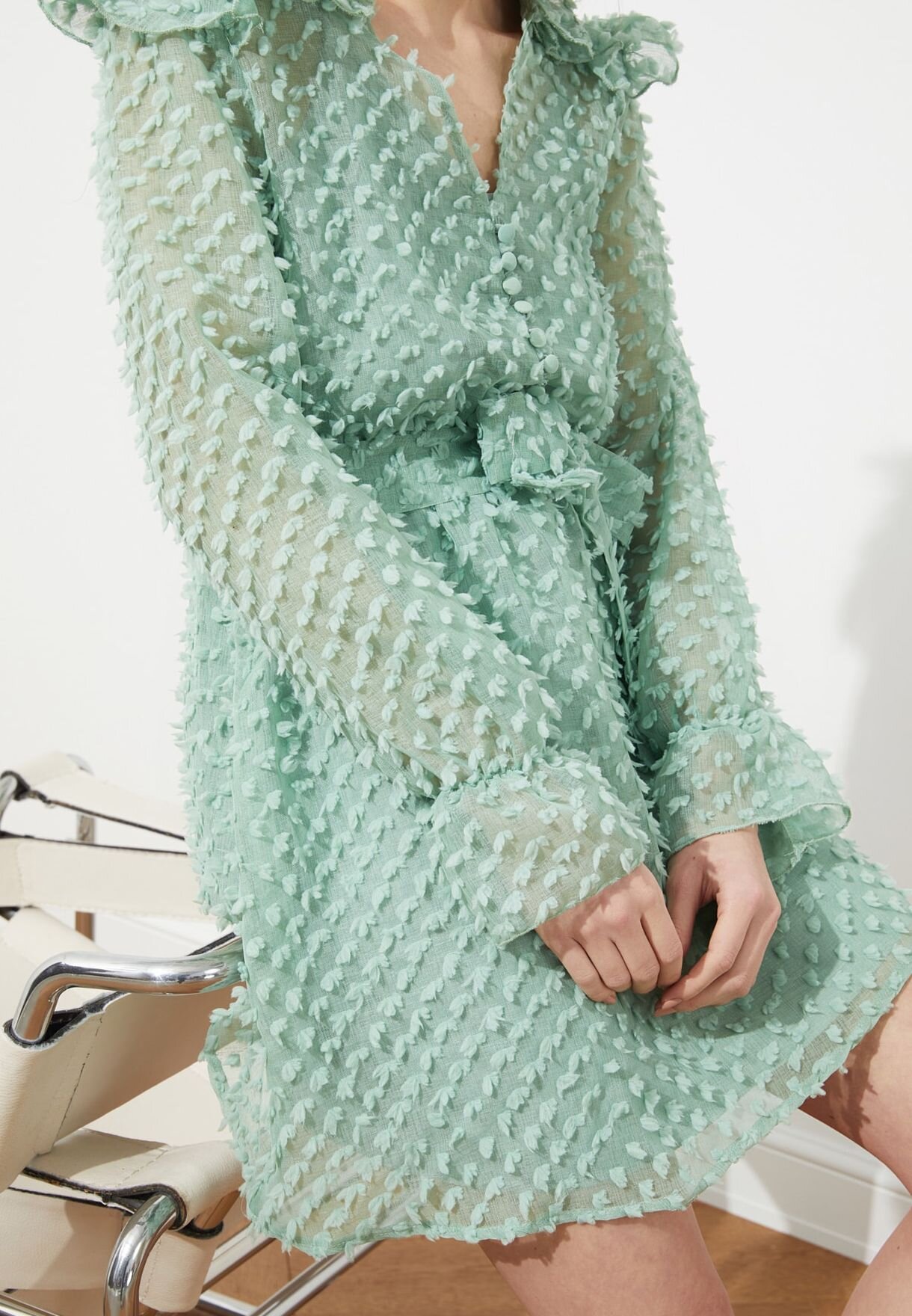
Image Via

Image Via

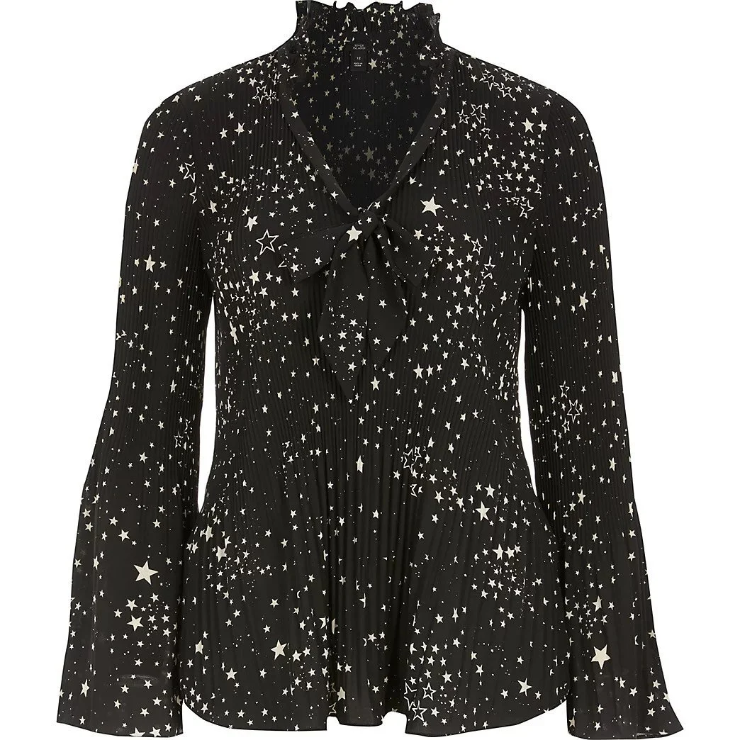
The second and third ways I approached the upper and lower body sections were to flip the color dynamics, finding both a seafoam-colored organza dress covering most of the body and an off-the-shoulder mint blouse that covers much less. The dress pattern style that you can see above is probably unique, so it may not be easy to find another one that replicates the same effect the mesh details create, which resemble a more grounded version of the specks of light Lowell alludes to when she writes “little spots of sunshine lie on the surface of the water” (the refracted light only creates a minor tint change in relation to the rest of the water).

Image Via

Image Via

Image Via

Image Via

Image Via

Image Via

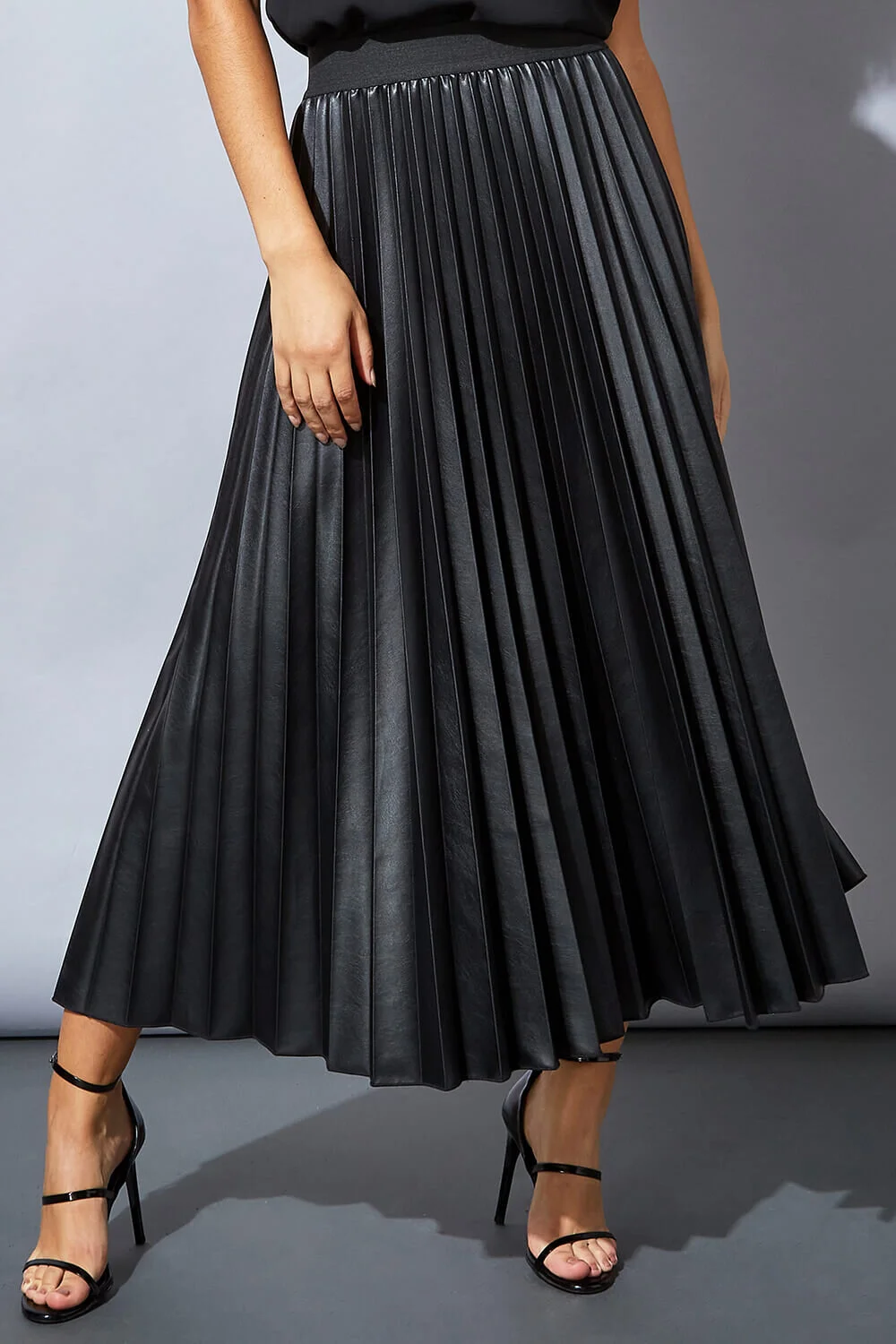
Therefore, a more accessible look involves a crop top, off-the-shoulder tulle (or any other soft and light fabric) blouse that can be paired up with either shorts or skirts since the water is now being represented at the top instead of the bottom, so there is no need for a long garment covering the legs. The choice of an off-the-shoulder blouse works more towards the idea of summer heat and that the water can be perceived as more of a side piece to the body depending on how much of it is covered by the liquid. My first choice of skirt leaned into the nude/nacre proposition I made before, just to create the opposite configuration from the first style, and because the rosy nude/nacre/beige color tonality is very accessible, works with almost all hues, and combines with the summer palette very well. Still, I also wanted to picture Lowell’s depiction of the water as jewel-like, so I also found a shimmer midi skirt that could exacerbate that imagery. The problem with most silver or shining skirts is that they are both heavy and too strong/vivid of a vesture, so instead of promoting the healing and soothing atmosphere, they try to dominate the look and present too much information. Moreover, they are not very day or summer-forward, even if they do shine brightly in the sun (some may look cheaply made even if they are not), and thus I am not as confident about the mint blouse and shimmering skirt set, even though it may fit with Bath

Image Via

Image Via

Image Via

Image Via

Image Via

Image Via

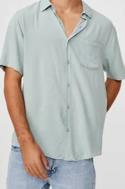
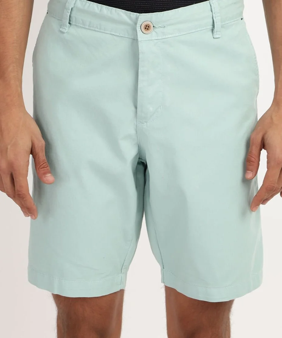
The “male version” of the costume could follow suit with the three types of style I laid out before (fully green, green above and different colors below, or nude above and green below). But, for the sake of time and your interest in this post, I will only depict two. I learned something new about male shirts researching this post. I had a summer shirt type in my mind, but I could only search for Hawaiian shirts, which would not fit the poem’s more individual/personal perspective as they usually are too out there for it. So, after entering a cycle of repeatedly finding gaudy patterns, I decided to search for shirts using fabrics as the independent variable. That was an excellent idea because I ended up finding the exact style of garment I wanted, the Cuban short sleeve shirt or guayabera. They are lightweight, worn outside the pants, and fitting to the smoothness felt in Bath. Most constitute linen and cotton, but as seen above, the one I found is made of viscose rayon. Then, onto the lower region, to create the monotonic sensation of the “full-body” covered in water, mint/seafoam green shorts would do the trick, and to replicate the pearl/sand summer palette, “glossy” beige/nacre shorts would fit nicely as the counterpart to the female design above. It is hard to find chiffon, viscose, or organza shorts, so cotton and even polyester are fine here if they don’t weigh down in the waist.

Image Via

Image Via

Image Via

Image Via

Image Via

Image Via

Image Via

Image Via

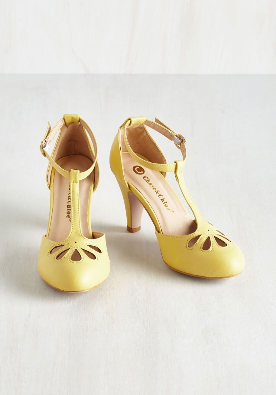
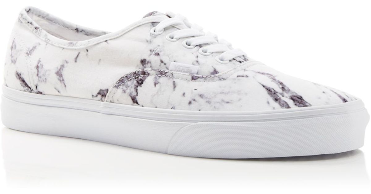
Finally, I should discuss what shoes and accessories could be suitable for the look. In the shoe category, funny enough, I discovered “Tulip flats” from the brand Ilse Jacobsen, which are eco-friendly shoes made out of recyclable microfibers. The light green color is precisely the mint/seafoam hue I have been seeking this whole post, and it features a wave pattern, so serendipity is real. However, the brand is not very accessible in the US, so any mint/seafoam-colored sneakers or sandals would function in this style exercise.


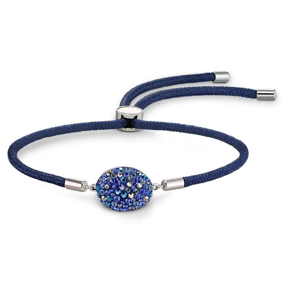
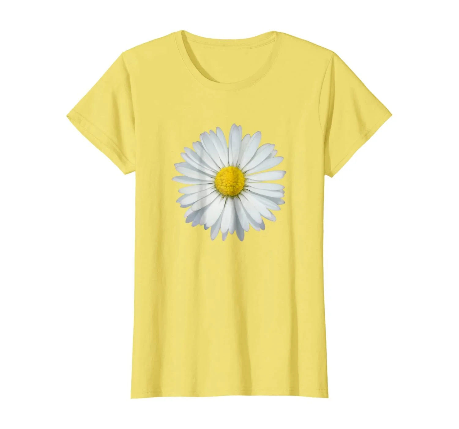
And in the accessory category, the items I found to complement the overall look are much more optional than anything. I believe jewelry is almost necessary to the poem, so I will begin there. On the one hand, replicating the more delicate nature of the reflective brightness of the water surface, a silver narcissus or tulip necklace could be apt for the costume. On the other hand, if you wish to have the crow featured as part of the outfit since the animal is semi visually important to the poem, a bracelet would be a stylistic choice that, even if not very cohesive with the atmosphere presented by Bath, would be more faithful to its contents. Yet, if you are not interested in wearing a crow bracelet, I found a crow-pattern ocean green bandana perfect for the outfit’s summer vibe (it even has embellishments in beige/nacre). Unfortunately, currently, it is sold out. Other options would include pearl jewelry, but most rings and necklaces could cost twice more than the outfit itself, so this is under your discretion. Lastly, of course, perfumes are probably the only medium that could genuinely invoke the scents of the poem to fully complete its atmosphere. To do so is to be a dedicated fan of poetrybounding, but here is a suggestion nonetheless: Carat by Cartier, which features middle notes of tulip and narcissus, a rare combination on itself, entwined with other various flower scents, but that is just subtext.

In sum, the spring/summer outfit I designed this time around benefits from not being singular, following the more scenic approach I took to analyzing and translating Bath, a poem that is as visual as the atmosphere it creates. The driving color was the mint/seafoam hue that I interpreted as the greenish-white tint of sunlit water Lowell mentions, crucial for constructing the bathroom scenery when coupled with the soft fabrics I also picked intended to tactually translate the lightweight and soothing touch of water. In contrast, the secondary colors inside the beige/nacre/nude spectrum and around shining silver, based upon my interpretation of the poem and its visual appeal (pearls, diamonds, the human body, etc.),  were less critical to the overall look. The accessories are a mix of different configurations the look could take, which also benefited from the more arbitrary nature of Bath, and because of the Pandemic, any monochromatic mask made with the colors mentioned in this post goes. I was even able to almost fully develop a “male” outfit for this interaction of poetrybounding, which goes to show how many possibilities style-based poetry may present. In the end, a poem can be, and many times should be interpreted differently by each reader, so my guide is only a glimpse into the realm that connects both fashion and poetry.


Source: https://www.flickr.com/photos/cameliatwu/5...

Poetrybounding: How You Should Dress Based on Marjorie Pickthall’s "Daisy Time"

Style-based poetry is an experiment. This post is the fourth installment of an interpretative and opinion-based series, and therefore should be read as an entertaining thought exercise. However, if after peering through this post, you find yourself interested in replicating the outfit I will outline or having a go at poetrybouding other poems, thank you for finding my ideas worthwhile.

So, if you are new to the series, style-based poetry is the culmination of connecting fashion with the eponymous literary form. Fashion is a form of visual expression that, in one way or another, conveys a particular image about the wearer, and poetry is the ultimate medium of raw emotional expression through words. However, because a poem is usually bound to pen, paper, and voice, several constraints prevent it from becoming more than feelings made into words made into feelings once more. Thus, because fashion shares a similar effect with poetry regarding personal expression, the former’s visual power has the potential to push the latter into new territories to transmit emotions through stylish conceptualized images represented as clothing. And if you are already a follower of poetrybouding, welcome back!

Daisy Time by Marjorie Pickthall is a romanticist poem that conveys the freshness and bliss of spring with highly evocative imagery of nature through flowers. It is not a difficult piece to comprehend, and its message of nature’s power to provide wonderment and elation is more steeped in a dream-like quality with singing winds and dancing daisies. Still, I believe that a little fantasy is necessary for people’s mental well being after a year of a “dwindling” yet still on-going and dangerous pandemic, especially when the heat of spring is soon arriving to melt the snow and revitalize those that were affected by the frost of winter. The poem even reads like a song, with its three stanzas all having the ABCB rhyme scheme and with lines intercalating between 7 and 6 syllables, something that provides Daisy Time with a heartwarming and silly tone that invites people not to take themselves very seriously sometimes and praise those that surround them.

Here is Daisy Time:

See, the grass is full of stars,
Fallen in their brightness;
Hearts they have of shining gold,
Rays of shining whiteness.

Buttercups have honeyed hearts,
Bees they love the clover,
But I love the daisies’ dance
All the meadow over.

Blow, O blow, you happy winds,
Singing summer’s praises,
Up the field and down the field
A-dancing with the daisies.
— https://www.poetryfoundation.org/poems/44866/daisy-time

The poem focuses its first stanza in painting a picture of daisies as beacons of light in the grass. The metonymy of stars grants this family of flowers a quality of celestial proportions, hyperbolizing its appearance as simple white and yellow flowers into stars with golden cores and white rays of light. The figurative language applied in the first stanza mystifies daisies and depicts them as beings of influence that stand out from the uniform green grass. The sun and the stars were seen as gods by many civilizations, so comparing these flowers to the utmost natural power using a color representing wealth makes them objects of prestige. Moreover, to have a heart of gold is a metaphor for an individual that is courageous and kind. That comes to show that Pickthall is arguing for the idea that daisies have the vigor and attractiveness to entice people, grabbing their attention and influencing their emotions, but also that they are kind-hearted at that.

The second stanza is a comparison between daisies and other flowers in the eyes of the lyrical persona. From the first stanza, it is apparent that the daisies enthrall them. The line “Buttercups have honeyed hearts” provides a fitting choice of words as honeyed means both covered in a honey color, a reference to buttercup’s yellow-orange hue, but also sweet and flattering, a prosopopeia that signals to the flower’s personality as sweet like honey. For the lyrical person, buttercups represent kindness. The line “Bees they love the clover” then personifies the bee to describe the clover by proxy. It grants an active quality to the clover by attracting bees with its scent and vivid purple-pink colors in a symbiotic relationship. Pickthall writes “bee” in its plural form while writing “clover” as a singular unit, pointing to the flower’s dominant nature over the bees, being sought after by the insect. Thus, clovers represent allure and desire for the lyrical persona, but because the flower also represents luck, such wanting could be related to a wish for prosperity to bring good feelings. However, when the subject mentions in the following lines that they love the dance of daisies, they are not speaking of a general attribute but what enthralls them about this family of flowers. It is no longer about how a flower looks or who likes them, but that the lyrical persona loves daisies (as also written in the first stanza), which becomes more relevant than the other species.

Image Via

Image Via

Finally, the third stanza depicts nature as kinetic art through a dreamy and whimsical pathetic fallacy where the wind’s movements sound like a song of warmth and the daisies dance to such melody, a direct allusion to feelings of joy and peace a person may feel while in a field of daisies sensing the warm (summer) breeze touching the skin. It is a hidden element of Daisy Time, but because the lyrical person says “See” in the first line of the poem, they directly interact with the audience while also signaling us to visualize the physical meadow, which points out to the idea that such field exists and that the lyrical person has been there. So, recapitulating the importance of daisies in the poem, these flowers are paragons of prestige, allure, and kindness, topping such qualities of other species, and when daisy’s rays of white and heart of gold move with the warm wind, their bodies appear to dance because of the way their appearance affects how the lyrical persona perceives them. And as such, the dance is depicted as magical and fantastic to mesmerize audiences into seeing nature as a constant that brings elation to those that contemplate it.

Now, you may be imagining that I would build an outfit solely based on the daisy motif, with gold, white, pink, and yellow hues all around daisy patterns. That is a fair idea and if you want to outfit yourself with these regal and happy colors, suit yourself because it can look amazing. Or it can look silly and fun, like the RIPNDIP Daisy Daze collection for men and women. But I want to explore the whole poem and how other aspects of it, like the bees and the other flowers, can serve as supporting actors to a central daisy motif to form a caricature of spring both in appearance and general vibe.

In that venture, I found myself drawn towards the clover flower color. The purple-pink hue is perfect when looking at an outfit made mostly of a yellow complementary tone, especially in a season when most flowers with the brightest and boldest of colors bloom again. In general, the colors featured in the poem include golden, white, buttercup yellow, and clover purple-pink (the green of the four-leafed clover will make the outfit look like Brazil’s flag, and the cloverleaf does not represent a flower). Colors, however, are not the only important aspect of Daisy Time that can depict its joyful whimsicality and represent spring in a wholesome way. The bees are quintessential aspects of the season as they pollinate the blooming flower, and the four-leafed clover is still a striking image that can be depicted in the outfit in a novel way (I will get to that). Moreover, as mentioned before, the floral daisy pattern is the most significant aspect of the piece, its prima donna, and because the dance of the daisies is an essential motif to Daisy Time as a way to convey the elation that spring begets, I need to depict this dance in my outfit creation. A dress does that superbly, as it can be flowy in the wind to resemble a harmonious, choreographed movement.

Image Via

Image Via

Image Via

Image Via

Above is an image that depicts what I think is a suitable example of a white and golden daisy dress. It is lowkey, loose in the arms, and fresh, but it also doesn’t have a big skirt, making it perfect for any moment in the day, especially in a park or meadow of flowers. However, as seen above, if you do not like wearing dresses, I found a shirt with the daisy motif with loose balloon sleeves that can also interact with the wind subtly and fittingly to the poem. And if you are planning on ever making this outfit and chose to wear the daisy shirt, I found an almost muted, very appropriate set of pants that feature buttercups in a combination of yellow and orange. These flowers are relatively uncommon when it comes to clothing, so wearing buttercup pants is a rare possible form of the outfit. Still, if you are not comfortable with this option, buttercup yellow pants are a more approachable and standard solution.

Image Via

Image Via

Image Via

Image Via

Speaking of buttercups, buttercup-colored shoes (mainly flats and broad heels) are my next suggestion for this poetrybouding outfit. It may sound cheesy, but kindness is the root of mutual elation; empathy is the grounds on which a fulfilling and loving relationship is based upon, so a shoe that, contextually speaking, portrays this idea as the clothing item that envelops the base of the body is suitable to the aesthetic power of what we are building. The images I use above represent one alternative of the many possible shoe styles in the buttercup hue. And the second secondary character in the look with the buttercups is the bee, but because of the insect’s more adjacent and supporting role as the pollinator (figurative joy spreader), I will not feature it prominently. I find insects/arachnids and jewelry a peculiar but stylish aesthetic combo, especially those that look either endearing (butterflies and bees) or fierce (scarabs, spiders, and scorpions) in jewelry form, so a simple honey bee or bumblebee bracelet suffices as this minor accessory with a fundamental yet hidden meaning. There are various bee bracelets out there with different qualities and metals (gold goes better with the yellow and golden aesthetic, but silver may combine with the next piece of jewelry), so this accessory is the easiest to find and style.

Image Via

Image Via

Finally, it is time to explore how I may tailor purple into the yellow/gold and white color palette of the outfit. Purple not only serves as a complementary color to the yellow/gold motif, but it appears in the form of clove flowers that, like buttercups and bees, work in a secondary role being a “character” of Daisy Time made to bolster the importance of daisies through comparison. Yet, clover’s allure and relationship with luck and prosperity, even if not part of the poem’s overall message, are intrinsic aspects of spring as a season of new beginnings and life born anew through vivid colors (the lively grass and tree greens, and of course, the blooming flowers). Therefore, an accessory fits the job description as a nonessential item that drives attention, but is there purple clover jewelry out there? It was challenging to find, but I managed to unveil a few purple clover bracelets and necklaces that anyone can wear in the look. The clover necklace below is not even close to being a must, but it still functions as a side character that can interact nicely with the bee bracelet; but again, jewelry can be worn in different places of the body, so styling the outfit, for example, with bee earrings and purple clover bracelets is open game.

However, purple still needs to be part of the outfit in the absence of jewelry (based on my interpretation), so a purple belt functions as the perfect midpiece that completes its palette. For the shirt and pants look, a normal-sized purple belt with golden or silver buckles serves as a bridge between the daisy shirt and the buttercup yellow pants. But for the dress look, I believe a skinny belt is more suitable because it reflects the delicacy of the dress. Purple is naturally eye-catching and bold as a royal color, which mirrors daisies’ depiction as regalia, but it may try to dominate the delicate dress with the powerful golden hue if featured prominently in a thick belt. A thin version provides a slight touch of purple to decorate, not conquer, the overall look.

Image Via

Image Via

Image Via

Image Via

In sum, the outfit I created encompasses clothing with daisy patterns in white and gold that interact with accessories in purple and golden and bottom pieces of buttercup yellow to build a picture of spring that conveys the ideas of boldness, joy, and a tad of whimsicality. For a spring pandemic look, this creation and its connection to Daisy Time brings a little fantasy and light into a time characterized by uncertainty and affliction, and adding a purple or yellow mask to it makes the outfit apt for the current environment. Still, I didn’t even go in-depth into what a more masculine version of the look could look like (maybe a more graphical daisy-pattern casual shirt with buttercup yellow pants and shoes, purple mask, and another purple accessory), which goes to show how many possibilities style-based poetry may present. In the end, a poem can be, and many times should be interpreted differently by each reader, so my guide is only a glimpse into the realm that connects both fashion and poetry.


Cover Image Via

Poetrybounding: How Should You Dress Based on Henry Wadsworth Longfellow’s Hymn to the Night?

If this is your first time reading about poetrybouding, you probably haven’t looked at my previous two articles on the topic. This is a series where I, as a fashion and literature enthusiast, try to move beyond the confines of written poetry to connect its power to vividly depict the abstract feelings of a writer with fashion’s existence as a method of self-expression that is materially visual. Fashion can be ordinary, but it has so much potential to provide a medium for anybody to embrace their feelings and personalities in personally unique ways, and poetry is another very personal medium through which emotions and the ego interact to create a written aesthetic with many times, therapeutical value.

In this installment, I will be picking apart Henry Wadsworth Longfellow’s Hymn to the Night to figure out how its imagery, sensory cues, and overall tone can be translated into clothing as a way to appreciate and mirror the message behind Longfellow’s poem. As a teaser, the Night’s characterization and personification as a figure of awe, tranquility, and inner peace is the main idea I will be focusing on as I try to create a look that represents those attributes. Comfort, style, conspicuousness, and a “light in the dark” effect are the key concepts that it should embody, as well as being predominantly a night design that can also be worn in the day. Finally, Longfellow gives the Night a female persona, so I will be tailoring the main look to the female gender, though I will subsequently add some alternative suggestions for men or anybody else to dress like the poem if they want to. 

Here is Hymn to the Night:

I heard the trailing garments of the Night
Sweep through her marble halls!
I saw her sable skirts all fringed with light.
From the celestial walls!

I felt her presence, by its spell of might,
Stoop o’er me from above;
The calm, majestic presence of the Night,
As of the one I love.

I heard the sounds of sorrow and delight,
The manifold, soft chimes,
That fill the haunted chambers of the Night,
Like some old poet’s rhymes.

From the cool cisterns of the midnight air
My spirit drank repose;
The fountain of perpetual peace flows there, —
From those deep cisterns flows.

O holy Night! from thee I learn to bear
What man has borne before!
Thou layest thy finger on the lips of Care,
And they complain no more.

Peace! Peace! Orestes-like I breathe this prayer!
Descend with broad-winged flight,
The welcome, the thrice-prayed for, the most fair,
The best-beloved Night!
— https://www.poetryfoundation.org/poems/44633/hymn-to-the-night

The poem relies on imagery and a rich vocabulary to present the Night as a godly figure of benevolence. The lyrical persona begins his description by introducing her through vision and sound, yet not in a detailed manner, which leaves the readers to imagine her presence through their own interpretations, an alluring mystery. Then, he conjures Night’s personality as spellbound and majestic. She is a deity that exudes love in a familiar way to the reader and is thus not haunting. The moon is mythologically connected to magic (the lunar syzygy and spiritualistic rituals, for one), so Longfellow brings that relationship between magic and Night to characterize her as something akin to the moon, the light in the darkness. From this description, the poet establishes Night as the light that exits over her own gloom. Even if the poet pictures her celestial abode as a vast marble place with halls and cisterns haunted by the cries in the night, which represent the negative aspect of the darkness that overwhelms everything during this time of the day, he finds the absence of light peaceful, like the flow of still water inviting the lyrical subject and the reader to relax and sleep, as if the Night was tucking us in. Longfellow then finalizes his poem by associating the figure of the Night with the one of Care, showing that she loves to take care of the living, and through this exchange, brings peace to those who welcome her.

The aspect of Night’s personality that touches me the most is her tendency to care for life, to bring light to a body of darkness, to spread inner peace to those that accept her. I see her as the moon lighting up the sky, but because the poem does not use “moon,” I can take aspects of it to inform the fashion look. Since Longfellow pictures the Night as this being that protects life and covers it with calming feelings, a long off-white cream cardigan feels like the appropriate garment for her. Maybe even one with an extended baggy armhole area to form a wing or with winged sleeves to fully depict the Night as seen in Hymn to the Night. Simply put, the color that mostly represents light is white, and the color that most faithfully represents the moon is off-white cream, and a long cardigan offers this feeling of coziness and can be worn inside a house and out in the city.

Image Via

Image Via

Nevertheless, the Night also exists in the form of shadows and darkness, so something in the look needs to represent these ideas. Instead of only selecting solid colors like black or navy to stylize the garment, I thought a long-sleeved star-patterned navy shirt or blouse could do the trick. Anyone can wear it below the cardigan to display the dominating nature of kindness over sorrow and fear of the unknown. The poem does not deny the Night’s cynical side; it chooses to celebrate her virtuous parts, so the outfit should imitate such thought. Moreover, the third line explicitly uses the sense of vision to exemplify an evident physical characteristic of the Night, while the first line uses sound to do so. While a gown that trails in the floor is accurate, it may not bode well for someone walking down the street, partying, and all sorts of things, so the image of something “long” is enough to tick that box. But a saber skirt is something I can work with. Archaically, saber means a shade of black, so the outfit needs a black skirt. But because the Night still has so much light to give, a pleated long black skirt or black vinyl pants (for those who don’t want to wear the bottom half of a dress) appear to shine when light reflects upon it, so this addition continues to push forward the narrative that the Night is more benevolent than malevolent.

Image Via

Image Via

Image Via

Image Via

Finally, I shall explore the footwear and accessories of the outfit. From the poem’s second line, it is clear that Night’s residence is pictured as being made of marble. Thus, because the floor is marble bound, a white marble pattern shoe could also speak of such an idea so as to connect the light coming from the cardigan to the floor in a white line. And residing inside her lair, there are several cisterns of which the poem depicts as having “fountains of perpetual peace.” Water is intrinsically connected to the Night’s somnolent attributes, so to materially illustrate it, a piece of jewelry with the water motif can be worn as a token of inner peace and relaxation. I found a beautiful Swarosky water power bracelet for women depicted below, but anything can go, gender-based or not.

Image Via

Image Via

Image Via

Image Via

In sum, the look I crafted for Hymn for the Night encompasses white tones surrounding darker colors in a conversation where light prevails over darkness but still acknowledges its existence. Everyone has their fears and insecurities, and it is always best to understand them, accept them, but not give in to their haunting cries so a ray of positivity can shine in their place. It is always easier said than done, but sometimes, reading something that embodies those ideas and then owning them by wearing them is at least a step in that direction. Poetry aside, the outfit is versatile and can be worn any time of the day in several different iterations, maybe even without the cardigan during the evening if you are interested in going on a party-heavy environment. In the end, a poem can be, and many times should be interpreted differently by each reader (this conclusion’s addendum is courtesy of my mind), so my guide is only a glimpse into the realm that connects both fashion and poetry.

featured image via

Source: https://www.pinterest.com/pin/353955470449...

Poetrybounding: How Should You Dress Based on Margaret Cole’s The Falling Leaves Poem?

Poetry has an aesthetic power that can transcend many boundaries. The influence of imagery in the appreciation of a poem gives the audience a more pronounced and impactful emotional understanding of its contents. Illustrations and paintings can go ways to mastering the visual appeal of poetry, breaking the boundaries of words. In the same vein, fashion has the potential to be an interpretative medium for the internalization and personal emotional expression of this literary form. Different colors, garment shapes, and accessories are cards that can be combined in various ways to form the image and main message behind a particular idea, which in this case, derives from a poem. This article will explore the visual appeal of Margaret Postgate Cole’s The Falling Leaves.

While specific interpretations linger on the parallel between leaves and soldiers, the poem presents a connection between fall and winter that serves a more aesthetic purpose and permeates the melancholy of its contents. The Falling Leaves is singularly powerful when nature becomes an extension of the poetic persona, representing their feelings as if both the outside and the inside influenced one another. The conversation between how visceral feelings influence the perception of an outer scape and then how the presentation of such environment feedbacks into the initial emotional state is also very prominent in fashion. The poem is as follows:

Today, as I rode by,
I saw the brown leaves dropping from their tree
In a still afternoon,
When no wind whirled them whistling to the sky,
But thickly, silently,
They fell, like snowflakes wiping out the noon;
And wandered slowly thence
For thinking of a gallant multitude
Which now all withering lay,
Slain by no wind of age or pestilence,
But in their beauty strewed
Like snowflakes falling on the Flemish clay.
— https://www.poetryfoundation.org/poems/57330/the-falling-leaves

The poem’s central message relates to the tragedy of WWI. Its epigraph mentions November 1915 as its setting, connecting the idea of autumn’s falling leaves with the soldiers’ death as the “gallant multitude.” But the way Cole inserts this essential detail is so subtle, coming from an outside perspective, a detached yet heartfelt position, that it lingers in the background as a clue to the poem’s real context and a manifestation of its melancholic undertones. Still, it does not provide The Falling Leaves its ultimate aesthetic prowess, as poetry can be read separately from its original setting. Cole’s descriptions about nature define its visual appeal as the autumn colors give away to the snow of coming winter. She peppers her writing with strong descriptive words to give weight to the idea of fall as a transitional period of farewells and endings, which concludes in the transformation of leaves into snowflakes, a force that is all-encompassing as it covers the floor and transforms it into a uniform white mass. Nature is inevitable, so the poetic persona can only feel and mourn its effects. 

Colors bring forth conceptual propositions that can represent both a physical state and an emotional connotation, illustrating those forces of nature. Autumn has a whole palette of warm colors related to it, ranging from red to yellow to orange, but orange seems to be the best option because it is an intermediary color, it contrasts nicely with the cold blues of winter, and because clay usually is orange-tinted. Burnt orange is an even better shade since it more accurately depicts the leaves’ decaying quality, their brown light. Due to its connection with the act of falling and the Flemish soil, both a burnt orange pair of shoes and layered silk wide-leg pants fit well with the article’s proposition, with silk displaying the leave’s fragile nature. Winter, in turn, is mostly made of whites, greys, and blues and, as pointed out before, features snow that covers the fallen bodies. The best option to depict snow’s thick, “wiping out” lyrical representation is a white wool cardigan styled with a white beanie. That would then form a white upper-half to contrast with the orange bottom-half, depicting a stationary motion with white falling over the orange; snowflakes covering up the leaves.

Image (Via)

Image (Via)

Image (Via)

Image (Via)

However, even though the war motif is not as central to the poem, it still has a significance that propels the need for its depiction in the outfit. From what I have already built, the model is still missing a shirt. It is in a t-shirt that the “Galant multitude” can be featured in the overall look. I found a blue-grey garment from the Kansas City National WWI Museum and Memorial, which follows the winter color pallet, but any t-shirt depicting soldiers could fit the proposal. And to finally establish the connection between soldier and leaf, a silver leaf-patterned bracelet finalizes the look as it is the ultimate blend between winter and fall: the silver of snow wraps the petal, located in the arm, a position that is near and horizontal to the t-shirt. 

Image (Via)

Image (Via)

Image (Via)

Image (Via)

In sum, the look I designed based on The Falling Leaves encompasses bold dark colors that dialogue with bright whites and greys, a conversation in motion that is very reminiscent of a transitional November period between Autumn and Winter, but that also address the metaphor of war. However, poetry aside, the outfit can lose its white parts and remain blue and orange to be worn in a summer environment, where the white doesn’t overshadow the opposition between the contrasting colors. In the end, a poem can be, and many times should be interpreted differently by each reader, so my guide is only a glimpse into the realm that connects both fashion and poetry.


Cover Image Via

Poetrybounding: How to Dress Like William Morris’ ‘Love is Enough’

Poetry is art from the realm of words. From melodic rhyme schemes and iambic meters to emotional unpacking found in freestyle, the power of this literary genre arguably springs from its ability to transform words into visceral feelings. Any poetry should transcend its textual domain to move into a non-verbal space, be it of the mind or the heart. But outside the internal human experience, poetic literature stays stagnant in limited mediums of translation inside physical and digital books and recitals. So, why not translate words into a new visual experience, one known to combine an inner sense of beauty into an external personal aesthetic composition?

Fashion has the power to inform people of someone’s personality and perception of image while also impacting the onlooker with distinct combinations of form and color. Because of its aesthetic power, it fits perfectly as a mode of adaptation to poetry’s emotional influence. One core emotion that most poems try to replicate is love, so for the first rendition of this amalgamation of poetry and fashion, I chose to look into Love is Enough Song I by William Morris.

Love is enough: though the World be a-waning
And the woods have no voice but the voice of complaining,
Though the sky be too dark for dim eyes to discover
The gold-cups and daisies fair blooming thereunder,
Though the hills be held shadows, and the sea a dark wonder,
And this day draw a veil over all deeds passed over,
Yet their hands shall not tremble, their feet shall not falter;
The void shall not weary, the fear shall not alter
These lips and these eyes of the loved and the lover.

The poem’s central message resides in the idea that true heartfelt love does not falter when faced with overbearing challenges. Love is enough to banish this fear and exhaustion that comes from the challenges of life, illustrated through the imagery of dark skies and seas, diminishing surroundings, shadowy and hazy mountains, and moaning trees, all represented by the invisible antithesis of a heavy veil. Three words can sum up the imagery of fear trying to weigh down and suffocate the lovers by overwhelming them into an isolated world of distress: dark, enclosing, and heavy. So, garments that can portray these ideas cannot become the center of the look; they need to surround the body. Since dark often relates to the absence of light and heat, a black coat or jacket is a very on-point piece that can represent the cold the environment is trying to use to oppress the lovers, especially if it is a heavy jacket. To match it, black or dark grey sweatpants mimic the same weight, color, and form the jackets can suggest, but they also serve as more of a coadjutant and low-key garment for the look.

Image (Via)

Image (Via)

Image (Via)

Image (Via)

However, Love is the word that should primarily define the poem. It is not for nothing that the lovers need only their company to survive through the opposing forces around them; not for nothing that their lips and eyes, arguably the parts of a person’s body that drive the most attention, define their bond and do not falter to the darkness. That is why it should become a significant part of the look. 

In the poem, two lines create a direct opposition to the oppressive forces of life. One of them mentions two flowers, daisies and gold-cups, or cups of gold, which still bloom under the darkness. Love Enough does not concretely state what they mean, but under my interpretation, these flowers represent the lovers surviving and thriving under the oppression. Because of this, the piece of garment that fits the best with the image of being surrounded by a heavy black jacket is a yellow/white floral shirt. I find that a daisy picture covered by yellow/white/cream cloth creates a beautiful contrast between death and life, mainly because the flower’s petals are white, giving color to the mournful black look.

Image (Via)

Image (Via)

Image (Via)

Image (Via)

The second line that directly opposes the surrounding menace’s vigor mentions that the lover’s hand would not tremble, and their feet would not falter. The only idea that comes to my mind is embalming the hands and feet with colorful garments to depict the warm strength of love. Since I already chose the daisy as a shirt motif, I will pick the cups of gold as the accessory color, the color that represents Love in the poem. Therefore, any shoe, glove, scarf, belt, bag, and hat should be colored like the flower. And in the case makeup is considered a significant aspect of the look, adding subtle yellow and white tones to the eyeshadows and blushes could be sufficient, as well as dabbing on the black lipstick (well, maybe?), but they are not a needed feature.

All things considered, the look I concocted feels directed towards a more winter scene with the black shades dominating the warm yellow-orange tones but can be modified by anyone to become spring/summer-like, removing the coat and some accessories, and changing the pants from sweatpants to trousers. In the end, a poem can be, and many times should be interpreted differently by each reader, so my guide is only a glimpse into the realm that connects both fashion and poetry.


Cover Image Via